Appendix E — DAY 3 — DISCUSSION
~ 19 min reading
ACTIVITY 3–b
We treat the words “variation” and “variety” in this context rather more precisely than is the case in general English usage. “Variety” indicates differences that have been deliberately introduced in order to provide a greater range of products and/or services compared with what would otherwise be available. Thus customers are able to choose what more closely meets their needs and desires. In this sense, variety is indeed the “spice of life”.
Differences may also be deliberately introduced for experimental purposes: one or more details involved with a process are altered in order to see what happens as a result—are those alterations beneficial or not? There is more on this in the final paragraph below.
In contrast to both of those above, “variation” implies differences that most certainly have not been deliberately introduced: they are unwanted, they are a nuisance, they cause inconvenience or worse. They may be differences within the service or production process, making that process more inefficient than necessary, thus raising costs; they may be differences in the resulting service or product, whereas customers want to be able to rely on getting what they thought they were buying.
Variation produces undesirable differences both internally and externally. Both are bad for the organisation concerned. As just observed, variation within processes causes inefficiency and thus extra cost. It may result in the need for increased inspection and troubleshooting—again costly. Variation experienced by the customer results in expensive repairs or replacements under warranty. Even worse for the customer, the problems may arise soon after the warranty has expired. In either case the company’s reputation for poor reliability and service is thereby increased, leading to poorer future sales, etc. All such waste reduces the company’s resources which could otherwise be available for innovation, experimentation, research—every one of which is necessary in order to successfully provide increased variety. So indeed, all this implies that reducing variation increases the feasibility of greater variety becoming available.
There is a close analogy in the branch of traditional Statistics known as the Design of Experiments or Analysis of Variance (so if you’re Stats-level 0 then you can skip this!). This topic had its origins in Agriculture: experimenting with various factors which might result in increased yield of crops—and some of the terminology from those origins still remains although the method is used extensively in many other areas. The “levels” (e.g. amounts, concentrations, etc) of one or more factors that are thought to probably affect results are deliberately varied in order to study the consequences. The resulting data are then analysed by comparing the variation resulting from different levels of the factors with what is usually referred to as the Residual Error or Unexplained Variation or something similar. The latter effectively plays the role of common-cause variation (though it is still quite rare for control charts to be used in this context, despite the fact that the mathematical assumptions made concerning the Residual Error are in fact much more stringent than simply being in statistical control!). Common-cause variation can be regarded as “fog”: the denser the fog (i.e. the larger the common-cause variation), the harder it is to see anything; the thinner the fog, the easier it becomes to see things—including whether e.g. different levels of a fertilizer do indeed affect the yield. Thus the thicker the fog, the less possible it becomes to see the effects of experimentation, again harming the possibility of developing greater variety in what the company can offer to its customers.
(Return to Day 3 page 4 or continue on Day 3 page 5.)
ACTIVITY 3–g
Using the first 12 values we have
\[\bar{X} = (18 + 19 + 17 + 17 + 16 + 17 + 16 + 15 + 14 + 15 + 15 + 13) \div 12 = 192 \div 12 = 16.00.\]
As before, the moving ranges are printed in italics:
18 19 17 17 16 17 16 15 14 15 15 13
1 2 0 1 1 1 1 1 1 0 2
So \(\overline{MR} = (1 + 2 + 0 + 1 + 1 + 1 + 1 + 1 + 1 + 0 + 2) \div 11 = 11 \div 11 = 1.00\) and \(2.66 \times \overline{MR} = 2.66 \times 1.00 = 2.66\). This puts the control limits at \(16.00 - 2.66 = 13.34\) and \(16.00 + 2.66 = 18.66\), confirming the obvious message from the run chart that the process is trending downward.
(Return to Day 3 page 18.)
MAJOR ACTIVITY 3–h
In order to aid my own learning from the Funnel Experiment, I wrote a computer simulation of the whole of this Major Activity, including fixing the first five dice-scores at the values you have been using. I then ran the simulation numerous times in order to study the kinds of similarities and differences that may occur. As a result, I can tell you about the kind of things that usually happen. But of course, by their very nature, data vary—and just now and again they vary in annoyingly unusual ways. And be sure that that happens with data other than those produced by throwing dice!
I have chosen to show you a couple of those simulations that demonstrate rather well both the similarities which typically occur and the kind of differences which may occur. (The sequences of dice-throws used in these simulations are those which I provided on Day 3 page 37 in case you couldn’t find any dice!)
First, let’s compare the histograms for Rules 1 and 2. If you look back to the similar histograms in the Ford example, remember that the Ford people were initially using Rule 2 but then eventually (on their statistician’s advice!) tried Rule 1. I’ll show the histograms here in that same order.
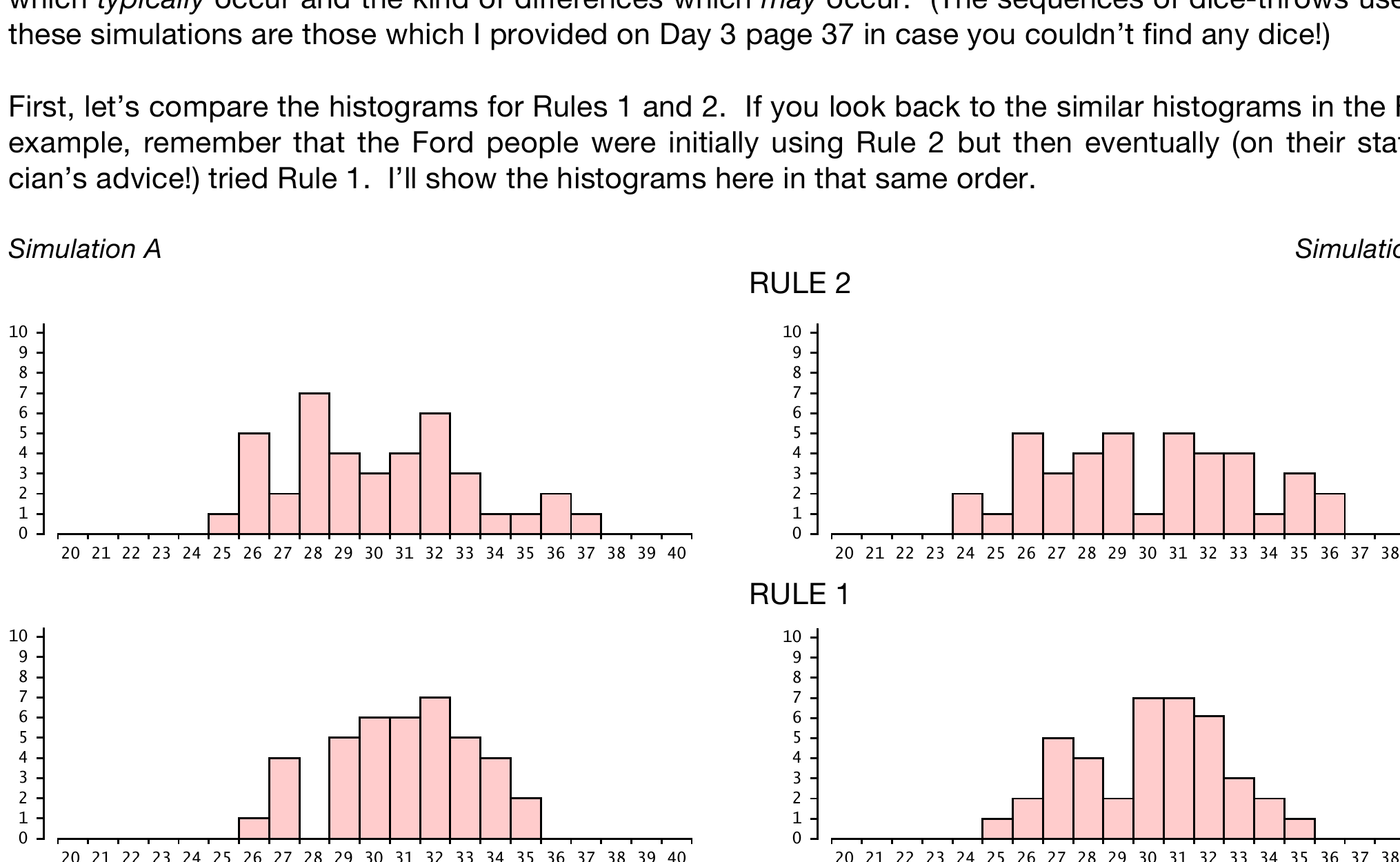
Because of our familiarity with the Ford example, there are no surprises here. Rule 2’s histograms are rather wider than Rule 1’s histograms, matching what was seen to occur in the Ford example. Rule 2 produces more variation than Rule 1. Using the kinds of measures of variation familiar to statisticians, Rule 2’s variation is generally calculated to be around 40% greater on average than that of Rule 1. The automatic compensation device was indeed “tampering” with the system, making things worse rather than improving the system in any way whatsoever.
But beware of “over-analysing” histograms. The eye might be drawn to unusually short bars such as at 30 in Simulation B’s Rule 2 and, even more so, the non-existent bar at 28 in Simulation A’s Rule 1. They mean nothing—just “the luck of the draw”! As I said at the beginning, data by their very nature vary, and just now and again they vary in annoyingly untypical ways.
I imagine that one can still purchase automatic compensation devices. I suppose they may do some good with processes that are horribly unstable. But I think it would be rather less expensive and more sensible to use control charts, thus enabling focus on bringing the processes into statistical control and then using Rule 1 or, better still, get working on improving the process since more will then be known about it.
Let’s move on to the run charts for Rules 3 and 4.
The run chart for Simulation A’s Rule 3 surprised me. I imagine it may also surprise you, assuming you had the kind of fun and games with Rule 3 that often occur! This actually doesn’t look too bad, although (again recalling Dr Worthington’s teaching near the start of his seminars), the zig-zag tendency in the chart looks suspicious. However, this chart is very different from my own general experience and also was a strange exception to pretty much all the other simulations of Rule 3 that I looked at. Consequently I reran this particular simulation but this time let it develop over 80 stages rather than 40. And then I obtained:
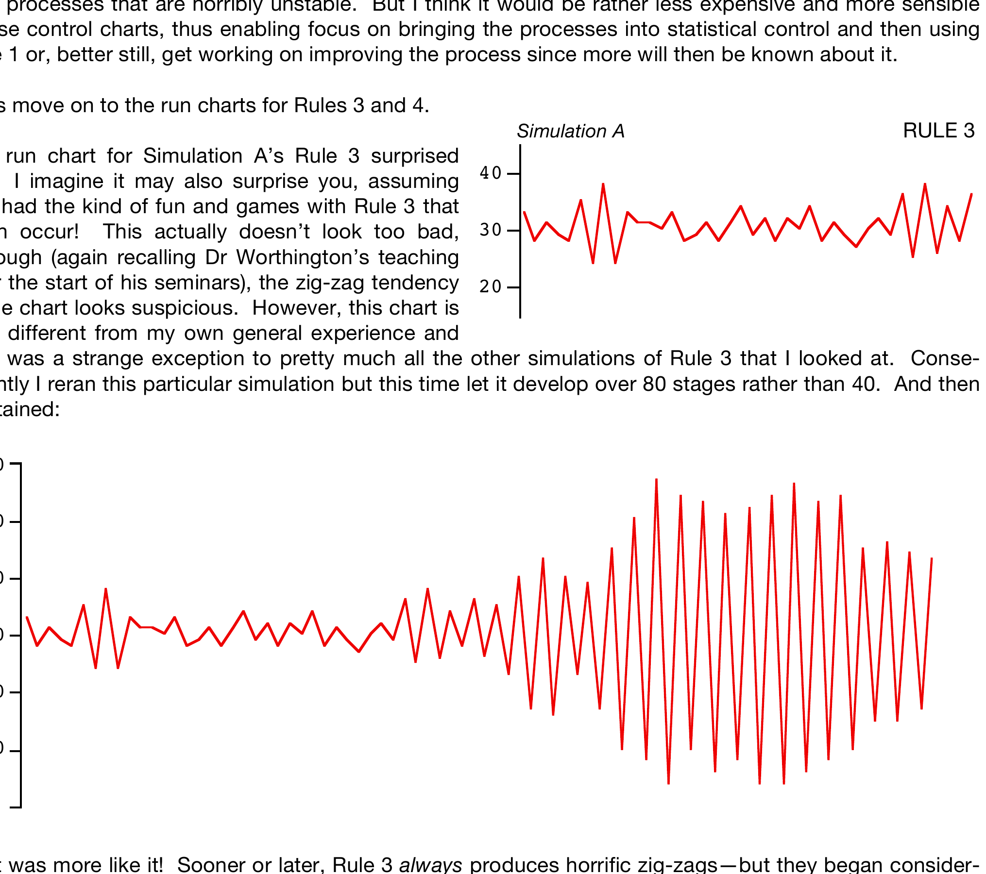
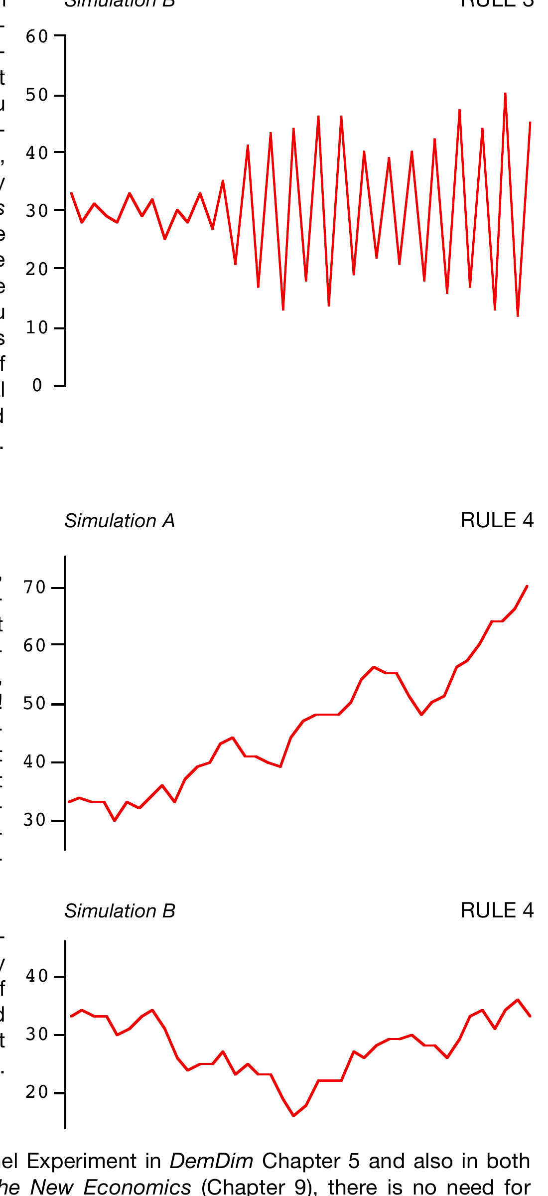
That was more like it! Sooner or later, Rule 3 always produces horrific zig-zags—but they began considerably later in Simulation A than is usually the case. The Rule 3 run chart in Simulation B at the top of the next page was more typical.
Now, although Rule 2 resulted in wider variation than Rule 1, the difference might not be regarded as particularly dramatic. But the behaviour of Rule 3 usually is dramatic! Recall that I asked you to predict what you thought Rule 3 would produce before you started working with it—I wonder what you suggested! For remember that, when it was introduced, Rule 3 may have seemed to simply be a relatively innocent variant of Rule 2. Well, not so. It was rather easier to carry out: I expect you may have developed your Rule 3 data in maybe half the time that you took for Rule 2. (That’s unless you became worried when huge zig-zags began to occur and you spent time checking for your mistake!) What was the difference between Rules 2 and 3? One way of expressing it is that, in Rule 3, attention to the vital factor of the funnel’s position was instead replaced by undue and inappropriate attention to the target. That may raise some analogies in your mind!
Finally, onto Rule 4.
There are no wild zig-zags with Rule 4. Instead, Rule 4 usually just gently “wanders around” (mathematicians often refer to this as a “random walk”). It may mostly wander in one direction, as in Simulation A. But although the wanderings are “gentle”, the consequences may well be rather unpleasant! Toward the end of this chart the school bus is arriving at around 9.10 rather than 8.30, and the socket is now around 2.7 cm wide rather than 2.3 cm. Not exactly improvement! Yet it is true that, as the motivation for Rule 4 was expressed, it does indeed reduce the point-to-point (short-term) variation compared even with Rule 1.
In Simulation B, Rule 4 initially slowly drifts downward but then eventually moves back up to roughly where it started—i.e. close to the desired value of 30. At that stage, maybe this would have inspired some relief in those involved with the process: “It took a while to settle down, but now it looks OK!”. But not for long … !
Since there is considerable discussion on the Funnel Experiment in DemDim Chapter 5 and also in both Out of the Crisis (pages 280–284[327–332]) and The New Economics (Chapter 9), there is no need for much more here. Being wise after the event (if not before), Rules 2, 3 and 4 show differing levels of stupidity in trying to improve results. If a process is out of statistical control, the only way to improve it is to identify and deal with special causes. If a process is in statistical control, the only way to improve the results is to improve the process—not just “tamper” with it. So, as previously mentioned, isn’t it frightening that, after learning from the Funnel Experiment, the delegates in both Dr Deming’s seminars and mine would then so readily recognise having seen these Rules active in their own work and elsewhere in life? Several examples will be presented on pages 20 to 21, starting in the discussion on Activity 3–j below.
So, returning to our version of the Funnel Experiment, if tampering doesn’t do any good (to put it mildly), how might we really “improve the process”, i.e. reduce the variation it produces? How about using some redesigned dice on which three of the faces show a 3 and the other three show a 4? That would do it! Or how might we improve the process in Lloyd Nelson’s original version? Using a very thick tablecloth would help. And so would lowering the funnel closer to the table. Can you see the difference? These actions would improve the process: they would not be tampering with it.
I shall content myself here with just one further observation on each of Rules 2, 3 and 4.
Compared with what happens with Rules 3 and 4, Rule 2 doesn’t look too bad. But that is only relative. Think back to your initial reaction to the Ford compensation example near the beginning of Day 3—as you now know, that was a direct application of Rule 2.
Rule 3’s behaviour is clearly catastrophic—though did you suspect that such would be the case when (as recalled on the previous page) we may have initially regarded it as an “apparently rather innocent variant of Rule 2” on Day 3 page 48? A natural reaction when people first see its behaviour illustrated on a run chart is that, of course, this wouldn’t be allowed to continue very long in practice: the strategy would be abandoned even if there was no real understanding of why its results were so horrible. Well, yes—that’s if the time between successive data-points is short enough for the behaviour to be so apparent. But sometimes my delegates mused over longer-term changes in cultural or economic matters … . Even in Simulation B’s run chart for Rule 3 (at the top of the previous page), things didn’t start to get any worse than Rule 2 until around a dozen points had been plotted. If the time-interval between points were, say, a year, what is the likelihood that anyone would realise the subsequent catastrophic behaviour was caused by a policy instigated some 12 years earlier?
And Rule 4 is really dangerous. Remember its motivation is to reduce short-term variation—which it succeeds in doing. Thus often it really does appear to be even better than Rule 1—in the short term. And, yet again, it might be quite a while before it wanders off very far from the target—so that, when it eventually does so, as with Rule 3, it might not be easy to recognise the real source of the trouble.
You know that Dr Deming sometimes described the Red Beads Experiment as “stupidly simple”. As I’ve indicated, the Funnel Experiment could surely be similarly described. But, as with the Red Beads, the messages to be learned from it are most certainly not stupid. They are profoundly important.
Forewarned is forearmed.
(Return to the bottom of Day 3 page 56.)
ACTIVITY 3–i
As you know, Rule 1 simply produces the unadulterated data coming from the underlying process of throwing the dice or, in Dr Nelson’s original version of the experiment, dropping the marble through the funnel. In particular, in our dice version the process is surely in statistical control with the control limits giving a fair indication of the likely range of the bulk of the data from that stable process. Even the extreme values of the dice-throws, i.e. 2 and 12, are not especially rare occurrences and so we would be rather unlucky if our computed control limits fail to enclose all the 11 possible outcomes.
I’ll move straight on to Rule 4 since that’s the one you have dealt with most recently. The clue as to what happens to the control limits here follows directly from Rule 4’s objective: “Since it is good to reduce variation, [the management] strive to minimise variation at least in the short term.” The obvious result of that strategy is to reduce the moving ranges from what they would normally be under Rule 1. In other words, the gap between the control limits will be narrower than under Rule 1; on average, it is actually around 30% narrower. Because of Rule 4’s “wandering” nature, it is likely to soon be producing plenty of points outside either type of control limits. However, that wandering nature soon becomes obvious with or without control limits; and so, unlike most kinds of special causes, there is nothing to learn from when exactly you start to get points outside the limits.
Apart from the feature of possibly wandering off to relatively enormous distances from wherever it starts, there is another aspect of Rule 4 which is often seen in real-world processes. This is that adjacent values are fairly closely “tied together” compared with the overall range of variation. For example, let’s recall Process D of the Six Processes (described on Day 3 page 21). Suppose that, instead of my pulse-rate being measured just once a day, I was fitted with one of those monitors which records it, say, every minute. Or it could be measuring the systolic and/or diastolic blood pressure, or my body temperature, etc. All such measurements and many more may vary quite a lot over a reasonable amount of time but not usually over just a minute! So, in that sense, their variation could never be “random”. If you want to impress your colleagues, this effect of adjacent measurements being closely “tied together” is called “positive autocorrelation”! The important point of which to be aware is that, as with Rule 4, control limits computed from such data will be unnaturally close together, and so you will be pretty much bound to get lots of points outside those limits before very long. However, now that you are aware of the problem, the remedy is obvious enough: make the time between readings long enough for the autocorrelation effect to become negligible. If you were to do this with pulse-rates etc then, as Chart D1 clearly showed (Day 3 page 19), it is entirely possibly to get a typical-looking stable control chart. However, with Rule 4 itself (because of its wandering nature) the time will come when virtually all points will be outside the limits.
Rule 3’s zig-zag effect is the complete opposite. (This is negative autocorrelation.) “Zig-zag” means up-down-up-down-up … : i.e. here the moving ranges almost immediately start becoming larger than would be expected from the common-cause variation in Rule 1 and sooner or later become huge! So control limits from such data are often much wider than in the other Rules—but, even so, as the zigs and zags increase in size then points start falling outside even those very wide limits!
Now of course, in a sense, part of this discussion has become academic: in practice, when either Rule 3 or 4 behaviour starts to become at all extreme then it will surely be noticed and some kind of emergency action taken even if the cause of the trouble is not understood. But serious damage might already have been caused before then. However, there are still some very practical lessons to be learned regarding the computation of control limits. Even if there is no actual Rule 3 or 4 affecting the process, it is possible that, just by bad luck, your data may be behaving rather untypically during the baseline (the period which is used for computing the limits)—either unusually smoothly or with some big “zig”s and “zag”s. Regarding this matter, and whether or not you are on Stats-level 0, refer back to Technical Aid 9 on Day 3 page 27.
Rule 2 is yet another matter. Unusually, this overcompensation problem is often quite difficult to recognise on a control chart. There is some tendency for a rather low value to be followed by a rather high one and vice-versa, but this effect is not usually very pronounced nor long-lasting. For most of the time there is little difference to see compared with a properly stable process. The experienced eye might possibly notice a tendency for more “jaggedness” than usual. However, the main difference from Rule 1 is that which has already been seen from the histograms: Rule 2’s higher level of variation compared with Rule 1. As previously mentioned, this can also be seen when comparing their control charts, but only relatively indirectly. I’d say the histograms have a big advantage here.
Regarding the control limits, there are two influences with Rule 2 that will widen the gap between them. Firstly, there is the approximately 40% increase in variation compared with Rule 1. Secondly, there is likely to be something of a zig-zag tendency although it is, of course, nowhere near as apparent as in Rule 3. The combination of these two influences may sometimes produce at least a hint of a “hugging the Central Line” effect, though it will certainly be nothing like as pronounced as in the “favourite example” (Day 3 page 24).
Some control-charting computer packages include a picture of a histogram turned through 90° (so that its scale coincides with the control chart’s vertical scale) at the end of the control chart. This can occasionally be quite useful, especially when processes appear to be in statistical control.
As mentioned in the main text, if you’d like to examine the actual control charts discussed here, take some “time out” to read through Part A of the Optional Extras.
(Return to Day 3 page 57 or continue on Day 3 page 58.)
ACTIVITY 3–j
Here is a selection of illustrations suggested by delegates in the earliest four-day seminars at which Dr Deming included the Funnel Experiment. As suggested, I have arranged it in two lists: one for Rules 2 and/or 3 and one for Rule 4.
Rules 2 and/or 3 (“zig-zag”)
- Procurement of materials, volume planning, MRP systems
- Rifle adjustment, golf swing
- Adjustments made to inventories based on surge demand
- If I want my kids to be in bed by 8.00 pm and last night they could not get ready until 8.30 pm, tonight I tell them bedtime is 7.30 pm
- If you miss this month’s shipment by $25,000, increase next month’s goal by $25,000
- Reacting to a single customer complaint
- Calibration of an instrument
- Using reduced or tightened inspection based on results of prior lot(s)
- Adjusting work standards to reflect current performance
- Balancing an unbalanced oscillating ceiling fan
Some time ago my friend Fran Wheeler sent me a Calvin and Hobbes cartoon which she had recognised as a rather sweet illustration of the “zig-zag” effect. Particularly instructive is the way it showed not only what was happening to the factor suffering from the effect but also the sad consequence that had as a side-effect on another factor. Copyright restrictions prevent me from reproducing that cartoon, and so I must be content to just describe it to you:
A little boy is in the bath (or, in view of the American source, I guess I should say “tub”!). He shouts for help:
Little boy: The water’s too cold!
His mother rushes up to remedy the situation by running hot water into the bath. A little while later,
Little boy: Now it’s too hot.
Mother adjusts the process to remedy the situation. A little while later,
Little boy: Now it’s too cold.
Mother further adjusts the process. A little while later,
Little boy: Now it’s too deep!
Rule 4 (“wandering”)
- Matching colour by saving the last swatch
- Adjustment of time of a meeting based on the last actual starting time
- Copy examples. Learn by example with no theory.
- Hanging wallpaper
- If part does not fit gauge, fit gauge to part
- Reacting to rumour
- The man who blew the mill whistle sets his watch by the jeweller’s clock on the way to work. The jeweller goes by the mill whistle.
- Interpretation of a law based on precedence
- Getting together to share ideas
- Changing company policy based on the last attitude survey
(Finally, see the bottom of Day 3 page 58.)