THE IMPORTANCE OF TIME
~ 5 min reading · ~ 20 min at Neave’s pace
The histogram is often not a very informative method of representing data from processes (i.e. data having a natural order in time)—at least, not without accompanying it by a run chart or control chart. Why not?
This is a sequence of 24 values written down in the order generated by a process:
11 10 11 11 12 11 13 13 14 13 14 13 13 15 14 15 15 16 17 16 17 18 17 19
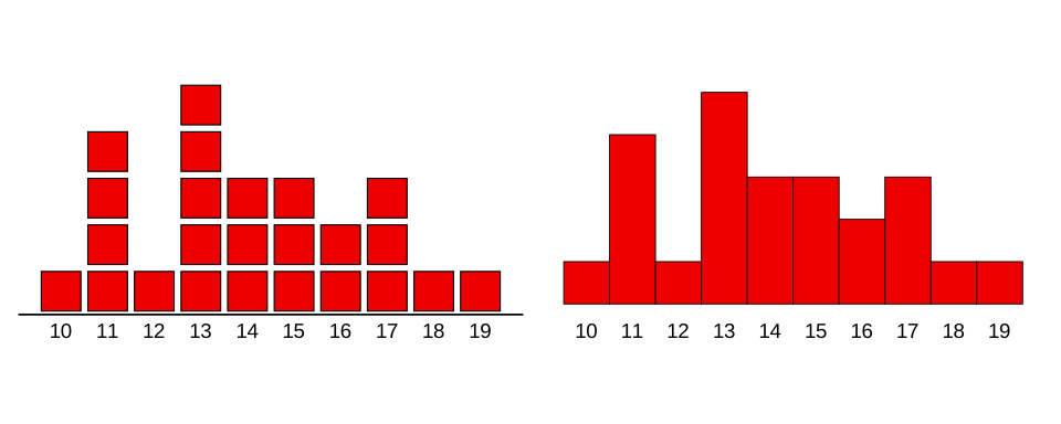
Here are two forms of histogram of those data. On the left, each item in the data is represented by a box stacked on the appropriate pile. Little gaps have been left there between the boxes so that you can see clearly where the boxes are. Such gaps are usually filled in, as is shown directly below and as in the Ford histograms you saw on page 5, at the Ford Motor Company.
Describe this chart
Two histograms of the same 24 values, drawn two ways. On the left, each value is a separate stacked box with small gaps between them; on the right, the gaps are filled in to make a conventional bar histogram. Both peak at value 13 (five occurrences) and tail off toward 10 and 19. The two pictures look identical in shape — but neither shows the order in which the values were generated, which is exactly what the next chart will reveal as the missing crucial information.
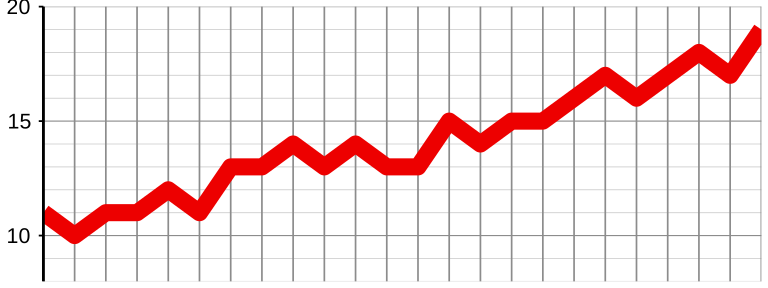
Just to be sure, let’s draw run charts of the data. Here is a run chart for the first process.
Describe this chart
A run chart of the same 24 values from the first process, plotted in time order. The line starts near 11 and climbs steadily to 19 by the final point — a clear upward trend. The histograms above show only that the values lie between 10 and 19; the run chart shows that they were trending upward over time. That trend is the lesson the histogram could not deliver.
ACTIVITY 3–e
Here again are the data from the second process (to save you from having to look back):
18 19 17 17 16 17 16 15 14 15 15 13 14 13 14 13 13 13 11 11 12 11 10 11
Please draw a run chart for this second process.
This is a drawing activity. Please sketch your run chart on paper, then compare and contrast below.
Compare and contrast the learning obtained from the two ways of pictorially representing data illustrated in Activities 3–d and 3–e.
Clearly, the first process was trending upward over time; the second was trending down. Very different behaviours. Yet we found exactly the same histogram in both cases. The two collections of numbers were exactly the same; they just occurred in a different order. But the order of the numbers is all-important for describing and understanding the behaviour of a process—it is foolish to ignore it.
Histograms totally ignore the order in which the numbers come out of a process. Yet that order is very likely to hold the most important information of all about the process’s behaviour.
However, that’s not to imply we should dispense with the histogram altogether. The top priority is to learn whether or not a process is in statistical control. But the histogram can sometimes indicate important features which may be less clear on a control chart. For example, we have already seen how loudly the Ford histograms shout the important message that the automatic compensation device was increasing the variation in the shaft diameters. That could also be seen from control charts, but I’d say the histograms demonstrate the contrast much more obviously and straightforwardly.
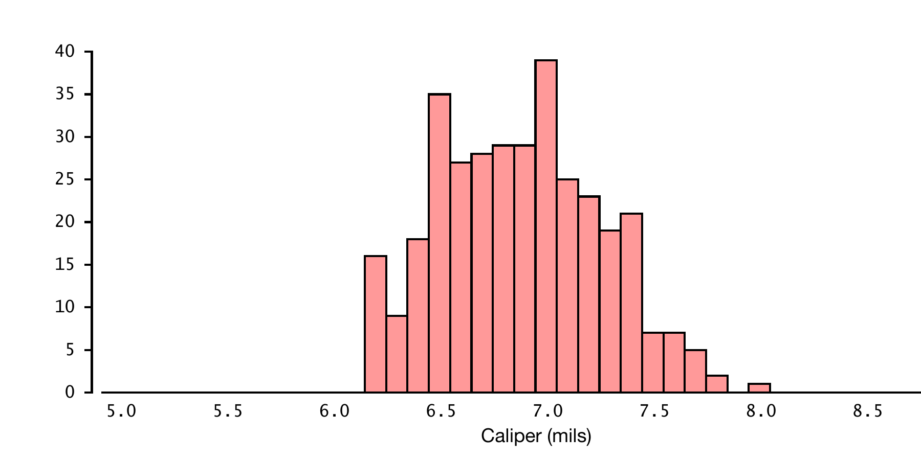
Dr Deming included a few histograms in Out of the Crisis. I particularly like his commentary on the following histogram which I have redrawn from page 229[267] of his book:
Describe this chart
A histogram of measurements taken during production, with a Lower Specification Limit drawn at 6.2 mils and no upper limit. The distribution rises sharply on the left and peaks at the very specification limit of 6.2 mils — an abrupt cut-off that no naturally-varying process would produce. The implication, in Deming’s words: any value that came in below 6.2 was quietly nudged up to 6.2 before being recorded. “No part recorded a failure” because no one wished to be the bearer of bad news.
Observing the rather abrupt cut-off on the left hand side at 6.2 mils (millimetres), he wrote that the histogram …
“… shows a distribution of measured values during production. The lower specification limit was 6.2 mils; no upper limit. No part recorded a failure. Note the peak at 6.2 mils. Were there any failures? No one will ever know. No one wishes to be the bearer of bad news.”
Actually, if you look carefully at the first of the two Ford histograms on page 5, at the Ford Motor Company, I think you will find that it contains not 50 but just 49 “boxes”. Maybe there was one that fell just outside specifications and, well, … vanished.
ACTIVITY 3–d
Here is another sequence of 24 numbers. Please sketch a histogram of these data. I suggest you use separate boxes as on the left above. What do you conclude?
18 19 17 17 16 17 16 15 14 15 15 13 14 13 14 13 13 13 11 11 12 11 10 11
A “similar histogram”? It turned out to be the very same histogram as that obtained with the first set of data! Yet the processes were surely very different from each other. That is to say: the behaviours of the two processes over time were very different from each other.