THE SIX PROCESSES REVISITED
~ 18 min reading · ~ 25 min at Neave’s pace (~ 20 min on Stats-level 0)
On pages 19–23, starting in the Six Processes section above I described and discussed how our study of the six processes can help us diagnose whether a process is or is not in statistical control. But it can do more than that. If it looks as if the process is being affected by special causes then the control chart can often give us useful guidance about when (and thus often where) to look for them.
So let’s conclude this extra-curricular discussion by examining more closely than previously the second halves of the process-data. I’ll reproduce Charts A3–F3 but now with the points numbered along the horizontal axis in order to aid the discussion. I have already told you what was happening with these processes. But now imagine that I hadn’t told you and that therefore you only had the control charts to guide you. What could they have told you? Also, imagine that you are developing the charts in real time after the halfway stage, i.e. after having computed the control limits from the first 24 data. Since at that stage the charts indicate the processes to be in statistical control, it is sensible to extend those control limits into the future and add the next 24 points to the chart one at a time as and when they are obtained.
Describe this chart
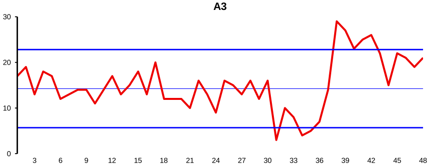
A single 48-point control chart for Process A (totals when dice are thrown). The first 30 points fluctuate quietly inside the limits — stable. Point 31 drops abruptly onto the Lower Control Limit, with the next few points nearby; the process average has fallen. From around Point 37 the points jump high, with several breaching the Upper Control Limit. The chart correctly tells the story: four dice for Points 1–30, two dice for Points 31–36, six dice from Point 37 onward.
Chart A3 is clearly indicating stability up to and including Point 30, but then Point 31 suddenly drops onto the LCL (Lower Control Limit). As recently pointed out, such a point may well occur occasionally even if the process remains stable. However, after seeing the next one or two points again lying near the LCL and also clearly lower than any of the first 30 points, there is little doubt that a special cause has occurred which has lowered the process average. It would thus be sensible to try to identify the special cause which occurred between Points 30 and 31. Subsequently perhaps some remedial action was taken after point 36 which however soon appears to have rather overcompensated for the drop! From there until the end of the chart all but one of the points are above the Central Line, with several points above the UCL (Upper Control Limit). In fact, the first three of these points are all near or above the UCL, and this is already very strong evidence that the process average has suddenly moved higher than it was in the initial stable period.
You will see that this interpretation of the chart accurately reflects what we recall was the truth: four dice were used for Points 1–30, two dice for Points 31–36, and six dice for Points 37–48.
Describe this chart
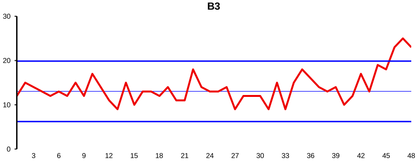
48-point control chart for Process B (number of Heads when coins are tossed). The first ~38 points fluctuate quietly inside the limits. From around Point 39 the points start drifting upward: Point 40 is close to the UCL, Points 41 and 42 confirm it, and from there on the chart traces a steady rising trend rather than an abrupt jump. The truth: two extra coins were added at every toss from Point 39 onward — a gradual special cause, picked up by the chart soon after it began.
Nothing “interesting” seems to be happening in Chart B3 until around Point 40 which is close to the UCL. As in Chart A3, by itself this is only a tiny hint that something untoward may be happening, but that hint immediately gets supported by point 41 (also close to the UCL) and then confirmed by Point 42 (virtually on the UCL). By coincidence, the following two points are both the same as Point 42, but we hardly need them to convince us that the process has moved upward. The remaining points are even higher and so we appear to have a trend rather than just a sudden move (as occurred twice in Chart A3).
That again is an accurate interpretation of what actually happened: two extra coins were added every time from Point 39 onward. This was a relatively steep trend and so was spotted soon after it began. Had the slope been gentler then it would have taken a little longer to become confident that it was happening; however, at that stage one would still be able to trace back to see roughly where the trend began, which would help identification of the special cause that was producing it.
With regard to these illustrations using dice, it may be worth my reproducing a suggestion from EST page 50: “Such ‘games’ [as in these illustrations] are a fast and effective way to gain experience of constructing and interpreting [control] charts. Work with a colleague. One of you generates the data, now and again unobtrusively changing the process. The other records the data and draws and interprets the charts. You could also try not bothering with the [control] limits, and see how you get on!”
Describe this chart
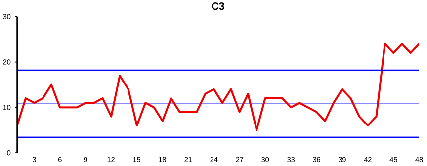
48-point control chart for Process C (numbers of red beads from the Red Beads Experiment). Points 1–42 fluctuate inside the limits in the familiar Red Beads pattern. From around Point 44 the values jump sharply upward, with the final five points well above the UCL. The contrived special cause was that the recorder added the two junior inspectors’ counts together (rather than plotting their agreed value) for the last six points — so it is the measurement process, not the bead-pulling process, that has gone out of control. By coincidence the first doubled count was small enough (4 → 8) to still fit inside the limits, so Point 43 hides what’s coming.
There is little to discuss with the Red Beads illustration: you will recall that I contrived to double the recorded values for the last six points. In fact, it looks as if I only doubled the values for the final five points; however, the first actual count of red beads when I started doing this happened to be only 4, so Point 43 is at 8—thus appearing to be just before the special cause occurred. You can’t expect the chart to be absolutely right all of the time!
Describe this chart
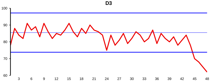
48-point control chart for Process D (Neave’s morning pulse rate over 48 consecutive days). The first 44 points fluctuate inside the limits at an unhealthily high level. At Point 45 the line drops sharply (87, then 77, then 66) and settles to a new, stable, much lower level for the rest of the chart — the special cause was a beta-blocker prescribed on day 44. This is a good special cause: the question for the chart’s user is not how to remove it but how to recognise it as the new normal and recompute the limits around the improved system.
The control chart of my morning pulse rates shows stability up to Point 44. That was the day when my doctor prescribed the beta-blocker and I took the first tablet straightaway. My pulse rates on Days 44, 45 and 46 were respectively 87, 77 and 66 (you can’t really see the 77 on the chart as it’s in the middle of an almost straight line). As you might guess just from the final three points on the chart, the pulse rate then settled down to stability at a much more healthy level! Obviously there is no doubt here as to what the special cause was, but I confess I was both amazed and delighted by how fast and how effectively it worked!
This raises a rather obvious question which fortunately also has a rather obvious answer. Regarding the control chart, what do we do now? This was a good special cause. It has not harmed the behaviour of the process as do most special causes: it has improved it. So, of course, we do not try to remove a good special cause: we retain it and, if possible, incorporate it into the system (of course, easy enough in this particular case). But since it has changed the system, clearly the current control limits are now redundant. Thus, after a few more data have been recorded, the obvious thing to do is recompute the control limits using data from the changed system and, presuming the changed system is seen to be in statistical control, to extend those new limits into the future.
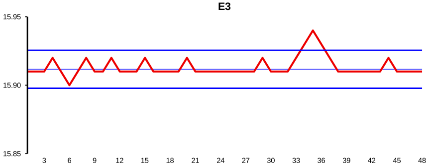
Describe this chart
48-point control chart for Process E (daily averages of cigarette-lighter-socket measurements at the Tokai Rika plant). Points 1–35 fluctuate inside the limits, centred near the 15.90 mm target. Point 36 spikes upward — the highest point on the chart (Friday 26 September 1980, traced to a worn positioning collar that was turned over the next day and replaced two days later). From Point 37 onward the line returns to target and the variation visibly tightens — Tokai Rika acted not because the values had breached specifications (they hadn’t) but because they wanted to operate on the target.
The data in Chart E3 are taken from an ancient but fascinating case study which Don Wheeler relates in a chapter on “Using Process Behaviour Charts for Continual Improvement” in his book with David Chambers: Understanding Statistical Process Controlb. This is how Don introduces the story:
“The … chart was brought to this country by a group of executives from the Body and Assembly Division of Ford Motor Company, following a visit to the Tokai Rika Company in March, 1982. As the Ford group was touring the Tokai Rika plant, they observed eight production workers ‘engaged in active discussion’ around this … Chart. To the people from Ford, it seemed that something must be wrong with the process represented by the chart, so they asked about it. They expected there to be an internal production problem, or an assembly plant problem, or a problem of too many rejects. However, they were told that this was simply a routine review of an ongoing process and, in fact, the process was currently operating predictably and was well within the specifications. To substantiate this, their hosts translated the chart, and presented a copy to the Ford group …”
The control chart (all hand-drawn and several feet long!) covered the period from August 1980 to March 1982. The points in Chart E3 are the daily averages of four measurements of the distance between the flange and the detent in manufactured cigarette lighter sockets. The nominal value of this distance was 15.90 mm with specification limits 15.80 mm and 16.00 mm. (So take a look at the vertical scale on Chart E3—doing well, weren’t they?!)
The high point in Chart E3 (Point 36) was for Friday 26 September 1980, and Points 37–41 were for the following week: Monday 29 September to Friday 3 October. Using the notes in the translation, Don writes:
” … ‘abrasion on the positioning collar’ is identified as the Assignable [Special] Cause for the process excursion noted in late September, 1980 … in addition to writing down the Assignable Cause on the chart they also took action—the very next day the process average shifted back to the target of 15.90 mm. Again, a note on the chart tells what was done.
As a temporary solution, a worker turned the worn collar over to use the back side. Two days later a new collar was installed. This incident displays a desire on the part of the Tokai Rika personnel to operate at the target. The process was in no danger of producing nonconforming product, yet they took the trouble to fix it so that it would stay centred on the target value of 15.90 mm. Moreover, just as the shift on September 29 shows the desire of the workers to operate at the target value, the replacement of the collar on October 1 shows the support of the management for this policy.”
It will probably not have escaped your notice that, as soon as action was taken to prevent further deterioration due to the worn collar, the variability of the data became considerably less than it was in the first half of the chart. The reason for this was not noted on the chart. Maybe the new collar was of an improved design or made of better material. Maybe the old collar had already been causing some deterioration earlier on but not enough to produce out-of-control signals on the control chart. Whatever was the case, the Tokai Rika personnel did the obvious thing. Yes, they recognised the existence of the changed system by recomputing the control limits and extending those limits into the future. Notice how wholly irrelevant any consideration of “conformance to specifications” was to how they behaved. This account about the Tokai Rika chart is considerably expanded upon in Part B of the Optional Extras.
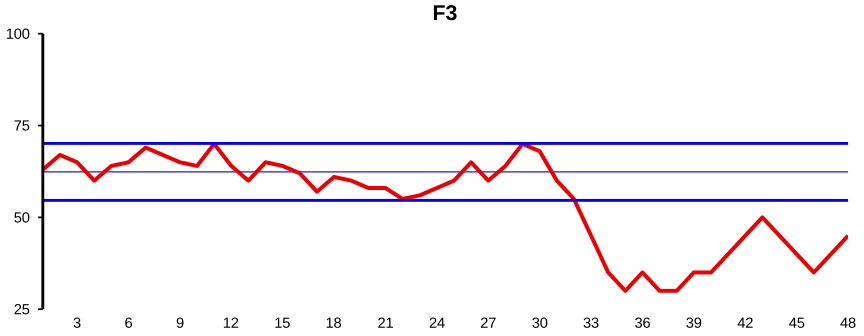
Describe this chart
48-point control chart for Process F (monthly US trade deficits, in billions of dollars, for 2006–2009). The first 31 points fluctuate inside the limits with a faint hint of a seasonal up-and-down rhythm — higher in summer, lower in winter. From around Point 32 the line trends sharply downward; Point 35 (November 2008) drops below the LCL, and the points stay below the LCL for the rest of the chart. That is the global financial crisis: domestic demand collapsed, imports fell faster than exports, and the deficit shrank well past anything the previous two stable years would have predicted.
Finally, recall that the data in Chart F3 show the monthly US trade deficits for the years 2006–2009. The striking feature is the considerable downward trend following the peak value at Point 31, particularly the drop to below the LCL at Point 35, and then the continuing sequence of points below the LCL until the end of the chart. But what was Point 35? It was November 2008, the first full month after the seriousness of the global financial crisis became clearly evident. Naturally, this caused internal demand to plummet, thus considerably reducing imports. Export figures also fell, but not to the same extent since several of America’s overseas markets were less seriously affected by the crisis.
Let’s return to the interesting feature observed on page 28, in the Control Chart + Brain section above that, rather than being properly in statistical control, there was some indication of a seasonal effect during the first two years. Examining the detailed figures over several years, this effect is seen to be real and primarily comes from rather higher and lower import figures in the summer and winter respectively. One could therefore consider switching to using “deseasonalised” figures. However, this seasonal effect is not particularly large and is relatively easy to interpret, so there is little harm in continuing to use the raw data. In fact, this is also consistent with something that Shewhart taught. He was keen, whenever possible, to use understandable raw data rather than data which have been through some mathematical manipulations that might make them “tidier” in some way but less easy to see what they actually represent.
As mentioned on page 21, in the Six Processes section above, the Springboard article shows the earlier version of Charts F1–F3. It is interesting to compare the two versions. For example, the earlier version of Chart F1 hardly hints at the seasonal effect indicated in the later version. As another example, the two versions of Chart F2 look remarkably similar, both showing the considerable decline at the crisis time followed by the partial recovery. But in the earlier case the recovery is shown to be moving back into at least the lower reaches of the pre-crisis system whereas, in this later version, the values are beginning to settle down into a region distinctly lower than the previous Lower Control Limit—verifying the greater seriousness of the 2008 crisis compared with the relatively minor recession in 1990.
Lastly, although we have been using Charts A3–F3 in this discussion, do not forget the importance of Charts A2–F2. These showed control limits which had been computed from the out-of-control data in those charts, so that the limits suffered some “contamination” compared with the limits used in Charts A3–F3. But recall that, as pointed out on page 22, in the Six Processes section above, despite that contamination, pretty much the same conclusions would have been reached with Charts A2–F2 (and at the same times) although the signals are usually not quite as strong. It is well worth re-emphasising the incredibly valuable feature that control charts can often do a great job even if their limits are computed when the process is out of statistical control.
As you can see, all we have left on this page is a couple of Technical Aids. So if you are on Stats-level 0 then please move straight on to page 35, in the Introduction to the Funnel Experiment section below.
Technical Aid 10
In the way that I set up Charts A3–F3, the control limits had been computed while the processes were in reasonable statistical control: thus it made sense to extend those control limits into the future. But suppose that had not been the case. Consider, for example, my control chart on page 18, in the How Do We Compute Those Control Limits section above. Suppose I had just reached the halfway point where I had available the first 12 data-values and had just computed the control limits and drawn the control chart over those 12 points. Now, although none of those 12 points were outside the limits, the indication of a trend was already very strong. So what would I have done?
I might already be so convinced of the trend that I would start searching for its special cause straightaway. Or I might have waited until I had seen two or three further points for confirmation. The fact is that when there is immediate evidence (i.e. as soon as the control limits have been obtained) of the process being out of statistical control then there is, of course, no sense in extending those control limits into the future. The process is not predictable—so there is no sense indicating on the chart what the prediction would have been if the process had been predictable!
Thus (presuming the process is one over which you have some influence) your need is to try to identify and deal with the special cause(s) of whose presence you have now been made aware. After you have taken appropriate action to try to stabilise the process, then (as in the Tokai Rika case study, Process E) you would resume recording data and, in due course, recompute the control limits. You are thus “back to Square 1”: extending those control limits into the future if the process is now in statistical control or else resuming your search for special causes if it isn’t.
Notice that if, as in the Tokai Rika case study, the action you have taken has not only removed the special cause but has also reduced the common-cause variation, it is quite possible that further special causes may become visible on the chart. The narrower control limits may now reveal special causes that were already there but had been camouflaged by the previous greater amount of common-cause variation.
Technical Aid 11
Finally, here are four “tidying-up” points.
Besides the Red Beads Experiment (Process C), Process B (counting the number of Heads when 25 coins were tossed) also fits the “batch inspection” conditions (see page 13, in the How Do We Compute Those Control Limits section above). So the method used for computing the control limits for Process B was the same as for the Red Beads Experiment except with \(n\) = 25 instead of 50. The moving-range method was used for the other four processes.
The control limits for all six processes were computed from 24 data. As mentioned earlier, this number was chosen simply because that was what we were used to using for the Red Beads Experiment. However, remember that for “live” charts a shorter baseline is recommended (Technical Aid 8 on page 17, in the How Do We Compute Those Control Limits section above).
If you refer to Dr Wheeler’s own account of the Tokai Rika case study, you may notice that the control limits used in Charts E1 and E3 are different from the original. This is because the control limits used here were computed from the first 24 data-points on the Tokai Rika chart given to the Ford personnel. It is unclear from the account when Tokai Rika’s control limits were computed, but it was probably before the beginning of the chart as we have it.
There is a further illustration of the moving-range method on page 9 of the file “Q. Contributions from Balaji Reddie”.