Appendix R — OPTIONAL EXTRAS
~ 21 min reading
(BY REQUEST OF BALAJI REDDIE …)
Introduction
This article that Balaji Reddie has been very keen for me to show you (see his “Contributions” page 33, in the Summary to “Some Lessons from History”) was the seventh in a series of eight short articles that I drafted around 20 years ago. My title for the series was SPC—Back to the Future. I did not submit them for publication to any of the main journals but was content to simply distribute them to members of the British Deming Association. My aim was to help a keen but general audience to develop understanding and confident use of control charts; that audience, of course, included many who had no previous background in Statistics. It will not surprise you therefore to know that there is quite a lot of overlap between the content of some of those articles and parts of the “Optional Extras” section in 12 Days to Deming including, of course, Part D: the “crash-course in conventional Statistics!”.
Part E of the Optional Extras: “Is There Anything Normal about Control Charts?” is effectively a rewrite of the sixth of those short articles. The article was titled Two Superstitions; quite simply, those superstitions, both of which were involved with control charts, just do not relate to the “real world”. The seventh of the short articles was titled More Superstitions. These further superstitions were related not to control charts but, as Balaji has already told you, to the concept of “six-sigma” quality.
So the original readers, like Balaji, of the seventh article were already familiar with the previous six articles—whereas you, of course, are not. Alternatively, had you reached this Appendix section after already reading Parts D and E of the Optional Extras then again you would have covered the relevant material from those earlier articles. However, since instead you might have arrived here as a result of what Balaji wrote in his “Lessons from History”, you may not have that background. In particular, you may know nothing about the conventional statisticians’ favourite toy, the normal distribution, with which they can endlessly entertain themselves. In fact (as you might perhaps guess from the title of Part E as stated above), inappropriate use of the normal distribution is actually the prime source of all these various superstitions. If at some time you decide you’d like to learn something about the normal distribution then Part D of the Optional Extras, the “crash-course in conventional Statistics!”, is ready and waiting for you; there is also more about it in Part F. But, for now, you’ll just have to accept what I tell you about it!
A useful start is a sentence from Day 7 page 26: “If you are uncomfortable with the use of the concept of ‘distribution’ … , you can simply think in terms of a histogram having roughly the shape illustrated”. And alongside is a typical “shape illustrated” in the case of the normal distribution; for obvious reasons, it is often described as a “bell-shaped curve”. As you can imagine even from your brief work on histograms on Day 3, it’s not at all unusual for a histogram formed from some process-data to have a shape roughly approximating the shape of a normal distribution.
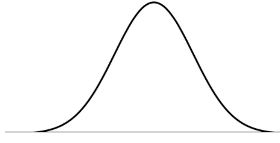
So it is not surprising that conventional statisticians often use the normal distribution in their mathematical derivations with the hope that their results will have some relevance to real data.
But beware! If you read Part E of the Optional Extras you will find me referring on page 60 to the famous British statistician, the late Professor George Box, saying: “All models are wrong—but some are useful”. One very clear reason why the normal distribution model is wrong regarding real-world process-data is that absolutely any number, never mind how large (positive or negative) it is, may appear in the data. Now, at least as far as I’m concerned, I can’t imagine any real-world process for which that’s true! Referring to my diagram of the normal distribution, the implication is that that bell-shaped curve never quite gets right down to the horizontal line (usually called the horizontal axis)—although, of course, you could never use a scale large enough to show that on a diagram. The likelihood of numbers occurring far out in the “tails” of the distribution is naturally very tiny, but—in the normal distribution—that likelihood is never zero, i.e. enormous values are always possible. Why am I telling you all this? Because it is this very matter which lies at the heart of both the first superstition tackled in Part E of the Optional Extras and also that claim of “3.4 parts per million” which so puzzled Balaji regarding “six-sigma” quality.
Nevertheless, the normal distribution has such appealing mathematical properties for the conventional statistician that I need to tell you a little more about it so that you’ll be able to see where those impressive claims come from. For they do depend on the unrealistic assumption that one is dealing with processes that produce normally-distributed data.
Actually, it’s a little misleading to talk of “the” normal distribution: there’s a whole family of normal distributions. In particular, the “bell-shape” can be either narrower or wider than I’ve illustrated; also, of course, it needs to be centred on the process-average. The width of the bell-shape depends on the distribution’s standard deviation (you’ve seen this mentioned several times) which is traditionally denoted by the Greek letter σ (sigma)—and yes, there is some distant connection with the σ with which you’re familiar from your work on control charts. The centre of the normal distribution is also traditionally denoted by a Greek letter: that letter is μ (which is pronounced like a cat’s “mew”). If you’re interested in seeing the content of this paragraph in pictorial form then take a look at page 47 of the Optional Extras.
Finally in this preamble to my revision of the seventh SPC—Back to the Future article, “six-sigma” quality is involved with judging quality in terms of conformance to specifications. This is a topic which is first seen early on Day 3 in 12 Days to Deming but is subsequently studied more fully on Day 7. Also, this current article ends with a brief but very useful mathematical footnote involving another topic which arises on Day 7. However, in this attempt to revise the article so as to become appropriate to a more general readership than originally, I shall not assume you have yet reached Day 7.
“SIX-SIGMA” SUPERSTITIONS
I was delighted when, several years ago, I first heard the phrase “six-sigma quality”, made famous through the quality programme bearing that name at Motorola, the American electronics company. I interpreted “six-sigma quality” as implying that, rather than being content to merely meet specifications, the aim was to make the natural variability in a process cover only half of the specification range [see the chart at the top of the next page]—which I presumed implied the middle half. That’s not the Deming ideal of “continual improvement”, but it seemed a fine step in that direction.
Sadly, my enthusiasm was short-lived. First, I soon came across some advisors who were extolling the virtue of “six-sigma” quality as being the greater freedom to let the process “wander” rather than trying to keep it properly centred. And then I started hearing the remarkable—and unbelievable—claim about “3.4 parts per million” … .
“Six-Sigma” Quality
At the time of first hearing of “six-sigma” quality, one of my frequent battles had been (and continued to be) that of getting people to think seriously of improving quality well beyond what is regarded as officially necessary. The notion that quality is just about satisfying requirements, meeting standards, achieving targets—i.e. conforming to specifications by any variety of names—is in fact a severe obstacle to genuine quality improvement, so much so that it is included in Dr Deming’s collection of “Obstacles to the Transformation” which you will examine in Day 7’s Major Activity.
We’ll restrict attention for now to situations where specifications are provided, e.g. by the customer (internal or external)—or by the boss! That is, there is a zone outside which the value of whatever we’re recording is supposed never to fall. The edges of that zone are the Lower and Upper Specification Limits. The usual situation is that there is an “ideal” or “perfect” value of the measurement which lies in the middle of the zone and the Specification Limits show how far from the ideal the measurement is allowed to stray before being deemed unacceptable—that distance is sometimes referred to as the “tolerance”.
Stated concisely, “six-sigma” quality is achieved when that tolerance reaches or exceeds 6σ. But that is likely to be easier said than done! Note that, in theory and when assuming data come from a normal distribution, etc, the value of σ might be presumed “known”. In practice it will need to be computed from data in the same or a similar way to that used when constructing a control chart. But, rather than bothering just now about that kind of fine detail, let’s see pictorially what sort of situation is implied by “six-sigma”.
First, here is a situation which is definitely not of “six-sigma” quality:
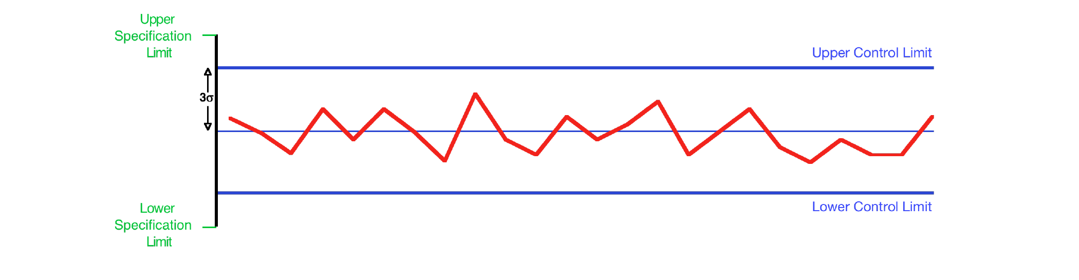
The process appears to be in statistical control, but the distance from the Central Line to the Specification Limits is only around 4.5σ rather than the desired 6σ. So what can be done? It is unlikely that whoever has set the specifications will be kind enough to relax them, i.e. move them further out, in view of the fact that our process is not good enough to satisfy their “six-sigma” criterion! So it’s σ that has to change, i.e. we have to improve the process so that, in due course, we’ll get a chart which looks more like this:
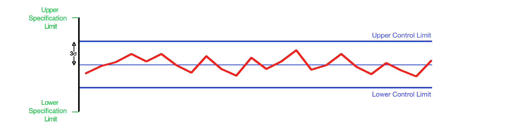
Spot the difference! Yes, we have now improved the process, i.e. reduced σ, sufficiently enough for the distance between the Central Line and either Specification Limit to now be about 6σ. (Note that the Specification Limits are where they were before.) Of course, this will not have been achieved overnight!
So I’m all in favour of “six-sigma” quality—or preferably even better than that! Certainly, for those who are still thinking and acting in terms of mere conformance to specifications (which certainly looks as if it was already being achieved in the first scenario at the bottom of the previous page), “six-sigma” quality is a major advance! But my initial excitement was soon tempered, for two reasons:
First, just a few weeks after initially hearing about “six-sigma”, I read papers in two journals (which I shall not reference because I don’t want you to read them!), both of which advertised the big advantage of “six-sigma” quality to be that you no longer have to bother about keeping the process centred. (I’ll return to that later.) And second, I discovered people making claims that, with “six-sigma” quality, the proportion of items falling outside the specifications was reduced to that mere 3.4 parts per million—yes, exactly as Balaji was told. Wow, such precision!
Superstition no. 3: 3.4 parts per million
Whenever I hear a statement like that, I know we’re back in the mathematical world, no longer in the real world. And so it proved.
In my introduction, I’ve already told you one of the extraordinary things about the normal distribution: i.e. that, although the curve gives the visual impression that it has disappeared from sight by the time we reach the edges of a diagram such as that on page 43, in the mathematical world that curve never quite gets down to the horizontal axis. There is little need to tell you that that could hardly be true in our real world. However, as “3.4 parts per million” comes from the mathematical world, we’d better stay there for a little while longer to see where in the (mathematical) world the 3.4 parts per million comes from. Then we’ll explore a little further … .
I’ll ask you to look one more time at the Optional Extras, this time on page 49. Here we have the same pictures as you saw two pages earlier (page 47) but now with those pictures divided into sections, each being of width σ and with percentages stated of the total area under the curve in each section. Rather similar to the way that the area under a section of a histogram corresponds to the proportion of the data that lie in that section, the percentages printed on page 49 of the Optional Extras indicate the probabilities that an observed value from the normal distribution lies in each of the different sections. Notice that those probabilities are exactly the same in each diagram, never mind how narrow or wide the bell-shape happens to be. This is actually an almost unique property of the normal distribution, and is one of the reasons that Mathematical Statisticians are so fond of it.
Note in the diagrams that the area in either tail of the normal distribution beyond 3σ from the mean μ is 0.135%. (This is what led to the existence of the first superstition dealt with in the sixth article and similarly in Part E of the Optional Extras.) Since (in the mathematical world) the normal curve never gets down to the axis, there will always be some area in a tail, never mind how far out that tail starts. Since we couldn’t hope to indicate any further such detail in pictures, the following table shows a variety of such “tail areas”, i.e. probabilities.
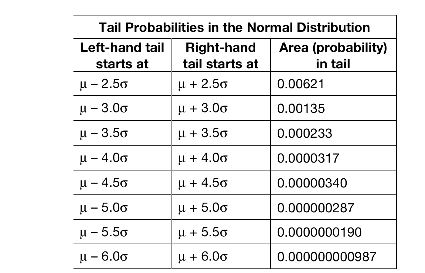
Can you see it? Do you see the “3.4 parts per million”? It’s the 0.00000340 for a tail area starting at 4.5σ from μ. Why there? That’s a very good question.
Now, if a process having “six-sigma” quality is properly centred, the relevant figure from the table is the final one, the 0.000000000987—except that there are two such tails, thus giving a total probability of 0.000000001974. That’s 1.974 parts per billion outside specifications. Perhaps that’s too embarrassing a figure to claim even in the mathematical world!
So instead, the mathematical “six-sigma” enthusiasts let the process mean (and thus the whole normal distribution) wander from its ideal central position. By how much? By 1.5σ. Why 1.5σ? I don’t know—ask them. I’m just reporting where the “3.4 parts per million” comes from. If the mean wanders that far, it is now 4.5σ from the nearer Specification Limit and 7.5σ from the further one. The chance of reaching the further Specification Limit is obviously really negligible (OK: if you insist, it’s 0.0000000000000319 which amounts to 31.9 errors in a quadrillion!), and so the total probability of falling outside specifications is then, to three significant figures, still the 0.00000340, i.e. the 3.4 parts per million.
The truth of all this (if “truth” can mean anything in the midst of such fantasy) depends, of course, on the process obeying the normal curve—right out into those far tails! How could you ever know? You’d never be able to even see it out there! You can compare a histogram of some data with the normal curve to see if it roughly fits in the region where you can see it (say, out to somewhere like 2.5σ or, being ambitious, 3σ from the mean), but no further. Does it matter? Does confirming that the process data might fit a normal curve in the region in which you can see it imply you may then assume the process follows the normal curve where you can’t see it?
An Alternative “Truth”
My great friend Don Wheeler (from whom I’ve learned so much over the years) told me about a family of probability distributions that was studied by Irving W Burr. Some of them look remarkably like normal distributions (where you can see them). One such is shown below, with a normal distribution drawn in for comparison. Don has kindly allowed me to reproduce this figure from page 196 of his Advanced Topics in Statistical Process Control. (He chose there to illustrate the “standardised” versions of the distributions, i.e. those having μ = 0 and σ = 1, which explains the numbers on his horizontal axis.)
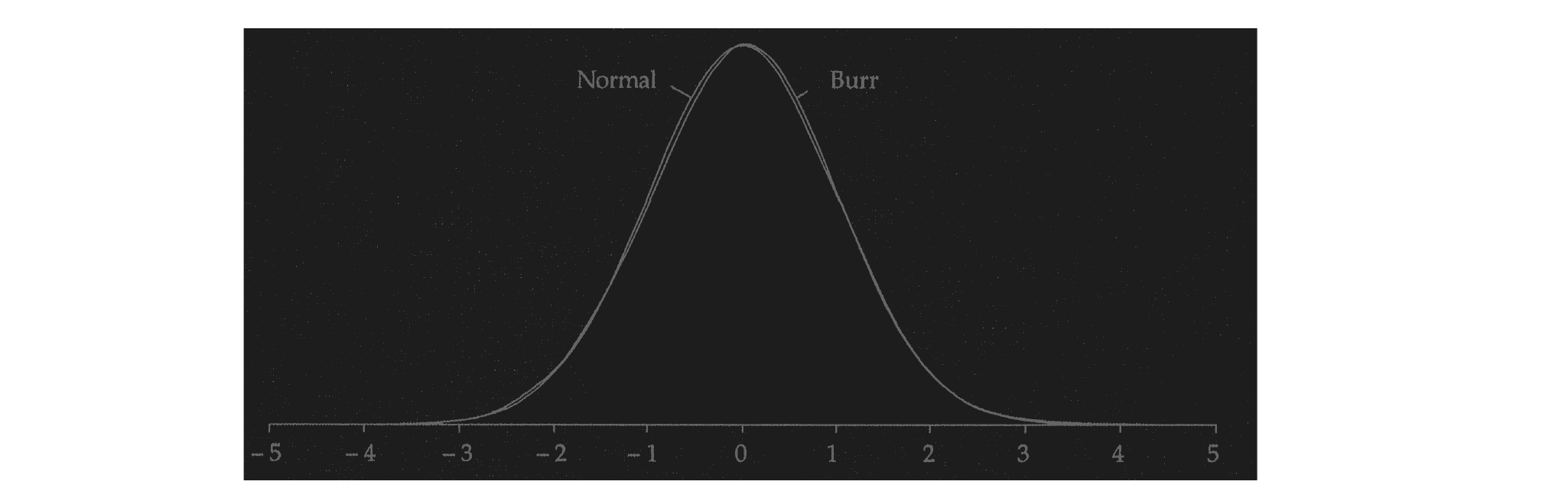
But what happens out in the tails—tails starting at 4.5σ or 6σ away from the mean, for example?
I’ll just quote a few figures. First, suppose we have a “six-sigma” process properly centred. Recall that the normal distribution tells us that then there are 1.974 parts per billion outside specifications. We can carry out similar calculations with the illustrated Burr distribution (which, remember, looks virtually the same). What do we get? Well, actually, 312 parts per billion—over 150 times as many!
Let’s try something else. What about if we let the process mean slide out by 1.5σ (where the normal distribution produces the famous “3.4 parts per million”)? What do the Burr calculations give? It actually now matters which way the mean slides, for that Burr distribution isn’t symmetric. (Had you spotted that?!) If it slides to the right, we get 22.2 parts per million—about seven times more than with the normal distribution. But, if it slides to the left, we instead get 6 parts per billion—about 500 times less.
And this is all from two distributions which look virtually the same where we can see them and which, in practice, we could never tell apart. And we haven’t even mentioned here the additional problems caused by the inconvenience of not knowing the “true” values of μ and σ! Such numbers as I have just quoted have no relevance in the real world, be they computed from the normal distribution, the Burr distribution, or anything else. Don refers to the use of any such numbers as “computations winning out over common sense”—and he tells you much more about the Burr distribution in his Advanced Topics book if you are really interested!
I’ll say something much simpler (for the real world, not the mathematical world):
If you have a “six-sigma” quality process, pretty much properly centred and in statistical control, you’ll never get anything outside specifications.
(But that’s still not good enough … .)
Superstitions
Damaging superstitions. There are more. For example, to even mention “3.4 parts per million” (even if it were true) is evidence of another very serious superstition: that quality can sensibly be measured in terms of conformance to specifications. A few words later about that. Before then, some reminders of why, in those two articles, I focused on the three superstitions that hopefully have now all been laid to rest.
Regarding the two that are tackled in Part E of the Optional Extras section, there is a message to all of you who have been worrying about normality in connection with control charts: you can stop worrying!
Attempting to judge quality as conformance to specifications has one advantage for those doing the judging: it’s easy! Set a specification (i.e. choose one or two numbers) and then reward or punish depending on whether or not specifications are met. (For “specification” read “requirement” or “target” or “standard” or “tolerance”, etc. as desired.)
The Government judges by conformance to specifications. Think of the various Charters, league tables, etc, etc, … . A train meets the specification if it is no more than either five or ten minutes late (according to the kind of journey). A school has met the specification for training (educating?) a child for an examination if the child obtains a Grade C. The National Health Service meets the specification if a patient waits no longer than 18 weeks for an operation. So to wait 127 days is bad but 125 days is good? Or for a train to be 10 minutes 5 seconds late is bad but 9 minutes 55 seconds late is good? And there might be only one mark difference between a Grade C and a Grade D.
Tightening the specifications doesn’t solve the problem. Perhaps being punctual now means no more than one minute late. So 59 seconds late is good but 61 seconds late is bad? It makes no sense.
Wise Words from Dr Don Wheeler
During Day 3 you were introduced to the ancient but valuable study by Don Wheeler of “A Japanese Control Chart”: it is examined in some detail in Part B of the Optional Extras. There is a yet more detailed account in Chapter 7 of Understanding Statistical Process Control by Don Wheeler and David Chambers, published by SPC Press. Long ago, SPC Press also issued a video: A Japanese Control Chart of Don describing the chart throughout the period August 1980 to March 1982. I would always show this video in my seminars on Understanding Variation. One of Don’s concluding remarks on the video was the following:
“The total conformance to specifications is no longer enough. Remember that specifications are a compromise created when we could do no better. Now that we can do better, those who are content to live with the compromises of the past will only become increasingly noncompetitive.”
A Better Way
“A better description of the world is the Taguchi loss function” said Deming on Out of the Crisis page 120 [141]. What’s that when it’s at home?! Basically it’s the rather reasonable hypothesis that the best is ideal and that, the further away from the ideal you get, the worse off you are and, in fact, the more rapidly things get worse. This is covered during Day 7, particularly in Activity 7–e (where you’ll be guided on how to discover the Taguchi loss function for yourself) and Pause for Thought 7–f (see Day 7 pages 20–23). This “better description of the world” was described by Genichi Taguchi at a famous meeting in Tokyo in 1960 at which Dr Deming was present.
So Deming’s statement is guidance for us to focus instead on what would be best, and work steadily to get closer and closer to it. It’s called “continual improvement”. “Create constancy of purpose for continual improvement” was the first of Deming’s 14 Points (Day 4 page 16). Subsequently he referred to “lack of constancy of purpose” as “the crippling disease” (Day 5 page 18).
A (useful) Mathematical Footnote
Actually, if you want to measure “quality”, a little mathematics shows that Taguchi’s study of “loss” leads to a very neat criterion. (For those who are interested, the “little mathematics” needed is very similar to the “useful trick” used on Optional Extras page 81.) That criterion expresses the Average Taguchi Loss as simply being proportional to
\[\sigma^{2} + (\text{non-centredness})^{2} .\]
If you have a control chart then you can immediately compute a value for this expression. You will (directly or indirectly) have used a value of σ to find the control limits, and “non-centredness” is the distance between the Central Line and the “ideal”. So a good way of regarding improvement is that of keeping the process in statistical control and properly centred while reducing the Average Taguchi Loss.
If you are mathematically inclined, you might like to use the above criterion to verify the following alarming argument. Let’s consider starting with the process which gives rise to the chart near the bottom of page 45. It appears to be something like “4.5-sigma” quality, by which I mean that the distance from the Central Line to either Specification Limit is about 4.5σ. We set about improving the process in order to sufficiently reduce σ in order to achieve “six-sigma” quality, i.e. so that the distance from the Central Line to either Specification Limit is 6σ. This brings us to the chart near the top of page 46. Without doubt, to improve the process by that amount would be likely to involve a considerable amount of hard work. I was presuming there that, in both cases, the process was properly centred. However, now imagine letting the process mean wander out to that “3.4 parts per million” point. Would you believe: the Average Taguchi Loss for that non-centred “six-sigma” process is now considerably greater than it was for the correctly-centred “4.5-sigma” process at the bottom of page 45!
Then recall the simple example on Day 3 page 1. I observed that changing the average of my process there would be very easy. And, in my experience, it is indeed very often the case that changing a process average is a lot easier than reducing its σ. After all (also from near the start of Day 3), Ford’s automatic compensation device was doing it after each item of data was recorded (I am, of course, not recommending that!). So not only are we supposed to believe claims from the “six-sigma” enthusiasts such as that 3.4 parts per million, we are now supposed to believe that a great advantage of “six-sigma” quality is that we are free to let the process mean wander around rather than keeping the process properly centred. What a waste that would be of all the hard work to reduce σ!
I have but a single word for it: absurd.
(Return to Contributions from Balaji Reddie page 33.)
Approvals, Acknowledgments and Information
a (page 10) This quotation from the Deming A5 Booklet W2 (formally BDA Booklet W2) has been reproduced with the approval of the Deming Transformation Forum.