CONTROL CHART + BRAIN
~ 15 min reading
It is now time to revisit the “simplest guidance” that Dr Deming gave on how to interpret control charts (near the bottom of Day 2 page 15):
“… if all the points lie between the two control limits then he would judge the process to be in statistical control (stable). Otherwise the indication is that the process may well be out of statistical control, and so then it could be worthwhile to try to identify special causes …”
I also implied that, in practice, it can sometimes be wise not to simply stick to Dr Deming’s basic guidance. After all, he didn’t!
The control chart in the “favourite example” covered in the previous section had no points anywhere near the control limits, let alone outside them. Yet, for very good reasons, Dr Deming soon realised that something was wrong. These data were not behaving as they would be expected to behave if the process were genuinely in statistical control. Here the points were much too far inside the control limits. Remember that the control limits realistically indicate the approximate range of the data to be expected when all is well. If all had been well then the control limits would have been much closer together so that, for example, the control chart would have looked more like the charts A1–F1 on page 19. As that was clearly not the case then he knew there was something for him to discover.
This kind of thinking immediately takes us far away from the idea of interpreting control charts by simply and mindlessly following the strict rules of that “basic guidance”. Rather than acting as if we were “mindless”, let’s use our brains. Rather than simply expecting the control chart to tell us all the answers, let’s intelligently combine its guidance with our own judgment and experience. Indeed, that is precisely what Shewhart did when inventing the control chart in 1924! If you read the “Discussion on the First Paradox” in the Appendix, do you remember how he began the sentence which contained his famous recommendation for positioning the control limits (at the top of Appendix page 5)? The sentence began with: “Experience indicates …” [my italics].
Using our own judgment and experience along with appropriate guidance is surely what we do with anything important in life. So that is what we need to do when interpreting control charts. It may not be the mathematician’s way. But it is the practical way.
Before going any further in that direction, let’s focus on a few specific reasons why it makes sense to have some flexibility when interpreting control charts as opposed to “mindlessly” just obeying rigid rules.
1. Just below / Just above
You may recall that the Ford histograms on page 5, at the Ford Motor Company showed the positions of Lower and Upper Specification Limits. Deming’s disapproval of judging quality merely in terms of conformance to specifications is shown by its inclusion in his list of numerous “Obstacles” (see DemDim page 54). This particular Obstacle will be considered in detail on Day 7. But the nub of his argument is this: two things, one of which is just below a specification limit while the other is just above it are, in practice, virtually the same as each other. So what is the logic of saying you must accept one and reject the other? A similar argument most surely applies to points on a control chart. A point which is, say, just above the Upper Control Limit and another which is just below that Upper Control Limit represent measurements which are almost equal to each other. So what is the logic in dogmatically deciding to search for a special cause in the one case but not in the other?
2. Control limits are (almost) never the same again
Further weight to the above argument comes from the fact that, even if a process remains blissfully in statistical control, control limits computed from two different sets of data from that stable process are almost bound to be different from each other. Data vary: thus so will control limits. So if other control limits are computed from different data from that same stable process, the strong likelihood is that the particular two points considered in the previous paragraph will now either be both below the new UCL or both above it—making it even more illogical to act completely differently depending on which of the two you have.
Technical Aid 9
An important practical point which arises here is that, especially when computing control limits using relatively few data-points (a short baseline), you may occasionally be unlucky with the particular data that you finish up with. Even if the process remains beautifully in statistical control, those data may be untypically close together or untypically far apart, with the obvious consequences on the moving ranges and hence on the distance between the control limits. In such circumstances you will hopefully soon become rather uneasy about those limits: before long you will begin to feel that subsequent points are either rather more volatile than you expected or alternatively show the “Hugging the Central Line” effect. Don’t then be afraid to recompute the limits from a larger or different set of data—it’s not “cheating”: it’s good sense! This kind of situation is not a frequent occurrence—but it does happen. This isn’t an exact science.
3. Strength of signals
We have already indirectly touched on the matter of “signal-strengths” when comparing Charts A2–F2 with Charts A3–F3 in the “Six Processes” section (page 22). I pointed out there that the signals of the process going out of statistical control were mostly stronger in Charts A3–F3 than in Charts A2–F2; by “stronger” I mean that the points were lying further outside the control limits. The straightforward fact is that, the further the outside the control limits a point lies, the stronger is its evidence that a special cause is present: it’s not simply a case of either yes or no.
4. Subject-matter knowledge
Obviously, all that the control chart “knows” anything about is how to help us interpret data from a process. It knows nothing else. So, in that sense, it plays the role of the “Un-Knowing” in the Red Beads Experiment. But sometimes, as we saw, the “Un-Knowing” knows just as much as the “All-Knowing” regarding what’s important. But not always, of course. Deming was careful to pay due respect to “subject-matter experts”. In contrast, I’ve known teachers of Statistics who seem keen on ignoring subject-matter knowledge lest it “bias” the conclusions available from the data. At the other extreme there are some “subject-matter experts” who perhaps feel they are “All-Knowing” to the extent that they cannot have anything to learn from data! Both extremes are silly. Intelligently combining both forms of knowledge makes sense: they both have contributions to make. Good subject-matter knowledge might e.g. mean you would need rather stronger signals to convince you to look for a special cause—but not to ignore the data altogether!
It is interesting to reflect again on the artificial sales data (pages 10–12, in the More on the Sales Data section above). It concerned a new product on the market. Surely we would not expect that process to be in statistical control in its early days: we would presumably be expecting, or at least hoping for, sales to increase from the starting-point of zero! So it would indeed have been a surprise to see the indication of stability in the control chart on page 11, in the More on the Sales Data section above. But, rather than the management team’s almost automatic reactions, maybe it would have been wise to heed the control chart’s guidance after all. Why might sales keep dropping as soon as the promotions stop? Maybe it is a system problem. Maybe the product is of poor quality or too expensive, so that those who buy it during a promotion do not buy it again and also recommend their friends and colleagues not to buy it either! Thus the problem might, after all, be in the system as the control chart indicates, pointing to the need to change the system by improving the product or charging a more realistic price.
5. Control limits are indications, not boundaries
The control limits indicate the range of values over which you would expect the large majority of data to lie while the process remains in statistical control. But that implies there may also be a small minority of points lying outside the control limits while the process remains stable! However, following the above arguments, you wouldn’t expect such occasional points to be very far outside the limits. A solitary point which “sticks out like a sore thumb” should almost certainly be investigated. It might simply be a mistake—but it might not. Investigation is also likely to be appropriate if you start getting points close to one of the control limits rather more frequently than usual, even if no point actually goes beyond that limit.
6. Other indications
There are other types of indications of special causes that can be seen even without the help of control limits. Examples are apparent trends (as we have seen on page 8, in the Importance of Time section above) or a special cause might simply shift the process average up or down (as discussed on page 14, in the How Do We Compute Those Control Limits section above). Another example, particularly if we are dealing with monthly data, is some kind of seasonal effect. You may have noticed that there was a hint of such an effect in Chart F1 on page 19 (if so, well done!) but, as it was not large enough to send any points outside the control limits, I didn’t mention it at the time. I’ll comment more on this matter on page 33, in the Six Processes Revisited section below.
You’ll now be appreciating how experience and relevant knowledge of the subject-matter should come into play when judging how long particular suspicious-looking behaviours should continue before deciding to look for special causes. It can even depend on the type of processes being studied: some processes are more prone to certain special-cause effects than others. For example, deciding whether or not to investigate that hint of a seasonal effect in Chart F1 is surely a matter of judgment along with some process knowledge. However, as we saw in Chart F3, those control limits were adequate enough to detect important special causes. All this and more indicates why on Day 2 I likened the wise use of a control chart to that of judiciously “bending the rules” as stipulated in a tool’s basic instruction leaflet (rather than just obeying the “mindless rule”) as you become more experienced and knowledgeable about using the tool.
The “mindless rule” of course has the advantages of being both easy to express and easy to use. But how can we express the wiser approach to interpreting control charts, and what might help us to carry it out in practice? I’ll give you answers to both parts of that question that both I and my delegates and students found useful over the years.
Here is my attempt at the first part of the question. Its nature is of course subjective rather than precise—it could not be otherwise:
If all (or almost all) of the data-points are comfortably contained within the control limits, and if there are no obvious trends or other patterns visible, then there is no evidence of any special causes affecting the process—so there is no point in wasting time and money looking for any. Otherwise, there may well be.
In the context of the “favourite example” (on pages 24–25, above), those data-points were of course far too comfortably contained between the control limits!
For the second part of the question I’ll simply suggest that you repeatedly refer to Charts A1–F1 (or, to be on the safe side, A1–E1). As I’ve already pointed out, despite originating from a very broad range of processes, those charts all look rather similar (and boring). Suppose you are ready to interpret a control chart of your own. Does it also look quite similar to Charts A1–E1 (apart from fine detail, of course). Or does it look comparatively “interesting”? If so, how? Your answers to those questions will become your guidance for interpreting your chart.
A contribution to Charts A1–E1 appearing so similar to each other was my choice of vertical scales; they were chosen so that the control limits were similar distances apart throughout. Even this has a precedent from Dr Deming’s advice. At one four-day seminar at which I was present, a delegate asked him for guidance on the choice of vertical scale for a control chart. After a brief pause, Dr Deming said “I would suggest one which sets the control limits about two inches apart.”
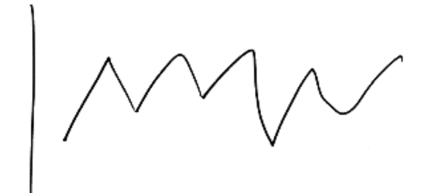
Having just raised the matter of “patterns”, I would like to mention something that my good friend Dr Peter Worthington often did near the beginning of some of his seminars. (Peter has almost certainly presented even more seminars on understanding variation than I ever did.) He asked his delegates to sketch what they perceived a run chart of random variation would look like. In his own hand, here on the right is the kind of picture that he told me they almost always produced:
Describe this diagram
A small hand-drawn sketch — the kind of run chart Peter Worthington’s seminar delegates would draw when asked what “random variation” looks like. The line zig-zags up and down at a regular rhythm: high for a stretch, then low for a stretch, then high again, alternating predictably. That regularity is the giveaway: random variation is not patterned. A genuinely random run chart contains plenty of ups and downs, but they don’t sustain a regular alternation like this. So whenever you see “wonderful zig-zagging” in real data, treat it as a signal, not as noise.
Peter was then able to point out to them that this is definitely not random variation! Random variation does not have patterns (except occasionally and briefly by a fluke). This sketch is a pattern—it’s a zig-zag pattern: it is high for a while, then goes down for a while, then goes up again, then goes down again, and so on. Take another look at the in-control charts on the left hand side of page 19—or, for that matter, any of the charts on that page. Do any of them demonstrate such regular up-and-down behaviour? Of course, there are lots of individual ups and downs, but they do not occur in a regular and long-running pattern. I repeat that, by definition, random variation does not have patterns.
Peter has permitted me to repeat what he told me about how this item in his seminars originated:
“Interestingly, the idea came from a comment made by an operator in Michelin [the tyre manufacturer] in the carbon black plant (awful stuff—it got everywhere including the coffee vending machine). They had plotted a run chart of the results of an experiment performed on a blend of carbon black and, in passing, I heard the remark: ‘That looks random.’ ‘Interesting’, I thought and, being nosey, I took a look—and saw wonderful zig-zagging!”
To watch out for “wonderful zig-zagging” is an important lesson to learn because, as e.g. we shall see this afternoon during part of the Funnel Experiment, a regular zig-zag pattern is a sign of trouble. It most certainly is not what a customer wants to receive from a supplier, whatever the product or service is!
So, in conclusion and following these various arguments, it’s clear that intelligent diagnosis of whether or not a process is in statistical control is preferably not just a matter to be decided upon purely by control limits; you need to bring your brain into play as well! The description used several times previously is that a process will be diagnosed as in statistical control if the process data cannot be regarded as different from what could reasonably be expected if the data were being generated by some kind of random mechanism (like the Red Beads or dice again). So notice the important point that concluding a process is in statistical control does not imply any “proof” that it is a purely random process producing “squeaky-clean” random numbers! (Indeed, one could argue that such a process never exists in practice as opposed to in mathematical theory.) The important consequence arising from concluding that a process is in statistical control is simply that there is no logical way you can identify any special causes from the process-data. In the process-improvement context it follows that, rather than searching for special causes, the available energies and resources should be spent on improving the system—where, after all, there is usually much more to be gained (recall the final Shewhart “bare bone” on Day 1 page 33).