Appendix M — PART B — A-FEW-AT-A-TIME DATA
PART B: A-FEW-AT-A-TIME DATA
~ 30 min reading
1. Introduction
I first mentioned “a-few-at-a-time” data a long while ago: in the discussion on the First Paradox (Appendix page 2). So it may have been quite some time since you saw it, and therefore I’ll reproduce that here:
“Another great value of Don [Wheeler]’s work is that, whereas it used to be the case that control charts were generally considered to require small samples of data to be available at each time-point represented on the chart, he popularised an excellent and simple method of how to construct control charts when only one value is obtainable at any particular time. Samples are often easily obtainable in manufacturing processes, but single values are all you can get with the majority of other types of process. Since most people only have ‘one-at-a-time’ data available in their processes, that type of data is all I consider in the main material of this course, in the Springboard article, and in the case studies covered in both ST and EST. However, in the latter little books, I do also briefly describe charts that are suitable for ‘a-few-at-a-time’ data.”
Let me emphasise a few basics. By “a-few-at-a-time” data I am implying that we are now dealing with what were referred to above as “samples” rather than just single values. The implication of “at-a-time” is that the data concerned are recorded pretty much at the same time and under the same conditions. The adjective “random” is often seen, and a “random sample” effectively implies that, in addition to “recorded pretty much at the same time and under the same conditions”, the data in the sample are otherwise not related to each other in any way. You may think that I am being rather fussy with my details here, but it turns out that such details are important regarding how these data will be regarded and used when being analysed on control charts. In fact, rather than just “samples” or “random samples”, a different word has traditionally been used to refer to them in the control-charting context, namely “subgroups”.
Why “subgroups”? Actually, I can’t recall ever having seen that word very precisely described! But presumably the idea is that there is some group of observations that were recorded “pretty much at the same time and under the same conditions” but that we only have a few of those observations available to use.
2. Calculations on a subgroup
If you want to move straight on to finding out how to construct control charts for subgrouped data (without bothering to find out why the details are what they are), you are welcome to skip this section for now and move straight on to Section 3 (page 20). However, if later you decide to embark upon Part D: the “crash-course in conventional Statistics!”, you will need to read some of this section at that time.
For illustration, here is a subgroup of size 5:
Note that there’s no reason why two or more values in the data shouldn’t be equal to each other (depending on the precision being used, one place of decimals in this case). As you see, here two values are equal to 1.2.
In the literature it is common to refer to individual values in the subgroup by the letter X and to the size of the subgroup by n, so that here n = 5. When used with control charts, n is usually no larger than this.
As in the main text of Days 2 and 3, one of the first things we think of doing with a set of numbers such as these is to calculate their average. Now, although the way that we have previously computed an average (i.e. add up the numbers and then divide that total by how many numbers there are) is by far the most common method, it isn’t the only way used by statisticians. For example, an alternative approach is introduced on page 84 in the Technical Section along with a little discussion on why that alternative might be preferable in some contexts. So, to avoid ambiguity, statisticians normally use a different term to refer to the type of average with which everybody is familiar: this is the mean (or to give it its full name) the arithmetic mean. Therefore, with this terminology, we can now say that the mean of our subgroup is
since X̄ is the notation specifically reserved by statisticians for “the mean of the values being represented by X”. The notation X̄ (“X-bar”) isn’t used for any other type of average.
Also as previously, we are likely to be interested in some way of measuring the variation of the numbers in our subgroup. On Day 3 we became familiar with the idea of using moving ranges for this purpose because we were then focused on examining the way the data varied over time. But, in a subgroup, we are now dealing with numbers “recorded pretty much at the same time”: so moving ranges are irrelevant in this context. This inevitably brings us back to the conventional statistician’s favourite measure of variation, namely the standard deviation. This has occasionally been mentioned in the main text, notably at the bottom of Day 3 page 13 (which it would be useful for you to briefly refer back to), although it has never actually been defined previously—and now you’ll soon be discovering why!
The definition starts out sensibly enough. The general idea is that, roughly speaking, the standard deviation indicates the typical size of gap between the n values of X and their mean X̄. This is a perfectly reasonable approach to measuring the variation in a subgroup: the larger the gaps, the larger the variation; and the smaller the gaps, the smaller the variation. The trouble is that statisticians do not tackle this “perfectly reasonable approach” in what many people would consider to be a “perfectly reasonable” way!
Let’s be sure about what I mean by “gaps” here: they are the distances between the individual numbers and the mean. So check that, with our subgroup, the gaps are, in turn, 0.14, 0.34, 0.56, 0.26 and 0.34. (0.14 is the distance between 1.4 and the mean 1.54, 0.34 is the distance between 1.2 and 1.54, and so on.) Note that I am carefully avoiding the use of words like “difference” or “deviation” since those words are generally understood to mean the value of X − X̄. The latter is, of course, a negative value if X is smaller than X̄ whereas gaps or distances are understood to always be positive (or zero). So the differences or deviations are −0.14, −0.34, 0.56, 0.26 and −0.34 respectively whereas the gaps are as listed above.
Now, surely the obvious way to get a measure of the variation in the subgroup would be to simply calculate the average (mean) gap or distance. That’s to say:
You might immediately notice a very good reason why we’re using “gaps” or “distances” in preference to “differences” or “deviations”: if we were to include the latter’s minus signs then their sum would be zero—as would be the case with any set of data. Try it for yourself if you don’t believe me!
This measure (using gaps) is occasionally seen in the literature, glorying in the name Mean Absolute Deviation—or MAD for short! (In Mathematics, the effect of the word “Absolute” is to get rid of those minus signs.) However, the experts rarely use the MAD. Instead, the traditional and almost universal method is to
square the gaps (or the deviations or differences since squaring them gets rid of all minus signs!),
add up the resulting “squared gaps”,
divide that sum of the “squared gaps” by n − 1, and finally
take the square root of the result.
And there you have the long-awaited definition of the standard deviation of a sample (or subgroup). Now you can probably appreciate why I have avoided showing it to you previously!
Before I discuss it and try to give it some rhyme and reason, let’s go through the arithmetic with our illustrative subgroup, just to make sure of what’s involved. I’ll lay it out in those same four steps: if you wish, check it with your calculator.
0.14² = 0.0196, 0.34² = 0.1156, 0.56² = 0.3136, 0.26² = 0.0676, 0.34² = 0.1156;
Adding up the above gives 0.6320;
n − 1 = 5 − 1 = 4, so dividing 0.632 by 4 gives 0.158; and
the square root of 0.158 = √0.158 = 0.397.
For a long while I couldn’t understand why this method was in common use! Sure, the standard deviation is some kind of way of producing something like an average or typical gap: but why so complicated and why do Mathematical Statisticians prefer it to the MAD? And why on Earth divide by n − 1 in Step (c) rather than the more obvious n? The answers eventually became clear to me as I learned more about Mathematical Statistics theory.
The answer to the first pair of questions is that, quite simply, despite being easier and quicker for you and me to calculate, the MAD turns out to be very awkward to use in algebra and other mathematical derivations, whereas it is much easier to develop nice mathematics with the standard deviation. As a matter of fact, nice mathematics is even easier to carry out without even bothering with Step (d), i.e. not bothering to take the square root of the result in Step (c). The result in Step (c) is called the variance and, if you turn the pages of any Mathematical Statistics textbook, you will actually find the variance being mentioned far more often than the standard deviation.
Years later, when I first came across the Taguchi Loss Function (studied on Day 7), I found rather more justification for concentrating on the variance than purely mathematical convenience. What we learn with the Taguchi Loss Function is that the square of the gap between a figure and its middle or optimum value actually has greater practical significance than the straightforward gap. So I, at least, became rather more comfortable than previously about concentrating on variances (using squares of gaps) rather than on just the straightforward gaps themselves. However, I feel pretty sure that convenience for the Mathematical Statisticians is the more likely main reason for the common use of the variance rather than the MAD!
Actually, the good news is that, for the purpose of constructing and using control charts for a-few-at-a-time data, i.e. using subgroups rather than one-at-a-time data, you don’t need to know the answers to those questions I’ve just raised! So why have I bothered to mention standard deviations at all? The reason is that some of the details used in constructing these and other types of control charts do involve the standard deviation (or variance) in the background theory. If you are content to simply accept the details that I tell you as being the truth rather than knowing anything about that background, then fine! Much of the content in this optional material is not essential for you to know: I’m simply providing it for those who are curious about such things. So you are most welcome to pick and choose what you bother with. But, in particular, for your benefit if you are not really mathematically inclined, questions which need answers here in terms of anything at all substantial in terms of Mathematics have been postponed to the final (Technical) section—therefore that section is even more optional than the rest of these Optional Extras!
There is still more good news to come! The almost universally accepted way of computing control limits for control charts based on a-few-at-a-time data, i.e. data which come to us in subgroups, doesn’t involve our computing either the standard deviation or the MAD! Instead it uses something much quicker and easier than either of them, namely the range of the subgroup. The range of a subgroup is simply defined as the highest value in the subgroup minus the lowest value in the subgroup. One typically computes control limits using data from somewhere between, say, 8 and 15 subgroups. So, even if you have a scientific calculator which has the standard deviation programmed in, you’d still be doing lots more button-pressing in order to evaluate it than you’d need in order to compute the ranges of those subgroups. Indeed, depending on the precision of the data being recorded, you might well be able to write down the ranges without using a calculator at all. But you will still need a calculator to produce the control limits themselves.
However, as mentioned earlier, the theory underlying where we place the control limits relates to standard deviations rather than to any other type of measure of variation. Now, since the standard deviation is some kind of average or typical gap between the values in the data and their mean, it is obvious that the range (largest value minus smallest value) will be greater than the standard deviation. We shall therefore need to divide it by some conversion factor to reduce it to a number which is on the same scale as the standard deviation—so that, in fact, it could then be regarded as an estimate of the standard deviation. The conversion factor involved is h, shown in the following table for subgroup sizes n = 2 to 6.
| n | 2 | 3 | 4 | 5 | 6 |
|---|---|---|---|---|---|
| h | 1.128 | 1.693 | 2.059 | 2.326 | 2.534 |
The technical details as to how this table is derived will be left (as you would expect!) to the Technical Section (page 83). With our illustrative subgroup of size 5, the largest and smallest values are respectively 2.1 and 1.2, so that the range, which we’ll denote by R, is 2.1 − 1.2 = 0.9. With n = 5, the converted value of R (converted in order to make its value comparable with the standard deviation) is thus 0.9 ÷ 2.326 = 0.387. The actual standard deviation of this subgroup was found on page 19 to be 0.397. Of course, we could not expect the converted R to be exactly equal to the standard deviation since it uses less detailed information about what’s in the subgroup. In fact, what the conversion method does (under the conditions assumed in the theory of the method) is to produce values that are equal to the standard deviation “on the average”.
You may recall that the value of the MAD for this subgroup was noticeably less than what the standard deviation turned out to be: 0.328 compared with 0.397. Interestingly, similar theory produces a conversion method which requires the MAD to be multiplied by 1.253 in order to obtain a value comparable with the standard deviation. This gives 0.328 × 1.253 = 0.411—which is again (of course) not equal to the standard deviation but is nevertheless considerably closer to it.
3. Control charts for subgrouped data
Most of the time in the previous section was spent on considering how to measure variation in subgrouped data. In case you skipped that section, I’ll summarise it in just a single sentence as follows. Although the underlying ideas about measuring variation are based on the standard deviation—the statistician’s favourite measure, as I have previously described it—practical work normally uses something much simpler: R, the subgroup’s range, i.e. the distance between the subgroup’s smallest and largest values.
In this section we’ll introduce the type of control charts that are almost universally employed for studying subgrouped data. There are other possibilities but, from the practical point of view, I do not think they are generally worth bothering with. However, particularly because of using ranges, it will be necessary to consult tables of so-called “control-chart constants” in order to compute the control limits. Such control limits are in accord with Shewhart’s “3σ-limits” as referenced by Dr Deming in his quotation reproduced on Appendix page 4. (That is followed by some discussion which, in particular, indicates why Mathematical Statisticians tend not to like the method!) As in the previous section, technical details about these control-chart constants are contained in the Technical Section at the end of these Optional Extras. Here we shall simply concentrate on how to use them.
With subgrouped data it is usual to construct not just one but two control charts, one for the subgroup means (the term introduced in the previous section for what we had previously simply referred to as the “average”): the X̄-chart, and one for the subgroup ranges: the R-chart. Thus we have one chart focused on whether or not the process average is stable and one chart focused on whether the amount of process variation is stable. This second chart, specifically studying whether the variation in the subgrouped data over time is or is not stable, has now become possible because of having “a few” data available at each time-point rather than just one. Since it is usual practice to deal with these charts as a pair rather than separately, they are sometimes referred to in the singular: the X̄-R chart.
Before covering the details, it would be useful to take a look at part of the rather famous hand-drawn X̄-R chart of which we have already seen something as the fifth of the “Six Processes” briefly mentioned on Day 3 page 21 and then described in some detail on Day 3 pages 32–33. Since those pages were “effectively ‘extra-curricular’”, I’ll repeat some of their content here. On the next page there is a short portion of the chart which in 1982 some Ford Motor Company personnel brought back from the Tokai Rika Company in Japan (for, at that time, anything of this nature was totally new to them). Something else that was wholly new to them was that such charts were being constructed, used and interpreted not by statistical “experts” but by the personnel on the factory floor. The writing is not very clear, but you will be able to see the daily data in subgroups of size 4 written above the graph-paper and the very active notes and comments below the graph-paper with some translations written in. The X̄-chart is drawn in the top half of the graph-paper and the R-chart is at the bottom of the graph-paper. You will also easily see, beginning on 27 October, clear signals below the Lower Control Limit on the X̄-chart indicating that the process had suddenly gone out of control. Also note the efforts made to find the reason and also that the control limits (on both parts of the chart) were accordingly recomputed. It is also worth observing that, although it was the X̄-chart which had the signals, the opportunity was also taken to update the R-chart since that also soon started getting points above its previous Upper Control Limit. Although ancient, this Japanese Control Chart is extremely interesting to study, and an excellent presentation about it is provided in Chapter 7 of Understanding Statistical Process Control (Third Edition) by Don Wheeler and the late David Chambers.
So let’s see how to construct an X̄-R chart. As with the control charts for single values in the main text, we will need to use data collected over a few time-points (the baseline). There’s no “rule” governing how many time-points to use but I would suggest that, with n as large as 4 or 5, 10 would generally be ample. The Central Line of the X̄-chart will naturally be the mean of the subgroup means, for which the traditional very logical notation is X̿. But how far above and below the Central Line should the control limits be? The answer is a multiple of the mean range R̄, that multiple being H which is provided in the following table:
| n | 2 | 3 | 4 | 5 | 6 |
|---|---|---|---|---|---|
| H | 1.880 | 1.023 | 0.729 | 0.577 | 0.483 |
And how about the second of the pair of control charts, the R-chart, on which we plot subgroup ranges? Obviously enough, the Central Line here will be the mean range R̄. And, very conveniently, the control limits are also multiples of R̄—except that, strictly following Shewhart’s guidance on 3σ-limits, there is no Lower Control Limit using small subgroup sizes! Why might this be sensible? Simply because, for small values of n such as in the brief table of control-chart constants that I have shown above, his guidance leads to negative values for the LCL; and, clearly, no range can be negative. Interpreting this in practice, this implies that there are some circumstances in which it is quite possible for a zero subgroup range to occur: i.e. all the values in the subgroup happen to be equal to each other—whether or not the process is in statistical control. Clearly, this depends on the amount of precision with which the data-values are being recorded. But the fact that such circumstances do exist in practice surely implies that it would be rather inconvenient if a zero range always had to be below the Lower Control Limit; so the fact that Shewhart’s guidance doesn’t provide one is not so peculiar after all—indeed, it’s rather fortunate!
The tables and notation being included here are extracts from the table of control-chart constants on page 46 of EST, my book of Elementary Statistics Tables. Those tables cover a wider variety of situations than the most common ones that I am including here, including subgroup sizes larger than n = 6. And then Lower Control Limits can and do exist. Using the notation in that EST table, the constants to be used for the Lower and Upper Control Limits on the R-chart are denoted h₁ and h₂. So all that concerns us here is that the Upper Control Limit on the R-chart is computed as h₂R̄ where h₂ is provided in the following table:
| n | 2 | 3 | 4 | 5 | 6 |
|---|---|---|---|---|---|
| h₂ | 3.267 | 2.575 | 2.282 | 2.114 | 2.004 |
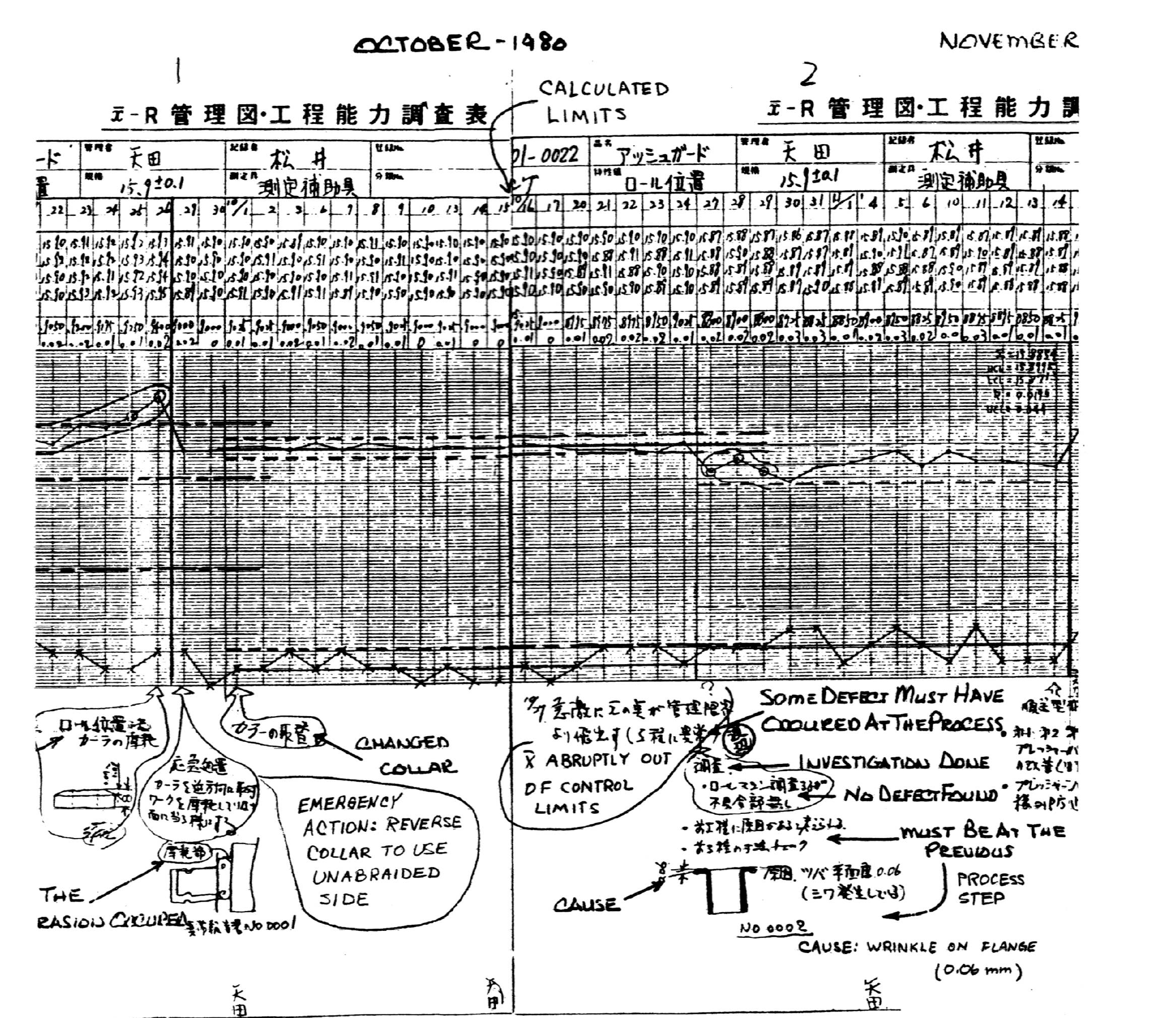
To put a little flesh on the bones, it would be a good idea for you to compute these various control limits and see them in action. The easiest way to do that is to use some data from that piece of the Japanese Control Chart reproduced on the previous page. It would therefore be useful for you to know a little more about some of the background to this chart and also to this particular part of it. So below I have reproduced some short extracts from Don Wheeler’s write-up. There is plenty to learn from these extracts, not only about the use of the control chart but also about the management and working environment—they are not unrelated! As you can see, the part of the chart being illustrated begins on Monday 22 September 1980 and runs through to Friday 14 November, and that is the period covered by the description below. I won’t repeat here any of the details already mentioned on page 21, so you might like to remind yourself of what I wrote there before moving on to the following extracts.
“As the Ford group was touring the Tokai Rika plant, they observed eight production workers ‘engaged in active discussion’ around this Average and Range Chart. To the people from Ford, it seemed that something must be wrong with the process represented by the chart, so they asked about it. They expected there to be an internal production problem, or an assembly plant problem, or a problem of too many rejects. However, they were told that this was simply a routine review of an ongoing process and, in fact, the process was currently being operated predictably and was well within the specifications. [In case you know about such things, the Process Capability Index was measured as about 2.25, indicating that virtually everything being produced was within the middle half of the specification range and that the process’s performance was even superior to so-called six-sigma quality. Not bad for 1980!]
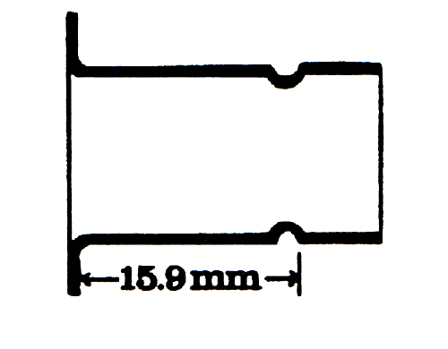
“The process represented by this chart is the fabrication of a cigar lighter shell. The dimension tracked by the chart is the distance between the flange and the detent, as shown. The target value for this dimension is 15.90 mm, and the specified tolerance is ±0.10 mm. The measurements shown on the chart were made with a snap gauge and were recorded to the nearest 0.01 mm. Based on production data given later, about 17,000 pieces were being produced each day.
“Points outside the limits are noted on September 25 and 26, 1980. Having noted that exceptional variation was present, they looked for the Assignable [Special] Cause. The notes at the bottom of the chart document these efforts. ‘Abrasion on the positioning collar’ is identified as the Assignable Cause for the process excursion noted in late September, 1980. In addition to writing down the Assignable Cause on the chart they took action—the very next day the process average shifted back to the target of 15.90 mm. Again, a note on the chart tells what was done.
“As a temporary solution, a worker turned the worn collar over to use the back side. Two days later a new collar was installed. This incident displays a desire on the part of the Tokai Rika personnel to operate at the target. The process was in no danger of producing nonconforming product, yet they took the trouble to fix it so that it would stay centred on the target value of 15.90 mm. Moreover, just as the shift on September 29 shows the desire of the workers to operate at the target value, the replacement of the collar on October 1 shows the support of the management for this policy.
“Why do the operators and their supervisors want to operate right at the target value when they have such [relatively] wide specifications? Isn’t this excessive? Would it not be cheaper to let the process run until the process average was above 15.95 mm? While it might be cheaper for this one operation, it would eventually prove to be more expensive for the company. The definition of World Class Quality is ‘On Target with Minimum Variance’. This example shows how this concept is put into practice. [Don then continues with some discussion involving the Taguchi Loss Function, studied on Day 7 of our course. The following two paragraphs now cover October 1980, and I’ll then ask you to compute the control limits used on the chart during October.]
“Following the installation of the new collar on October 1, data were collected for recalculating the limits. The process stayed within these new limits until October 27. At that time the product dimension suddenly shifted downward. The fact that it was a sudden change in the process was a clue to the nature of the problem, and as such was noted at the bottom of the chart.
“The search for the Assignable Cause led back to the preceding step, a blanking operation. When a problem was found, it was checked to see if it corresponded to the indications given by the process behaviour chart [control chart]. Since this problem involved the repair of a die, the fix was postponed until the weekend of November 15 and 16.”
Now, returning to the chart on page 22, you will see the note at the top pointing out that the new control limits were computed after the 15 October subgroup had been recorded. To save you from having to try to decipher the writing above the chart, here are the data that were used for the computation:
| 10/1 | 2 | 3 | 6 | 7 | 8 | 9 | 10 | 13 | 14 | 15 |
|---|---|---|---|---|---|---|---|---|---|---|
| 15.90 | 15.90 | 15.88 | 15.90 | 15.90 | 15.90 | 15.90 | 15.90 | 15.90 | 15.90 | 15.90 |
| 15.90 | 15.91 | 15.90 | 15.91 | 15.89 | 15.91 | 15.91 | 15.90 | 15.90 | 15.90 | 15.90 |
| 15.90 | 15.90 | 15.90 | 15.90 | 15.91 | 15.91 | 15.90 | 15.91 | 15.91 | 15.90 | 15.90 |
| 15.91 | 15.90 | 15.89 | 15.91 | 15.91 | 15.89 | 15.90 | 15.91 | 15.90 | 15.90 | 15.90 |
| 15.91 | 15.90 | 15.91 | 15.91 | 15.89 | 15.90 | 15.90 | 15.90 | 15.90 | 15.90 | 15.90 |
| X̄ | ||||||||||
| R |
So, go ahead and write down the values of X̄ and R for each subgroup—not very difficult with these data! And yes, you will soon see a few of those zero ranges that I mentioned on page 21. Next compute the values of X̿ and R̄. Finally, compute the control limits for both parts of the chart as described earlier and check that they agree (approximately) with what the Japanese workers had drawn as reproduced here on page 22. My answers are on page 27 if you need them—but first try it yourself here:
As you have seen on page 22, all remained well until the out-of-control signals which began on 27 October. You have read at the top of this page what then happened. After the repair had been carried out during the weekend of 15–16 November and some subsequent data had been collected, new control limits were drawn on the chart from 17 November onward. Meanwhile, someone had checked through the data from 27 October to 14 November and had computed control limits for that period using that whole set of data. If you would like to try out the computations one more time, here are the data recorded over that period (I don’t know the reasons for the apparent six-day break followed by a three-day week):
| 27 | 28 | 29 | 30 | 31 | 11/1 | 4 | 5 | 6 | 10 | 11 | 12 | 13 | 14 |
|---|---|---|---|---|---|---|---|---|---|---|---|---|---|
| 15.87 | 15.88 | 15.87 | 15.86 | 15.87 | 15.88 | 15.87 | 15.89 | 15.90 | 15.87 | 15.89 | 15.89 | 15.87 | 15.89 |
| 15.88 | 15.90 | 15.88 | 15.87 | 15.87 | 15.88 | 15.87 | 15.89 | 15.90 | 15.87 | 15.88 | 15.89 | 15.89 | 15.88 |
| 15.88 | 15.89 | 15.87 | 15.88 | 15.90 | 15.88 | 15.89 | 15.88 | 15.89 | 15.89 | 15.89 | 15.90 | 15.88 | 15.88 |
| 15.89 | 15.88 | 15.88 | 15.89 | 15.89 | 15.89 | 15.88 | 15.88 | 15.87 | 15.87 | 15.89 | 15.89 | 15.89 | 15.89 |
| 15.89 | 15.88 | 15.89 | 15.87 | 15.90 | 15.89 | 15.89 | 15.89 | 15.90 | 15.89 | 15.89 | 15.88 | 15.89 | 15.88 |
| X̄ | |||||||||||||
| R |
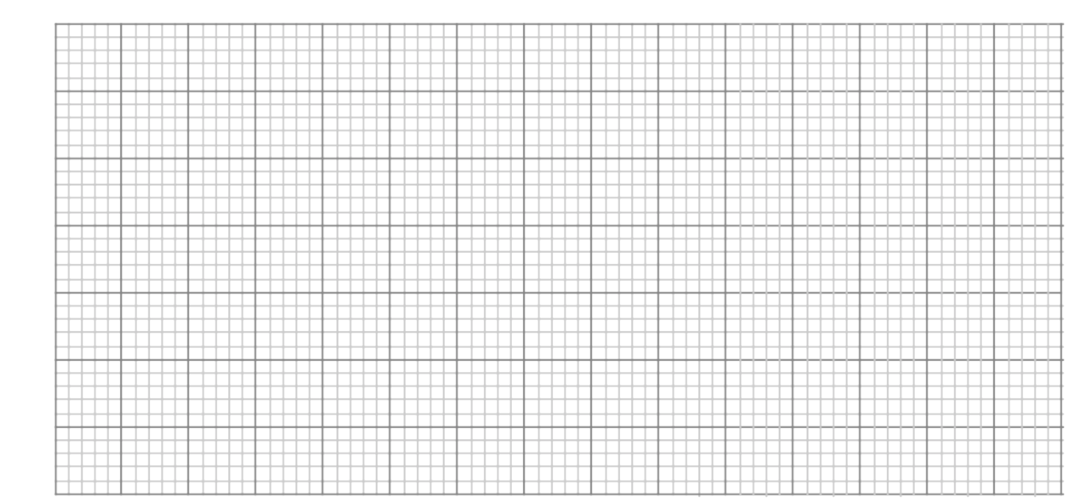
If you’d like to examine this period by drawing the X̄-R chart on the graph-paper below, you will see that the process remained in control during this time, albeit with the lower mean and with increased variation. However, you will also see that, despite the problem that had been discovered, it is highly unlikely that any piece manufactured even during this period was anywhere near going outside the specifications of 15.90 mm ± 0.10 mm. This is, of course, an illustration of the value of having improved the process well beyond the minimum that had appeared to be necessary: despite the current perturbation, everything produced still remained “fit for purpose” (as conformance to specifications is often described).
4. Discussion
One of the expressions that is in vogue these days is “doing more with less”. What better illustration could there be of that aim than this Japanese Control Chart? Firstly, only a tiny amount of data was used: just four readings out of around 17,000 units per day. Secondly, although maybe the accuracy of the readings (to the nearest one-hundredth of a millimetre) might have been quite impressive over 35 years ago, nevertheless it may appear to be rather crude considering the variability of the measurements involved: they were usually only varying between, say, 15.87 mm and 15.93 mm, and often over an even narrower interval than that. But just look at what putting those “rather crude” data on control charts still enabled the production workers to learn and do!
There is one aspect of the Japanese Control Chart that I must advise you not to copy unless you already have really considerable knowledge and understanding of your process. That was the way in which the subgroups were formed. To quote from Wheeler and Chambers page 155, “The four pieces for the daily subgroup were drawn … at 10.00 am, 11.00 am, 2.00 pm, and 4.00 pm”. That is hardly consistent with my introductory remarks about subgroups on page 17: ” … the data concerned are recorded pretty much at the same time and under the same conditions”! Immediately following that quotation about when the readings were taken, there is some discussion on this very point. Translating some of the Japanese writing under the chart for August 1980, the Japanese already had evidence that this schedule for recording the data was such that “the present measurement method can detect process change”. The discussion then continued with these wise words:
“As long as a process behaviour chart [control chart] is capable of detecting exceptional variation, it is sensitive enough to use … . There is no need to increase sensitivity by increasing subgroup size. Furthermore, one subgroup per day had proven to be adequate since this process was one that usually would change slowly, over a period of days. For these reasons, the subgroup size and the subgroup frequency were not changed.”
But let me repeat my above warning: “I must advise you not to copy [such a method of data-collection] unless you already have really considerable knowledge and understanding of your process.” I learned that lesson from an incident which occurred some time before I had even met Dr Deming. Since this happened well over 30 years ago, I cannot recall all the details, but I can recall what was most important. I was visiting a plant that was manufacturing long rolls of some rubbery material which was being used in a paper-manufacturing process. The people there had become puzzled because both their X̄-chart and R-chart were showing extraordinary “hugging the Central Line” effects—much more extreme than you saw when studying the control charts for Rule 2 of the Funnel on page 10 of these Optional Extras. The reason became clear when I asked them how they were forming their subgroups. They told me that they were measuring the thickness of the material at both edges, and in the middle of the roll, and then halfway in-between those measurements, producing subgroups of size n = 5. Unfortunately, when I examined the data, it turned out that there was a relatively substantial difference between the thickness of the roll at its edges compared with most of the material away from the edges! That difference far exceeded the natural variation at any one of the five positions, and so resulted in the range of any such five measurements being vastly greater than what would have been obtained from the natural variation alone. You can soon visualise the effect that that had on the control limits on both parts of their X̄-R chart. Those good people would have been far better off by just taking single measurements either at an edge or in the middle and using the ordinary one-at-a-time chart!
My purpose in introducing you to the Japanese Control Chart has been twofold. Firstly, of course, it contains very suitable data for you to practise with, both on the computations and with the interpretations. But secondly, I hope the short extract you have seen here will have whetted your appetite for seeing more of it!
I have already mentioned the superb coverage of the Japanese Control Chart in the book by Don Wheeler and David Chambers cited on page 21. The whole 20-month chart is contained (in sections) within that chapter along with excellent discussion. Further, a slightly updated version of Don’s original video of A Japanese Control Chart is also available from SPC Press (https://www.spcpress.com), either by download or on DVD. I particularly recommend the book if you are interested in learning much more on control charts than I have included either in these Optional Extras or in the main course. It is quite expensive, but the whole book contains extremely interesting and useful material. If you have a local library, see if they can find it for you!
Computed control limits
With the data on page 24 the control limits for the X̄-chart are at 15.895 mm and 15.908 mm, while the (upper) limit on the R-chart is at 0.0207 mm.
With the data on page 25 the control limits for the X̄-chart are at 15.871 mm and 15.899 mm, while the (upper) limit on the R-chart is at 0.0440 mm.