SIX PROCESSES
~ 11 min reading · ~ 15 min at Neave’s pace (~ 20 min on Stats-level 0)
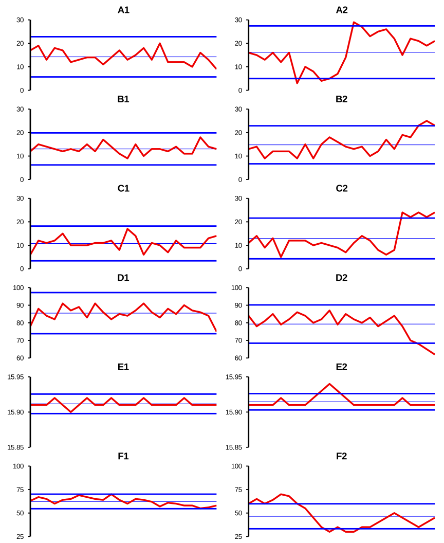
Take an initial look at these twelve control charts:
Describe this chart
Twelve control charts arranged as six pairs (rows A through F). The left column (A1–F1) shows six different stable processes — dice totals, coin tosses, Red Beads counts, breakfast pulse rates, manufactured-socket measurements, and US trade deficits — all in statistical control. They look strikingly similar to each other: noise within limits, no patterns, no points outside. The right column (A2–F2) shows the same six processes after special causes have entered: points outside the control limits, sudden shifts, trends, outliers. The first column is “boring” — and boring is good news. The second column is “interesting” — and that is what trouble looks like.
To simplify comparisons, each of the 12 charts was constructed from the same number (24) of data-points and in each case the control limits have been computed from all of those 24 values. You will probably guess why I have chosen those particular details. Yes, one of the processes charted here is the one with which you are currently most familiar: a Red Beads process: and those were precisely the details relevant to all of yesterday’s illustrations. (This choice of baseline length does not contradict the advice given in Technical Aid 8 since these analyses are all retrospective rather than “live”.)
Six of these charts indicate that the relevant processes were in statistical control. The other six charts indicate the relevant processes were out of statistical control. I think you will easily be able to see which are which! Also, both from the title of this section and the way I have numbered the charts, you will probably guess that the 12 charts are formed in six pairs, the charts for each pair both coming from the same process. On the left hand side (Charts A1–F1) the charts indicated that the processes were in statistical control. On the right hand side (Charts A2–F2) the data used were recorded when all the same processes had gone out of statistical control.
I collected together such a set of twelve charts a long while ago and always found them to be very useful for beginning to get my delegates and students used to interpreting control charts. The charts cover a very broad range of types of process. I’ll give you some details a little later on. But before getting into those details, I’ll make some general observations.
One aspect almost immediately noticed by the delegates in my seminars is how control charts of stable processes (in statistical control) all look broadly similar to each other, irrespective of what type of processes they are. Naturally, Charts A1–F1 differ in detail but they all give the same kind of general impression. That should be no great surprise if you recall the description of data from stable processes on page 12, in the More on the Sales Data section above: such data “are typical of what you would get if you were just throwing dice (or using some other similarly ‘random’ mechanism)”. So, in reality, nothing of interest happens in such processes. In contrast, Charts A2–F2 differ in much more than mere detail, reflecting the fact that special causes are affecting the way that these processes are now behaving and can do so in all sorts of different ways.
Related to this is that the delegates often pointed out that Charts A1–F1 looked pretty “boring” whereas Charts A2–F2 looked relatively “interesting”. Again, those impressions are not surprising: processes that are in statistical control produce data whose general behaviour stays the same. So no wonder they might be regarded as looking “boring”: they are all “much of a muchness”. Similarly, why do Charts A2–F2 look “interesting” rather than “boring”? Because, in each case, something has (or some things have) happened in them—indicated in particular by one or more points lying outside the control limits. These points warn us of real changes, caused by something different from the routine factors which were previously the only influences on the process. Something has changed which results in changed behaviour—usually, in practice, worse behaviour of the process.
So notice that (at least as far as control charts are concerned!) “boring” is nice! Charts A1–F1 tell us that the processes are in statistical control, stable, predictable. It is nice to have some idea of what our processes are likely to produce in the future—the near future, at least, i.e. until something occurs (intentionally or unintentionally) to change matters. The prediction is that, as long as the process stays stable, future data will continue to behave in the same manner as they are currently behaving. To put it mildly, that is useful to know!
On the other hand, of course, “interesting” is usually not nice! Instead it means there are some problems that need to be solved. But at least the control chart may provide some clues which may help us to solve those problems.
To see how, let me now tell you what the six processes were and what happened to them.
They divide equally into two sets. The first three are ones where I can again become the “All-Knowing”: one is a Red Beads Experiment and the other two are illustrations with dice and tossing coins. The other three are definitely “serious” processes where neither I nor anybody else could claim to be “All-Knowing”.
It is Process C which is the Red Beads process: the data are, as usual, the numbers of red beads finishing up in the paddle. The data for Process A are the total “spots” showing when four dice are thrown. The data for Process B are the numbers of Heads when 25 coins are tossed. So, similarly to the Red Beads Experiment, the dice in Process A and the coins in Process B are respectively thrown or tossed 24 times.
Regarding the “serious” processes, where nobody is “All-Knowing”, the charts for Process D show my pulse-rate taken at breakfast-time over a period of 24 consecutive days. The charts for Process E show average measurements in 24 small samples of manufactured cigarette-lighter sockets in a Japanese case study. There will be some detailed description of those measurements on page 32, in the Six Processes Revisited section below. Finally, the charts for Process F show the monthly United States trade deficits in billions of dollars over a two-year period. As I said earlier, these charts “cover a very broad range of types of process”!
In the case of Processes A–C, the above descriptions apply strictly only to Charts A1–C1. Clearly, if they also applied to Charts A2–C2 then I would have had some difficulty in finding any data which would indicate the processes were out of statistical control! So in those cases I deliberately introduced some special causes. I will also tell you what I know about the circumstances underlying the data in Charts D2–F2, over which of course I had no such direct influence!
For Chart A2, four dice were used in the first six throws as was the case throughout Chart A1. But only two dice were used in the next six throws and then six dice for the rest of the time. Similarly, Chart B2 began by tossing 25 coins as was the case throughout Chart B1, but I increased the number of coins by two each time from the 15th point onwards, finishing up with 45 coins by the end of the chart.
However, as you would expect, it was pretty difficult to figure out how to upset the Red Beads data! All I could think of was (for the final six points) to add up the two junior inspectors’ counts rather than to plot their common value (sorry—rather feeble, I know!). So, in that case, it wasn’t the process itself which went out of control: it was the process of recording the data that was in trouble. But that’s also important. Deming often pointed out that the measurement process needs to be in statistical control as well.
Moving on to the “serious” processes, you may have noticed that my pulse-rates on Chart D1 were rather unhealthily high. Chart D2 shows my pulse-rates for a later period of 24 days with the final four days showing the effects of a newly-prescribed beta-blocker. In the Japanese case study, a fault developed during the period covered by Chart E2, a fault which was soon more than effectively rectified.
Process F was the only one whose details I have changed from my initial version of the six processes. Despite the more than 30 years that have passed since then, it seems to me that the first five processes have stood the test of time pretty well. The original version of Process F consisted, as now, of monthly data on US trade deficits. However the years concerned then were 1988–89 for Chart F1 and 1990–91 for Chart F2. That earlier version of Chart F1 showed stability but Chart F2 showed some temporary instability, presumably because of the relatively minor recession which officially lasted from July 1990 to March 1991. However, because of the antiquity of those data and the considerably more serious international financial crisis of 2008, I thought it might be interesting to instead try the US trade deficit figures for 2006–07 for Chart F1 and 2008–09 for Chart F2. I was not disappointed!
The Springboard article also includes some discussion on these six processes except that there the earlier versions of Charts F1 and F2 are shown. On page 33, in the Six Processes Revisited section below I’ll compare what happens in the two versions.
There is yet more to be read from these charts. However, I shall discuss just one further important issue at this stage and then return to these processes later on.
In every case, the in-control chart on the left-hand side of page 19 involved data which occurred prior to the data for the out-of-control chart on the right-hand side. Recall that one of the important interpretations of processes being in statistical control is that they are predictable. To repeat an important sentence from page 20, above, “The prediction is that, as long as the process stays stable, future data will continue to behave in the same manner as they are currently behaving.” This surely implies that, if we have a control chart which indicates the process is currently in statistical control, it is sensible to extend the current control limits into the future.
There are two advantages of doing this. First, it saves you time and effort by not recomputing the control limits when there is no need to do so. Second, if a future recomputation of control limits is being carried out while the process is becoming unstable, you’ll obviously be spoiling the control chart’s chance of warning you about that particular problem. And that’s in addition to the likelihood of widening the control limits because of contamination from that special cause. So the clear “no-brainer” message is to leave the control limits alone if you have no good reason for changing them!
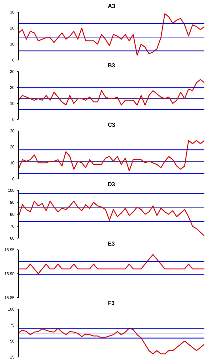
To illustrate these matters, on page 23 I have constructed Charts A3–F3. They contain respectively all 48 data from Charts A1–F1 and Charts A2–F2 but show the control limits from Charts A1–F1 throughout, i.e. extended into the future from when the first set of charts ended. If you compare Charts A3–F3 with Charts A2–F2 on page 19, above then you will see that the signals of instability are generally stronger, i.e. the relevant points are mostly further outside the control limits than they were when the control limits were computed using the new data.
Describe this chart
The same six processes again — but now Charts A3–F3 each contain all 48 points (the 24 from A1–F1 followed by the 24 from A2–F2), with the control limits taken from the first half and extended unchanged into the second half. The signals of instability that appeared in A2–F2 are now even stronger: points sit further outside these earlier, narrower limits than they did when the limits were recomputed from the unstable data. The takeaway: when a process has been stable, leave the control limits alone. Don’t recompute — extend, and let the chart catch the change.
Thus note that we have obtained more useful results by doing less work (in this case, by not recomputing the control limits unnecessarily). This is a message that will recur during the Funnel Experiment this afternoon. It reminds me of Dr Deming ruing a sad fact which he frequently observed, namely: “people working hard, doing the wrong thing”.