THE THIRTEENTH OBSTACLE
~ 9 min reading · ~ 25 min at Neave’s pace
Specifications are really no more and no less than two-sided numerical targets. Thus some of what has already been covered earlier today and also while you were discussing Point 11 on Day 5 pages 10–11 is immediately relevant here with minor rewording.
One major difference in application of the concepts is that whereas targets, appraisals, league-tabling, etc almost invariably apply to people, singly or in groups, specifications are more often applied to things. In that case, the use of a “performance indicator” can be less problematic. Recalling the two particular difficulties with performance indicators spelled out in Pause for Thought 7–c on page 6, in Performance Indicators:
in some cases—but maybe not as many as might be thought—it may now be feasible for a single performance indicator to be an adequate measure of performance (e.g. the weight or length or volume of a product); and
if something goes wrong, it is rather less likely that the “thing” itself will get blamed, so investigators will instead now look for “What caused it?”. This question at least admits the possibility of considering the system that caused it; sadly, of course, in many organisations the question gets replaced by “Who caused it?”.
But, even if the “performance indicator” is a more reasonable proposition in the context of a “thing”, the mentality of it being sufficient for that performance indicator to merely conform to specifications is still an obvious barrier to continual improvement. You know the idea. We have Lower (LSL) and Upper (USL) Specification Limits for the quantity to be measured or counted. If that quantity lies between the LSL and the USL then it is within specifications, i.e. it is “OK”. But if it is below the LSL or above the USL then it is outside specifications and is thus “not OK”.
To confirm, this is just the same thinking as we have with targets except that “OK” now corresponds to being within the range defined by two numbers whereas, with targets, “OK” corresponds to reaching or going beyond the single defining number. The Gallery Furniture salesman would get his 10% commission if he sold $7,000 of furniture or more (Day 6 page 8); Dr Deming’s student, Christine, would have been “OK” if she made 25 or more calls per hour (Day 6 page 22); the performance of the police was “OK” if they reached the scene of the crime in 10 minutes or less (same page).
The concept of specifications rather than a target normally arises where there is some “nominal” or “optimum” value for the number being recorded. Realising that perfection is rare, specifications are therefore provided to indicate how much error (deviation from optimum) is acceptable. But one of the two logical flaws in this is immediately obvious. The optimum is best—that’s precisely what the Latin word “optimum” means. Thus anything which is not at the optimum is less than best! The general truth in practice is that, the further away the number is from the optimum, the less suitable the “thing” becomes for its intended purpose. So the criterion of conformance to specifications is, to put it mildly, a rather crude criterion of “goodness”. Let me clarify what I mean.
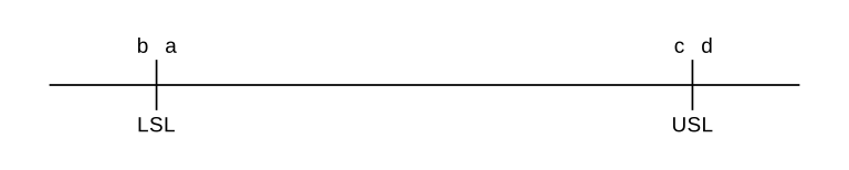
Here is a scale on which I have marked the two specification limits and also four possible results:
Describe this diagram
A horizontal number line marked with two vertical tick-marks: LSL (Lower Specification Limit) on the left and USL (Upper Specification Limit) on the right. Four results sit close to those limits: b lies just outside LSL, a just inside it; c lies just inside USL, d just outside. By the conformance-to-specification rule, a and c are accepted while b and d are rejected — yet a–b and c–d are essentially indistinguishable from each other. The diagram is the visual punchline for Neave’s “second logical flaw”: a knife-edge between “OK” and “scrap” with no real difference in fitness for purpose.
Results “a” and “c” are “OK”: they are within specifications, they have met requirements, and so the “things” represented by those figures are presumed suitable to be passed on to the customer, be the customer external or internal. Results “b” and “d” are outside specifications, they have not met requirements, and so the “things” represented by those figures are presumed not suitable to be passed on to the customer: they must be scrapped or reworked. These are very different consequences: “b” and “d” result in costly wastage or remedial action; “a” and “c” do not. Yet obviously there is essentially no practical difference between “a” and “b” nor between “c” and “d”. That’s the second logical flaw.
An effective way of representing a more realistic view was described and discussed by Genichi Taguchi at a famous meeting in Tokyo in 1960 at which Dr Deming was present. The “Taguchi loss function” was not really a new idea, especially amongst mathematicians; but Dr Taguchi did a good job of making it known and showing its relevance in “the real world”. It is obvious why it appealed to Dr Deming: it wholly avoids the illogicalities just demonstrated with regard to conformance to specifications, and it is entirely consistent with his thesis of continual improvement.
1960 was the first of four years in which Dr Taguchi was awarded Japan’s Deming Prize.
We shall spend the next few pages discussing and working with the Taguchi loss function. But, if you need more, the Taguchi loss function appears in DemDim Chapter 11 and is then the subject of the whole of Chapter 12. So, as usual, if you’re interested, you know where to look! However, parts of Chapter 12 are expressed in more mathematical terms than is necessary for students on this course. So, if you would prefer to steer clear of anything unduly mathematical then please don’t bother with Chapter 12.
Rather than my introducing the Taguchi loss function to you, I’d like you to introduce it to yourself by using a little exercise that I often got the delegates at my seminars to carry out. You will then soon see that ideas about the Taguchi loss function are neither just some abstruse piece of Mathematics nor only restricted to manufacturing situations.
ACTIVITY 7–e
Think of your normal work situation—or one of them if there are several. For example, you may have a “desk job”, so imagine yourself sitting there in front of the computer, or doing some paperwork, writing a report, reading a manual, drawing a control chart—or working on this course!
Everybody’s work is affected to some extent by the conditions under which they are working. Let’s focus in particular on the temperature in your office (or wherever you are).
1. Write down what you would regard as the most comfortable, the “ideal”, temperature for your work:
2. Now write down a fairly wide temperature scale around that ideal value (for illustration, I’m using three steps of 5°C either side of 21°):
Thus, e.g., 6°C 11°C 16°C 22°C 26°C 31°C 36°C
3. Presumably, whatever work you are doing, you will do it best at your “ideal” temperature. So let’s represent that amount and quality of work done at the ideal temperature by 100% in whatever connections you deem relevant: accuracy, amount, creativity, concentration, quality in any appropriate sense. Now think of working at those other temperatures. If it is noticeably hotter or colder than your ideal temperature, your work is very likely to suffer. So, compared with the 100% at the ideal temperature, what would be the approximate percentages representing the amount and goodness of your work at those other six temperatures? Firstly, copy over your seven temperatures from step 2 and then write in your approximate percentages underneath them:
Here are my own answers:
6°C 11°C 16°C 22°C 26°C 31°C 36°C 5 % 50 % 85 % 100% 90 % 55 % 15 %
4. Now subtract your percentages from 100%, therefore obtaining the percentage loss in your work through having to suffer a temperature which is too high or too low:
Here are my answers:
95 % 50 % 15 % 0 % 10 % 45 % 85 %
5. Write your seven temperatures along the horizontal axis at the bottom of the graph-paper below. You will see that I have included my own temperature scale printed faintly in blue: so simply overwrite my temperatures with your own. Then, referring to your temperatures along the horizontal and your percentage losses on the vertical axis, plot your relevant seven points on the graph-paper.
If you are not very confident about plotting points and drawing graphs, please feel free to first study my illustration (using my own temperatures and percentage losses) overleaf.
6. Finally, draw a smoothish curve approximately through your seven points. Don’t bother about trying to be too artistic!
Just about everybody gets a graph which looks something like Figure 34 on DemDim page 173:
This picture shows the nicely symmetric model often illustrated and used by mathematicians as the Taguchi loss function. Mathematicians know it as a “parabola”. Actual loss functions are not usually exactly symmetric about the nominal/optimum value. Mine isn’t, for I tend to lose efficiency rather more if I’m cold than if I’m hot; for many people it may be the other way round. So the fine detail doesn’t matter—but the general shape does. Here is my graph:
Describe this chart
Two graphs stacked. The top graph is the abstract Taguchi loss function: a smooth U-shaped parabola with loss on the vertical axis and measurement on the horizontal axis, the curve bottoming out exactly at the nominal value and rising symmetrically away from it on both sides. The bottom graph is Neave’s own plotted version, with seven Xs at his temperature/loss readings (95% at 6°C, 50% at 11°C, 15% at 16°C, 0% at 21°C, 10% at 26°C, 45% at 31°C, 85% at 36°C) joined by a smooth curve. His curve is recognisably the same U-shape but is not quite symmetric — losses rise faster on the cold side than on the hot side. The lesson: the precise mathematical parabola is the model, but real-life loss functions have the same general shape even when individuals are asymmetric.
NB Of course, if you went even further out in either direction, i.e. to even higher or lower temperatures, your loss function has to flatten out at 100%—it has no further to go! But that only happens at really ridiculous temperatures (or whatever else we’re considering): the typical Taguchi shape applies primarily to the kinds of variation normally met in practice.