Appendix P — PART E — IS THERE ANYTHING NORMAL ABOUT CONTROL CHARTS?
PART E: IS THERE ANYTHING NORMAL ABOUT CONTROL CHARTS?
~ 32 min reading
Not a lot! Firstly, as you now know and unlike most techniques in traditional Statistics, control charts are specifically designed for what Deming referred to as “analytic studies”, i.e. their prime purpose is to provide help toward an improved future rather than simply describing characteristics of the current (or past) state. Thus in that sense they are indeed not “normal” compared with most statistical methods. Further, their “validity” does not depend upon data being normally distributed—or being describable in terms of any probability distribution: “the reason is that no process … is steady, unwavering” (page 30).
But what about those control-chart constants like 2.66? Now, some nice mathematics is needed in order to derive them. And it is true that they are derived using the model of a normal distribution. But the fact is that the mathematician needs some such model or assumption or else he cannot produce any nice mathematics! So we either do without ever having such numbers or we have to allow some model or assumption in order to get them. And to use the normal distribution for this purpose is particularly convenient for the mathematician. The meaningful question in practice is not whether such numbers are “valid”: it’s whether or not they are found to be useful. As we saw on Day 1 page 8 and quoting from the creator of the control chart rather than from his famous student, their “validity” does not come from the fact that they have been derived using “a fine ancestry of highbrow statistical theorems”. On page 18 of Shewhart’s 1931 book, his next sentence was: “Such justification must come from empirical evidence that it works.” Experience of well over three-quarters of a century is clear: it works.
1. Back to basics
You have seen several instances in the course where I’ve made what might have appeared to be derogatory comments about “conventional” or “traditional” statisticians. Actually the problem is, of course, not with the statisticians themselves but with the way that they have been taught. By now, if you have read Parts C and D, you know something about that. And then, as so often is the case, one of Dr Deming’s famous and perceptive one-liners comes into my mind; in this case it’s: “How would they know?”.
The basic problem is the teaching of Statistics as if it were merely a branch of Mathematics. Or rather; doing that but not clarifying the limitations of so doing when attempts are subsequently made to apply the consequences of that teaching to the real world: in real situations, with real data, with real processes, in real circumstances.
Both learning and teaching Statistics as if it were merely a branch of Mathematics can be very convincing. I should know: I’ve done plenty of both in my lifetime. Mathematics is very convincing. Of course it is: in essence, Mathematics is simply (but not necessarily easily!) an exercise in logic. Mathematical logic consists of arguments like
“If this is true and if that is true then here’s something else which is true.”
These are statements of absolute truth—and that’s very comforting! So of course Mathematics is convincing: you keep learning what are unarguably new truths! What follows the “then” in that statement is a new truth—as long as what follows the “if”s are true. And there’s the problem in moving to real-world applications.
In Mathematical Statistics you will find loads of logical progressions such as
“If we have one or more normal distributions and if we can draw random samples from those distributions then …”
except that the “if”s are not usually emphasised as I have just done. Where do the “if”s come from? In a subject like Mathematical Statistics they are quite likely to be partly motivated by things that might be fondly hoped to approximately happen in real life. But they are definitely motivated by what makes the mathematics possible to do! You will often come across histograms whose shapes look roughly like a normal distribution, implying that (if the source from which the data are taken was exactly stable) the distribution from which they come is something like a normal distribution. Certainly you may believe that tossing coins or throwing dice—or selecting 50 beads out of a container of 4,000 beads using a paddle—produces something like a random sample. But Mathematics is not do-able with “something like”s. Mathematics needs “exactly”s. And so what follows the “if”s in the mathematical argument are not “something like”s, for no progress with the mathematics can then be made. Instead, at best, they are idealisations of what might be regarded as roughly happening in practice which, if those idealisations are assumed to be true, permit and enable the mathematical argument to proceed.
As I said back on page 29 (which in turn recalled something on Day 1 page 6), delegates having some qualification in Statistics could be something of a problem in my seminars. Initially I did not have the wit to describe the obstacles to transferring mathematically-obtained results into statistical practice in the way that I have just expressed them above. So what could I do instead to attempt to convince those statisticians? Eventually I hit upon some things that worked. If ever you find yourself confronted by mathematically-educated statisticians, I hope that both the above discussion and the rest of what follows in this part of the Optional Extras will prove helpful to you if you ever find yourself faced with any similar kind of awkward situation.
Now, it might be that you became so excited by some of what you were learning in Part D’s “crash-course”, such as the famous and amazing Central Limit Theorem and the simplicity and elegance of forming confidence intervals, that you may have forgotten why I have included Part D in this material! It was to help you to understand how the conventional statistician thinks and why he thinks that way. Thus you now have some means of communication with him which might well not have existed previously.
So, thinking back to the very beginning of the crash-course (page 37), let’s get back to reality.
We began with what I described there as “quite familiar ground”: the histogram. And, of course, to an extent, it was. But when the histogram was introduced early in our 12 Days course, the approach and discussions were rather different from what is usually met in an introductory conventional course, as typified by the crash-course. The “common ground” was indeed that the histogram is a particular way of producing a “picture” representing a collection of data. But a prime difference relates to the kind and likely source of the data being illustrated.
With our Shewhart/Deming background we are very likely to presume that the data being illustrated in a histogram come from some process: we regard the understanding and improvement of processes to be our main aim and purpose of collecting data. But that is not the language you normally see and hear in the introductory conventional course—there was nothing of that in Part D’s crash-course. Instead, in the crash-course, the source of the data illustrated in a histogram was expressed more in terms of what would soon be met in the conventional course: what I have previously referred to as the “life-blood” of the conventional statistician, namely probability and probability distributions. This is also the reason you are relatively unlikely to see the run chart at an early stage in the conventional course, despite its simplicity and its usefulness: run charts do not fit into this mould. Yes, conventional Statistics can eventually come up with some methods of analysing run charts: but nothing that would suit the early stages of an introductory course and nothing which is anywhere near as straightforward and effective as control charts. Recall the fundamental problem of the histogram. It was this: if there was any time-dependence in the behaviour of the process (and, to put it mildly, there usually is!), the histogram ignores it. It was there in the original data, ready to be seen on a run chart or control chart and thus to be useful to us. But it is rendered invisible by the histogram.
As we have seen in the crash-course and would soon be seen in the introductory conventional Statistics course, one common way of describing the data is in terms of something like “a random sample from a population”. Another common way is as the results obtained by carrying out repeated trials of an experiment or of some operation. (Although sounding rather different, these two ways often turn out to be pretty much equivalent to each other.) But surely it is sensible to carefully examine these two descriptions of the source of the data—which is usually not done in the conventional course. So let’s do it.
First, what does “a random sample from a population” imply? A “population” is some collection of “things”—possibly people but often not. In the Red Beads Experiment, the population is a collection of 4,000 beads. A “sample” from the population is, of course, a selection of some of those “things” from the population—we are familiar with samples consisting of 50 beads obtained using the “paddle”. So what does a “random sample” imply? It implies something very specific: namely, that each and every possible different sample (of the specified size) is equally likely to be drawn as any other.
In the case of the Red Beads Experiment, that’s a lot of different possibilities! According to my reckoning, there are exactly
30,645,728,733,196,872,985,716,792,733,231,423,451,265,770,337,904,251,108,650,805,313,511,833,016,584,223,503,281,029,862,021,442,852,832,482,389,462,720
different possible selections of 50 beads from the population of 4,000 beads. (If anybody thinks differently then do please get in touch with me—I’m still waiting!) And “random sampling” means that each and every one of those selections is equally likely to be drawn as any other. That’s a pretty stringent requirement! It would require remarkably consistent workmanship in the production of the beads and, I suggest, a rather more refined sampling mechanism than that wooden or plastic paddle!
The introductory course then swiftly moves on to Probability—no wonder since, as I’ve said before, the conventional statistician regards Probability as the branch of Mathematics on which the whole subject of Statistics is based. As we have seen in Part D, the idea of the probability of an event occurring in some particular situation is often described in terms of the long-term proportion of occurrences of that event, implying (conceptually at least) that it is possible to repeat the situation being envisaged ad infinitum. Moreover, it also implies that the likelihood of occurrence of the event of interest remains wholly unchanged throughout all that rather long time. So again we have the implication that whatever is being considered stays “steady, unwavering” forever, the property which I refer to as “exact stability”. As mentioned in the crash-course, exact stability is a far more exacting notion of stability than that which is considered in the control-charting context; whereas the latter is an entirely practical proposition, the former is pretty fanciful! But usually such doubts about this major assumption are hardly even mentioned, so again the student is effectively being “brain-washed” to ignore time-dependence.
As already implied when referring to random sampling, many examples of probability calculations, both at the introductory stage and later, make use of considerations of symmetry, which is where the various possible outcomes are all regarded as equally likely to occur. As previously mentioned, common examples are the two sides of a coin, the six faces of a die, or the 52 playing cards in a “well-shuffled deck”. The difficulty, or rather the impossibility, of creating such symmetry in practice is also rarely mentioned, so yet again one might suggest that there is some unfortunate brainwashing going on: effectively that the world can be described in terms of mathematical idealisations that are unattainable in practice. Recall the evidence which Deming himself provides (Out of the Crisis page 300[351–352]) which we saw on Appendix page 11. Over the years he tried four different paddles, two of them for large numbers of experiments. “Paddle No. 1, used for 30 years, shows an average of 11.3” whereas “the cumulated average for paddle No. 2 over many experiments in the past has settled down to 9.4 red beads per lot of 50.” Deming carried out the Experiment on Red Beads a very large number of times. Random sampling and assumptions of symmetry would, without any real doubt, instead have produced long-term averages pretty close to 10.
Now, don’t get me wrong. I’m not trying to imply that, because the Mathematician’s assumptions are rarely if ever attainable in practice, Mathematics is useless in practice. Of course not. I often quote a statement made by the famous British statistician Professor George Box (whose huge Statistics Department at the University of Wisconsin I was privileged to work in during 1967–68, very near the beginning of my career). His very astute observation was that “All models are wrong—but some are useful”; I rather wish that George had also appended a few qualifying words such as “in some circumstances”. By making those idealising assumptions, the Mathematician can produce all sorts of results that would be quite impossible to derive otherwise. And many of them are highly useful in practice. My “grumble” is that the student is not reminded often enough, if at all, that the proof of those results does strictly depend on those idealising assumptions. Thus, when trying to use those results in practice, the student is likely to be insufficiently wary about whether practical situations of interest might be too far removed from the idealising assumptions for those results to hold sufficiently closely to be useful.
So what should be done? Let me complete Shewhart’s quotation to which I alluded in the second paragraph of page 57 (from page 18 of his 1931 book):
“… the fact that the criterion which we happen to use has a fine ancestry of highbrow statistical theorems does not justify its use. Such justification must come from empirical evidence that it works. As the practical engineer might say, the proof of the pudding is in the eating.”
The conventional statistician has sometimes produced some claims about control charts, claims that indeed have a very fine ancestry. But where is their empirical evidence; where is the proof of the pudding? On the other hand, I shall produce some empirical evidence, but my empirical evidence will confirm that what the conventional statistician is often heard to say about control charts actually doesn’t work!
2. Two simulation studies
If you decided to work through the crash-course (Part D) then it may be quite a while since you read Part C. I shall therefore start by reproducing the final section of Part C from page 35 since here I shall then continue directly on from that point.
… and what can be done about it
Substantially, the conventional statistician’s case for requiring normality to make control charts and their control limits “valid” exists on two main fronts. Such a statistician believes that normality is needed:
- because control-chart constants that are used in computation of control limits, such as the 2.66 which we became familiar with on Day 3, are derived from normal distribution theory (as indeed they are); and
- so that a probability interpretation can be given to control limits: specifically, the claim is often made that, under normality, there is a probability of 0.0027 (i.e. 0.27%) that any particular data-point falls outside Shewhart’s 3σ-limits (note that 0.27% = 2 × 0.135% when you look at page 49) if the process is in statistical control.
Now again, any acceptance of Shewhart’s and Deming’s teachings immediately leads to the denial of the conventional statistician’s claims in both of these respects. The “fortunate and remarkable” facts alluded to [on page 34 of Part C] are however that, even if we ignore what Shewhart and Deming said about both normality and probability interpretations (recall, in particular, page 30), the above claims are still demonstrably wrong! In other words, we are able to wade right into the conventional statistician’s camp, onto ground which both Shewhart and Deming believed to be without foundation yet which the conventional statistician needs to have faith in (for all that he has learned is built upon it), and to talk to him in language which he both understands and accepts (even if we don’t), and to still produce evidence which disproves his beliefs!!
That evidence is demonstrated in Part E on pages 65 to 70, starting in Section 3 below.
A conclusion which must surely be drawn is that, if you hear (as one does) a conventional statistician proclaiming something to the effect that, for control charts to be “valid”, the data must be normally distributed, the said statistician really does not know what he’s talking about.
The two particular issues raised above both stem from the fact that some help from Mathematics is necessary in order to develop the details of where control limits should be placed. We have the guidance from Shewhart about “3σ” but that isn’t sufficient to provide exact details. So how can Mathematics help to provide those details? As already emphasised: only by making idealised assumptions about where the data will come from. Unsurprisingly, the Mathematical Statistician likes to assume the data come from a normal distribution. That is the assumption made (plus exact stability, random sampling, and the rest), combined with Shewhart’s “3σ”-guidance, in order to obtain the 2.66 for producing the control limits using moving ranges. The same is true of all the values of h, H and h2 on pages 20–22. The manner in which the values of these constants are derived is described in the Technical Section on page 83.
So the first issue which arises is that, because these control-chart constants depend upon the assumption of normality, the conventional statistician claims that the data need to come from a normal distribution in order for the control chart to be “valid”. Now, you and I know that, if that were really true, the control charts we use (and any others that could ever be devised) would never be “valid”! With real process data we don’t even believe in exact stability, i.e. that they come from some fixed probability distribution—real processes are never completely unchanging over time—let alone having a normal distribution in particular. So, isn’t “Are they useful in practice?” the important question to ask about control charts? Well, nearly a century of their use would seem to answer that question! The second issue is that the Mathematical Statistician needs to express his conclusions in terms of probabilities—he feels he hasn’t done a “proper job” otherwise. But you and I know that, again with processes never being completely unchanging over time, it cannot ever be possible to express anything about them in terms of exact probabilities.
Now, this matter of processes never being wholly unchanging, i.e. not being exactly stable, is a really hard nut to crack with Mathematical Statisticians. That’s not surprising for, as you now know, almost all of their methods depend on exact stability (probability, probability distributions, and the like). Hence, when I was faced with such debates, I regarded that as a brick wall upon which I could make no impression, at least for the time being. So I asked myself whether there could be some way that (in order for them to listen to me) I could assume exact stability but still show that what they were saying with regard to the two issues just outlined was simply untrue. There was. I devised two computer simulations, one for each issue. I no longer have my original programs (it was a long while ago!) but fortunately I still have some of the results that they produced. I have therefore recently rewritten those programs from scratch and have found (with relief!) that these new programs are producing output that is entirely similar to the old results. I can therefore now proceed to the rest of this section with confidence!
So firstly let’s take the issue that, because the constants we use to find our control limits have been computed by mathematicians after they assume the data come from normal distributions, our data have to come from normal distributions in order for the control limits to be “valid”. For this I developed an argument based on one-at-a-time data. As you know, there is one “magic number” needed to construct control charts in this case: 2.66. It will be seen on page 65 that there is a direct relationship between the 2.66 and the conversion factor h which was tabulated on page 20. At that stage I was discussing the issue that, when working with a-few-at-a-time data, variation is measured using ranges rather than with sample standard deviations. I pointed out that, since the standard deviation is a kind of average or typical gap between the values in the data and their mean, it is obvious that the range (largest value minus smallest value) will be greater than the standard deviation. Therefore if one wanted to change the range into a measure of variation which is on the same scale as σ then it would have to be divided by some conversion factor: that’s the conversion factor which is denoted by h and which, of course, depends upon the subgroup size. With one-at-a-time data the argument is similar: the only difference is that moving ranges are used to measure variation. But moving ranges are effectively ranges of subgroups of size 2, and so then the relevant conversion factor is the value of h for n = 2, and that is 1.128. A sensible estimator of σ (the standard deviation of the assumed normal distribution) is thus obtained by dividing the mean moving range MR̄ by 1.128.
I thought it would first be interesting to go along with the conventional statistician by generating data from a normal distribution and then examining how good MR̄ ÷ 1.128 turned out to be as an estimator of σ.
Having learned something about that, there was an obvious way to examine the claim that our data have to come from a normal distribution in order for the control limits to be “valid”. That was to modify the program so as to generate data from some other probability distributions (chosen to be clearly very different from normal distributions) and examine how good the estimator MR̄ ÷ 1.128 turned out to be as an estimator of σ with them. Now presumably, if there were any virtue in the notion that normality is necessary for the standard method of constructing control charts for one-at-a-time data to be “valid” (or, at least, useful), the performance of this estimate should be “good” under normality while it should be “bad” otherwise. Was it? Both the full details and the results of this simulation study are contained in Section 3 (pages 65–67).
Now let’s move on to the second computer simulation. This was to examine the claim made by some Mathematical Statisticians that, if the data to be plotted on a control chart come from a normal distribution, they can provide probability interpretations of what the control chart does—just as they can in the case of other statistical techniques with which they are much more familiar. There is one particular probability interpretation that is often seen. It is the claim that, if we have an exactly stable process with the data coming from a normal distribution, the use of Shewhart’s “3σ” control limits on an X̄-chart results in there being just a 0.0027 probability that a value of X̄ falls outside the control limits.
Here are a couple of examples of such a claim that I found on the internet. I cannot recall exactly where—again, it was a long while ago—and, in any case, I would not want to encourage you to chase up such sources! Firstly, this is a copy of part of some course material supposedly telling us “where do typical control chart signals come from”:
Designing Control Charts
- UCL & LCL 3σ (α = 0.0027 = 3/1000) For z = 3.00, p = 2 × (1 − prob(z < 3.00)) = 2 × (1 − 0.99865) = 2 × 0.00135 = 0.0027
- Hence, probability of data point above or below the UCL / LCL = 3/1000
- Analogous to Type One Error – Indicates the process is Out-of-Control when the process is Not Out-of-Control
And, secondly, here is an extract from something titled “Designing Control Charts Control Region”:
“If we observe a signal even though the process has not changed, we have made a Type I error (α). This error leads to inefficiency since we will react to a signal but not find any actual cause, the process having not actually changed. By convention, the probability of a Type I error (α) is specified as 0.0027 (0.27%). This results in the control limits trapping 99.73% of the statistic that is being plotted on the control chart.
Note: 99.73% equates to ± 3 standard deviations from the process average, if the data being plotted is normally distributed.”
You have previously seen how that 0.0027 arises. To remind you, it comes from observing in the diagrams on page 49 that there’s a 0.00135 probability in each of the two “tails” of a normal distribution beyond the ±3σ points. So it is indeed true that the probability of a normally-distributed random variable being more than 3 standard deviations away from its mean is 0.0027.
But, hold on. In order to be able to communicate with the conventional statistician, we have already gone a long, long way. We have gone so far as to ignore Deming’s crucial observation that “no process … is steady, unwavering” so as allow him the possibility (which he needs to assume) that a process can produce data from the same probability distribution hour after hour, day after day, week after week—and moreover that that probability distribution could be a normal distribution. Despite not believing this for a host of reasons, we are prepared to pretend that it could be true (at least for the time being).
For interest, I asked the delegates at several of my seminars whether any of their processes behaved like that. Nobody ever said “Yes”. Some even greeted the suggestion with considerable mirth!
But pretending it is feasible to actually know which normal distribution we have is surely a step too far even for the conventional statistician! However, that is what is needed for that probability of 0.0027 to be “valid” (there—we can use some of his own language!).
If we politely point out that fact, he will go along with it (unless he is of extraordinarily closed mind). He’s quite used to that kind of problem in his own field, so I think he will accept that it is a necessary evil that, in the absence of divine inspiration about the values of μ and σ, we shall have to be content with estimates of them computed from the data. Never mind, the control chart has been around for the best part of a century and has been seen to be pretty useful during that time, in spite of this little difficulty. So presumably the inaccuracy caused by having to estimate μ and σ rather than knowing their true values can’t be much. After all, he’s often done the same kind of thing elsewhere. Therefore that probability computation of 0.0027 should surely be at least approximately correct.
There’s only one way I know of finding out—yes, another computer simulation. This one was quite easy to write. All that was needed was to (a) generate a-few-at-a-time data from a normal distribution for various subgroup sizes and baseline lengths (the number of time-points used in the calculations), then (b) compute the control limits for an X̄-chart in the usual way as described in Part B (pages 21–22), and (c) in each case, compute the probability of a subsequent value of X̄ falling outside those control limits.
Obviously, except for the very occasional fluke, every set of data will produce a different X̄ and a different R̄, and thus a different probability. These probabilities can then be collected into a histogram, and the histogram can be investigated to see if there is any sense in claiming that the probability of a point falling outside the limits is 0.0027.
Full details of this simulation study and the results it produced are provided in Section 4 (pages 68–70).
3. “Control-chart constants depend on normally-distributed data, so unless your data are normally distributed your control chart isn’t valid.”
As observed on page 57, the familiar 2.66 does depend on the assumption that we have normally distributed data (in conjunction with Shewhart’s 3σ-guidance). The dependence arises since the conversion factors h tabulated on page 20 depend on that assumption. With moving ranges effectively being subgroups of size two, the relevant value of h is 1.128 so that MR̄ ÷ 1.128 becomes a “valid” estimator of σ under that normality assumption. The 2.66 then arises as the result of dividing 3 by 1.128 since this makes the resulting control limits consistent with Shewhart’s 3σ-guidance. By “valid” in this context is the implication that the estimator is equal to σ “on the average” in the long term, making it a so-called “unbiased” estimator of σ; there is more discussion on this matter on page 82 in the Technical Section. However, being correct on the average in the long term doesn’t really say much about how close to σ we expect it to be in the short term, i.e. on the occasions when we actually use it! So my initial aim when writing this first of the two computer simulations was to find out how this estimator actually behaves in practice.
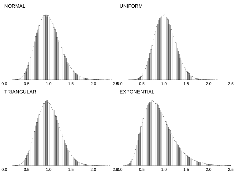
I therefore wrote a program to generate a large number of series of data from a normal distribution having σ = 1, and in each case calculate MR̄ ÷ 1.128. I chose to use baselines (series-lengths) of 12 and to generate 10 million such series. The program then drew a histogram of those 10 million estimates. That histogram is shown at the top left of page 67 and, as you can see, the values of the estimator varied from below 0.5 to above 2.0. That may well strike you as rather wider variation around the true value of σ = 1 than you might like. However, to substantially reduce that variation would require a much longer baseline. There are many arguments as to why that’s undesirable. Some reasons are discussed in detail in Section 1 of Part F (pages 71–74). A further reason which is not raised there is that, unless data are arriving thick and fast (impossible with many processes), there will a considerable delay before the control chart can begin to be used. As yet a further objection, there’s a law of decreasing returns in operation here: for example, to halve the width of this histogram would require quadrupling the baseline length to 48—wholly unsatisfactory for the numerous reasons just referred to. However, that whole issue is another matter. We are simply concerned at the moment with the Mathematical Statistician’s claim that, because that 2.66 figure depends on the assumption of a normal distribution, this method is “not valid” if the data do not fit that assumption.
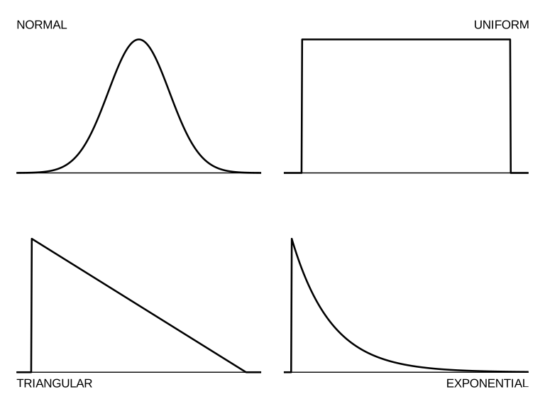
There’s an obvious way to examine this (without raising the tricky matter of exact stability not being feasible!). And that is to modify the program so as to generate data from distributions other than the normal distribution and take a look at those resulting histograms. I used the same three distributions as in the simulation study on the Central Limit Theorem (pages 51–54): the uniform distribution, the unsymmetric triangular distribution and the exponential distribution, each being in a version with σ = 1 for ease of comparison with the initial normal version. You’ve seen pictures of these distributions on pages 52–53 in Part D but, for your convenience, they are illustrated again on the next page along with the normal distribution for comparison.
The shapes of these three distributions are so different from each other (as well as from the normal distribution itself) that examining the behaviour of MR̄ ÷ 1.128 as an estimator of σ in such a variety of cases would appear to be a suitably severe test of its usefulness.
The resulting histograms are shown on page 67. Now, presumably if there were any truth in the notion that normality is necessary for the standard method of constructing control charts for one-at-a-time data to be useful, the top left histogram for the normal distribution should stand out as representing “good” behaviour while the others should be clearly “bad” in comparison. But, to put it mildly, such evidence is not easy to see! Despite its lack of symmetry, the triangular case appears to be virtually identical to the normal case while the uniform case is just a bit superior to the normal case! The exponential distribution’s histogram is a little wider but, to be honest and seeing how incredibly different that shape of distribution is from the normal distribution, I was pleasantly surprised to see how similar to the others its histogram turned out to be. The overall conclusion from this simulation exercise surely has to be that the claim of data needing to be normally distributed in order to use the 2.66 MR̄ method for constructing control charts lacks credibility.
4. “If your data are normally distributed then the probability of a false signal is 0.0027”
There was a fairly full introduction to this simulation study on pages 63–64 and so I can now move straight into the details of the study.
The main question for me to consider was what size of subgroups should I try and how many subgroups should I use in calculating the control limits? Since you have now seen something of the Japanese Control Chart in Part B, I decided to be initially guided by what the Japanese workers did. Investigating their chart which, as you will recall, used subgroups of size n = 4 throughout, it appeared that they generally used between 10 and 15 subgroups to compute the limits. Therefore I chose to use 12 subgroups of size 4 in the simulation. Next, although n = 4 is quite a common choice of subgroup size, I decided to repeat the simulation twice: once with n = 2 and then with n = 6. (It is rare to find people using subgroups any larger than 6.) After a little trial and error I found that to use one million replications each time was sufficient to produce very clear pictures. The resulting histograms are shown on the next page, and I have clearly marked the 0.0027 probability on the horizontal axes.
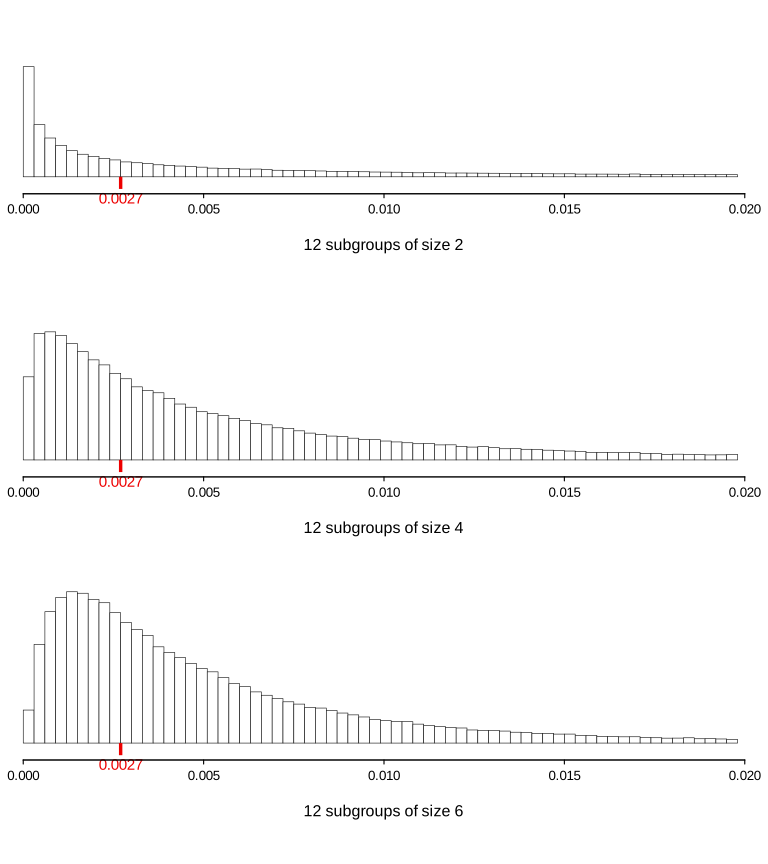
So what was all this about normality of the data implying that the probability of a false signal is 0.0027?! The histograms are very spread out. As you can see, I chose a horizontal axis which stretches from zero probability right up to 0.025 (nearly ten times 0.0027) and even that was insufficient to cover all the results!
After seeing these histograms, I could imagine some statisticians complaining that to use only 12 subgroups for computing the limits was insufficient. I therefore repeated the whole simulation using 40 subgroups instead. 40 subgroups is a far larger number than most people use in practice. Those histograms are shown on page 70.
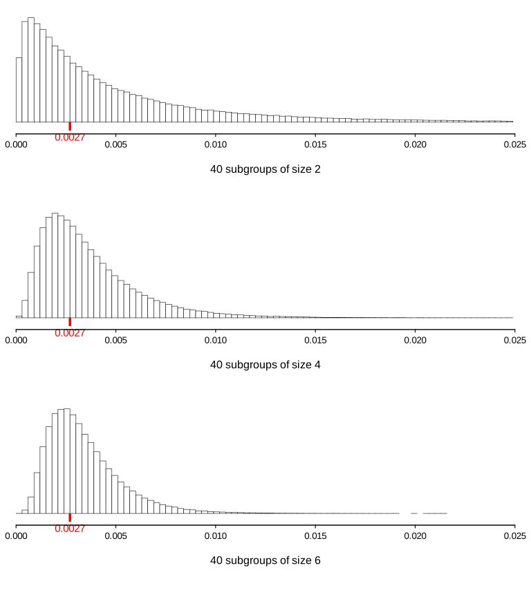
At least, with these latter histograms, one can see some evidence of the one thing we know about the values of the probability of a false signal. We can actually see that it is indeed feasible for the probability of a false signal to have a (very) long-term average of around 0.0027—admittedly not so with subgroups of size 2 but looking not unlikely with subgroups of size 4 or 6. However, this is already using far more data than is at all usual in practice. The disadvantages of using long baselines with subgrouped data are very much the same as with one-at-a-time data: recall that the latter are the subject of the first part of the Technical Section which follows on page 71.
Quite simply, if considering the probability of a false signal when using an X̄-chart, even with 40 subgroups (way beyond what is usual), really all that can be said about that probability is that it is likely to be less than somewhere between 0.01 and 0.02 depending on the size of the subgroups.
The nonsense of claiming that that probability is 0.0027 is surely plain for all to see.
The control chart as Shewhart created and developed it does not have “a fine ancestry of highbrow statistical theorems”. But it does work.
If you have read Balaji Reddie’s “Contributions”, particularly his pages 32–33 in “Some Lessons from History”, you will know that some of the content here has been based on an article that I wrote around 20 years ago: it was titled Two Superstations [sic]. A subsequent article was titled More Superstitions. However, unlike what we have covered here, that further article involved not control charts but the topic known as “six-sigma” quality. Despite this, Balaji was very keen that I also make this article available to 12 Days to Deming students since he had found it to be of particular interest to his own students and other contacts. If you also might be interested, you will find it beginning on Appendix page 43.