MORE ON THE “SALES DATA”
~ 8 min reading · ~ 40 min at Neave’s pace
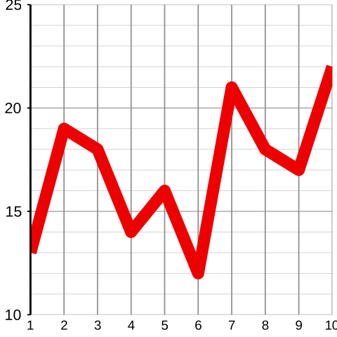
Now, also as previously promised, let’s return to the illustrative example with which we started Day 2. So, if you need to, take a quick look back at the first three pages of Day 2 to remind yourself about what happened there. We finished up with the run chart alongside of ten supposed monthly sales figures for a new product.
Describe this chart
A run chart of the ten “monthly sales figures” carried over from Day 2 (13, 19, 18, 14, 16, 12, 21, 18, 17, 22). The line zig-zags up and down — reaching a low of 12 in Month 6 and a high of 22 in Month 10. The eye reads a story (decline, recovery, success); the All-Knowing knows there is no story to read here.
First, a short Pause for Thought:
Furthermore, doesn’t that type of management behaviour remind you of what you were doing yesterday when playing the part of the Foreman in the Red Beads Experiment? With the sales data, the management team interpreted every month’s figure “in its own right”. On some occasions it was bad news, requiring immediate and possibly expensive action. On other occasions it was good news and so they could breathe easily again. The Foreman moaned about high numbers of red beads and came up with “reasons” for them. He praised the low numbers of red beads and found reasons for them too. Did any of this make any sense from the All-Knowing’s viewpoint? Remember that the All-Knowing genuinely understood everything there was to know about the process which was producing the data (an exceptional privilege!).
Let’s gather together some thoughts. What might our basic learning about variation tell us? One crucial matter which is (a) obvious but (b) largely ignored by those who lack such basic learning is that all but the most trivial of processes exhibit some variation. Thus, as I said in my comment on yesterday’s Pause for Thought 2–a (Day 2 page 4), the figure being recorded will indeed usually either go up or down! That being the case, greater attention needs to be paid not to whether the figure goes up or down but to how far the figure goes up or down. Now, the management team did this to an extent, but only to a relatively small extent. And, without the use of control charts, that is what usually happens. Even if people appreciate that processes do indeed have their own inherent variation (the common-cause variation) the truth is that, without using a control chart, they almost always underestimate how large it is (recall my first additional learning-point from the Red Beads Experiment on Appendix page 10). Thus they are still largely prone to the effect shown in the Ford example: increasing variation as opposed to doing anything useful. The only reliable way to assess the order of magnitude of the common-cause variation is to use a control chart.
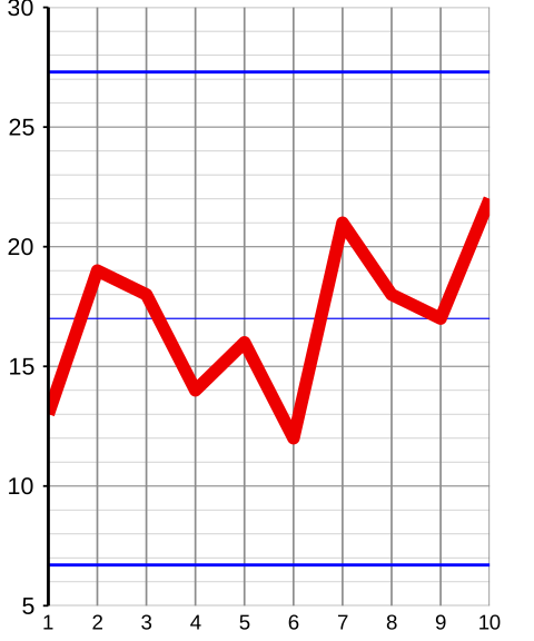
So let’s now carry on as we did through much of yesterday with the various sets of Red Beads data: let’s now upgrade the run chart to a control chart by inserting control limits.
With that build-up, the control chart on the right should perhaps be less of a surprise than if I had shown it to you yesterday before you began learning from the Red Beads Experiment. Look where those control limits are in relation to the data!
Returning to the question at the bottom of the previous page (concerning the All-Knowing’s viewpoint), did any of the management team’s interpretations of the data, and did any of the Foreman’s interpretations of the numbers of red beads in the Red Beads Experiment, make any sense to the Un-Knowing? Remember that, though knowing nothing about the process itself, the Un-Knowing did understand how to interpret a control chart!
Describe this chart
The same ten “sales” values from above, now upgraded to a control chart with control limits and a thin blue Central Line at the average (17). All ten points lie comfortably inside the limits — the process is in statistical control. The reveal that lands later: these were not sales figures at all. They were the totals from throwing five ordinary dice. The management’s elaborate story-building was applied to pure random noise.
All the data are happily contained within the control limits. The indication from the control chart is that, as in the Red Beads Experiment, this process is stable, in statistical control. According to the control chart, there is no evidence that the point-by-point interpretations of the data as carried out by the management team made any sense whatsoever.
But remember, as I emphasised in Pause for Thought 2–a, “these were not real sales figures, and this was not a real management team”. Why did I use artificial data rather than real sales data? That will now become clear.
As a minor point of detail, notice the thin blue line in the middle of the chart. This is the “Central Line” representing the average of the data-values from which those control limits have been computed. More often than not, people do include the Central Line on their control charts. Dr Deming did not bother with the Central Line when control-charting Red Beads data, and neither did I. It is nowhere near as important as the control limits. Nevertheless, following common practice, we shall usually include it from now on.
Here I am able to become the “All-Knowing”—because I know where these data originated. In fact, if you happen to have a copy of the second edition of my Elementary Statistics Tables (abbreviated on Day 1 by EST) then you might be able to find them for yourself! For those data are in fact the first ten of the 50 data from one of three case studies included there (see EST page 48, Figure 1). Yes, those data do come from a process, though not a sales process. They come from a process of … throwing dice! Those ten data are the total spots which showed when I threw five ordinary dice.
These really were “honest” data—I didn’t keep on throwing the dice until I obtained a sequence which would make a good story! Indeed, it didn’t even occur to me to use these data for such an illustration as this until some considerable time after the new edition of EST was published.
Apologies if all this seems to have been something of an elaborate hoax—although I have given you plenty of clues that all might not be as it seemed! There was a very important point for me to re-emphasise following yesterday’s work on the Red Beads Experiment, and this seemed a good way of doing it. It’s simply this:
If your data are typical of what you would get if you were just throwing dice (or using some other similarly “random” mechanism), what justification is there in trying to interpret individual figures from that process?
Try to argue with this if you will—but, if these data are all that you have, the answer is: none! And this is precisely the kind of sensible conclusion that the control chart encourages you to make, and then helps you to make it.
Incidentally, you may have noticed that every control chart you have seen so far has indicated that the relevant process is stable. Maybe you have begun to think that all control charts show statistical control! This will be immediately remedied at the start of the “Six Processes” section on page 19.
NB We have now reached the stage where I strongly advise Stats-level 0 students and, even more so, Stats-level 00 students not to work hard at the following pages. Even higher Stats-level students will be hard-pressed to take in everything on these pages at a first reading. So, really, I definitely recommend everybody to spend no more time here than the clock icons advise. Just get a flavour of what’s here for now, and then return to study it more carefully at some time in the future when you start collecting and analysing your own real-life data. The material on pages 13–34, starting with How Do We Compute Those Control Limits is effectively extra-curricular—it is not used anywhere within the course after today. But I believe it will prove valuable to you when the time comes for you to start constructing and interpreting your own control charts.
PAUSE FOR THOUGHT 3–f
Does the Ford example from earlier today (pages 5–6, at the Ford Motor Company) suggest to you any concerns about the management’s interpretation of yesterday’s monthly sales data (Day 2 pages 1–3), the conclusions they drew, and the decisions they made?
This is not an exact analogy with the Ford example because, in that case, there was an “ideal” or “target” value, and the compensation device acted according to whether the value was above or below the target. Nevertheless, the management’s behaviour here was somewhat analogous—generally acting one way if the figure went up and another way if it went down. The suspicion which the Ford example might therefore raise in our minds is that maybe such reactions could actually have increased the variation in the figures.