OUR FIRST CONTROL CHART
~ 6 min reading · ~ 25 min at Neave’s pace
We have now seen our first set of what were referred to yesterday as “process data” (other than the set illustrated on today’s first page). We certainly have a process: meticulously defined by the Foreman during the training period. And we have some time-ordered data from that process: the 24 consecutive numbers of red beads recorded by Dec, the Recorder, in his table on page 11, in A Brief Overview.
Thus, recalling some of what was introduced on Day 1, it is reasonable to think of developing a control chart of these data. The control chart has a pretty good track-record of telling the truth about a process or, at least, providing guidance on where it is sensible to look for the truth.
So the Recorder in the Red Beads Experiment has a final task to complete: to draw a control chart of the data he has just been recording. Unfortunately, although I retained the tables of data written up by the Recorders at my seminars, I did not retain their control charts. Thus, as I am not able to show you Dec’s own control chart, I will now construct it myself.
Here again are the numbers of red beads from the experiment, now for convenience printed in time order as a single row rather than the layout in Dec’s table:
7 10 11 11 12 11 11 8 10 9 12 15 3 10 10 10 9 6 6 13 10 6 14 11
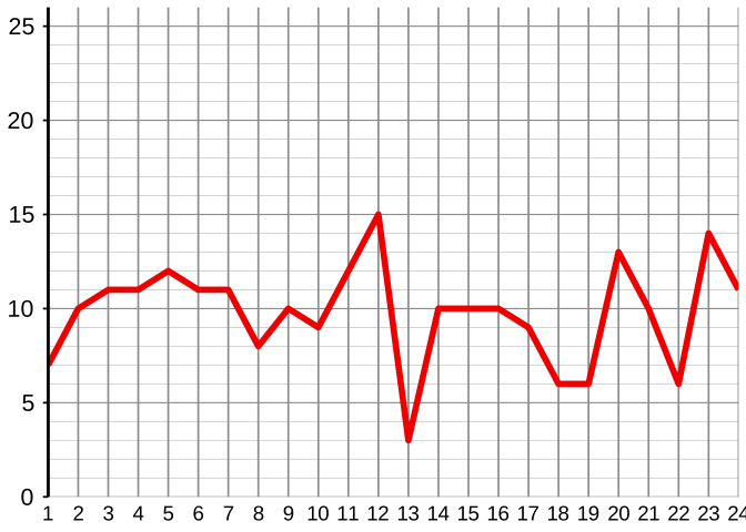
There are two stages in constructing a control chart. The first stage is simply to draw a run chart of the data; so here it is:
Describe this chart
A run chart of all 24 red-bead counts in time order, with no control limits yet. Most points lie between 6 and 12. Two points stand out from the rest: the value of 15 at point 12, and the value of 3 at point 13 — both in the middle of the series. To the eye, the chart looks busy but unstructured; without control limits, it is hard to say whether anything in it is genuinely unusual.
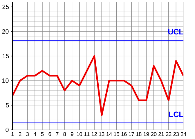
The second of the two stages which then completes the control chart is to place a couple of horizontal lines on the run chart: the control limits. The Foreman gave Dec a card on which he had written the method for finding out where these control limits should be drawn. After pressing a few keys on his calculator, Dec came up with the values 1.4 for the Lower Control Limit (LCL) and 18.2 for the Upper Control Limit (UCL). So here is the resulting control chart:
Describe this chart
The same run chart as above, now with two horizontal lines added: the Lower Control Limit at 1.4 and the Upper Control Limit at 18.2. All 24 points, including the 15 and the 3, lie between the two lines.
If you have classified yourself at Stats-level 1 or above then there will soon be a couple of Technical Aids which will enable you to compute the control limits shown above. If you are at Stats-level 0 then please don’t bother with those Technical Aids: just concentrate on what is really important, namely how to interpret the chart and what to deduce from it once it has been drawn. That is what follows here.
Let’s recall a couple of short extracts from Day 1. Firstly from Day 1 page 5, when discussing what is meant by “understanding variation”, we had:
“In a nutshell, understanding variation is to do with being able to justifiably describe the behaviour over time of processes or systems of any kind by words such as ‘stable’ and ‘predictable’ or, on the other hand, ‘unstable’ and ‘unpredictable’ … the control chart is the invaluable tool which best enables us to discriminate between those two states. The ‘official’ terms for the two states that you will find both Drs Shewhart and Deming using are respectively ‘in statistical control’ and ‘out of statistical control’ although, in the former case, Deming also often refers to a ‘stable system’.”
And then on Day 1 page 33, to emphasise the point, the ninth of the ten Shewhart “bare bones” was:
“The purpose of Shewhart’s control chart is to help us to discriminate between the two states: is the process in or out of statistical control? Without it, it’s often not as easy as it might sound.”
Having now seen our first control chart, it won’t be difficult for you to guess how it helps us to discriminate between the two states. The simplest guidance (which was pretty much all that Dr Deming gave in his seminars) is that if all the points lie between the two control limits then he would judge the process to be in statistical control (stable). Otherwise the indication is that the process may well be out of statistical control, and so then it could be worthwhile to try to identify special causes: the situations where points go outside the control limits will be good places to start looking.
Now, I rather liken this basic guidance on interpreting a control chart to how you are taught to drive a car in order to pass the official driving test. You obey the speed limits, and you give all the proper signals (whether or not there is anybody behind to see them). However, having passed the test, it is a rare driver who continues to obey all such rules to the letter—indeed, it can be rather annoying for others to be stuck behind a vehicle whose driver is doing so! As a second illustration, if you have just bought an electrical or petrol-driven tool to use for woodworking or in the garden, you would probably be wise to start by obeying all the instructions in the leaflet which accompanies the tool. Subsequently however, as you gain experience, you are likely to bend the rules some of the time. The control chart is also a tool, albeit a statistical tool rather than an electrical or petrol-driven one. So tomorrow I’ll suggest some thoughts on how you might judiciously amend the basic guidance as you become a more experienced user of this tool.
As a new user of the control chart, here is your obvious Pause for Thought:
Are you startled by what the control chart has just told you? Fear not: all will be revealed!
PAUSE FOR THOUGHT 2–e
What does the control chart on page 15, above tell you?
(For brief but very important discussion, see Appendix page 7 one more time.)