Appendix O — PART D — A CRASH-COURSE IN CONVENTIONAL STATISTICS
PART D: A CRASH-COURSE IN CONVENTIONAL STATISTICS!
~ 38 min reading
Histograms and sample statistics
We’re starting off on quite familiar ground, particularly if you have read Part B of these Optional Extras, and so this first section is very short.
From the practical viewpoint, one could simply express the prime purpose of Statistics as being “data analysis”. So let’s suppose we have available for analysis a random sample of data (in the sense described on page 17) taken from some “population” of values. Alternatively, our data might consist of the results from repeated trials of some experiment, operation or procedure, etc. What can the data tell us about that population or other source from which they’ve been drawn? To get some idea about that, the first thing you might well do is to construct a histogram of those data, as you have seen and done on Day 3. You will see many more histograms in this crash-course.
Secondly, the term “sample statistics” simply refers to any quantities that can be computed from the data. We have already discussed some sample statistics in the “Calculations on a subgroup” section in Part B (beginning on page 17) although I didn’t use that term there. So again I need say very little here. However, at the time I did give you the option of skipping that section. If you accepted that option then I’m afraid I must now ask you to go back to it, for quite a lot that I would otherwise have had to include here is all there. You won’t have to read the whole section, but you will need to read the first two pages: you can stop once you’ve read the paragraph in the middle of page 19 which introduces the “variance”.
Probability
The conventional statistician regards Probability as the branch of Mathematics on which the subject of Statistics is based.
The idea of the probability of an event occurring in some particular situation is often described in terms of the long-term proportion of occurrences of that event, implying (conceptually at least) that it is possible to repeat the situation being envisaged under the same conditions ad infinitum.
That is, of course, a far more exacting notion of stability than is considered in the control-charting context; and so, when necessary to avoid ambiguity, I shall refer to the situation now being described as that of “exact stability”.
Many examples of probability calculations, both at the introductory stage and later, make use of considerations of symmetry, which is where all the various possible outcomes are regarded as being equally likely to occur. Common illustrations in the introductory texts are the two sides of a coin, the six faces of a die, and the 52 playing cards in a “well-shuffled” deck.
Linking it all together
Now comes a master-stroke in the introductory conventional Statistics course: to combine the ideas presented above into a unified theory so as to create a basis of probability for results obtained from sampling.
Let’s demonstrate by means of a very simple example: the number of Heads obtained when two coins are tossed. Assuming that the coins obey the mathematical ideal of an exactly 50–50 chance of Head or Tail every time they are tossed, it follows that, when both are tossed:
\[ \begin{aligned} \text{Probability of no Heads} &= \tfrac{1}{4} \\ \text{Probability of 1 Head and 1 Tail} &= \tfrac{1}{2} \\ \text{Probability of 2 Heads} &= \tfrac{1}{4} \end{aligned} \]
A typical way of verifying this (if you need one) is as follows. Suppose we label the coins as A and B. Then there are four possible outcomes, all equally likely. They are:
| Coin A: | Head | Head | Tail | Tail |
| Coin B: | Head | Tail | Head | Tail |
In other words, each of these four possibilities occurs a quarter of the time in the long run, i.e. each one of the four possibilities has probability \(\tfrac{1}{4}\). This easily translates into the above probabilities since the event “1 Head and 1 Tail” corresponds to two of the four equally-likely possibilities. We can draw a picture of these three probabilities where, similarly to a histogram, heights or areas are proportional to the probabilities:
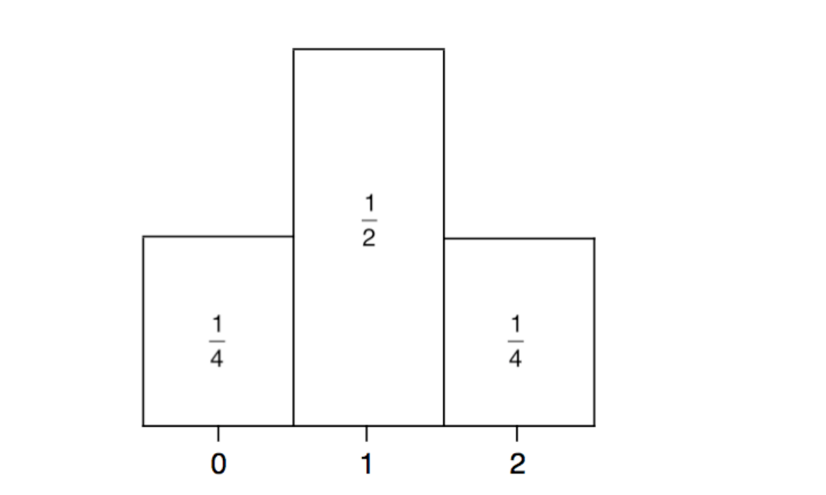
Note that these three probabilities add up to 1, as of course is bound to be true in any situation when adding up the probabilities of all possible mutually exclusive outcomes. So, in terms of such a picture of probabilities (whether the situation being described is simple like this one or far more complex), the total area contained in any such picture must be 1.
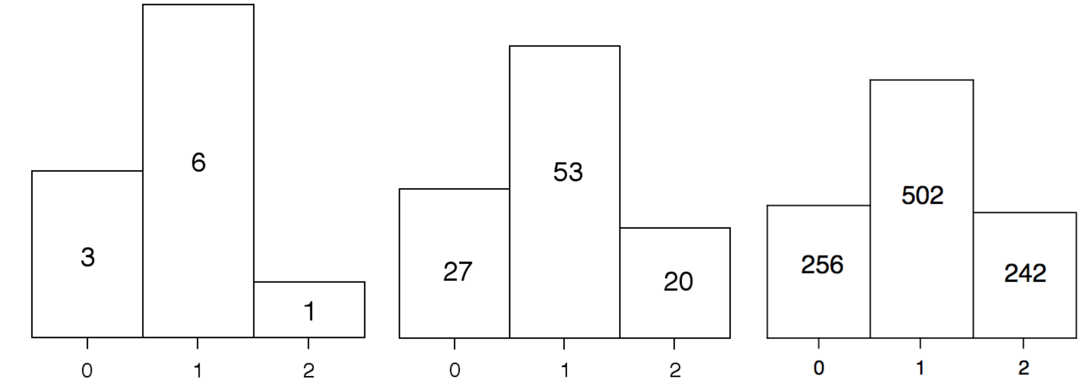
Now suppose we toss the two coins several times, keeping track of how often we get no Heads, one Head, and two Heads. Here are some typical results. After tossing the coins ten times, we might have:
| 0 Heads: | 3 times |
| 1 Head: | 6 times |
| 2 Heads: | once |
Then, after 100 tosses, we could have:
| 0 Heads: | 27 times |
| 1 Head: | 53 times |
| 2 Heads: | 20 times |
And after 1,000 tosses, the results might be:
| 0 Heads: | 256 times |
| 1 Head: | 502 times |
| 2 Heads: | 242 times |
Here are the histograms corresponding to those three sets of data (with vertical scales adjusted so that the pictures are comparable with each other):
However, following what we just observed about the total area contained within pictures of probabilities, it is more useful to include the proportions of times each possibility occurred, as that will then immediately enable us to see approximations or estimates of the probabilities of the outcomes. In the following pictures, the proportions are expressed in terms of decimals rather than fractions as that will make it easier to see what is happening numerically as well as pictorially. Yet another advantage of using proportions is that we then have no need to worry about adjusting the vertical scales: the areas now automatically add up to 1.
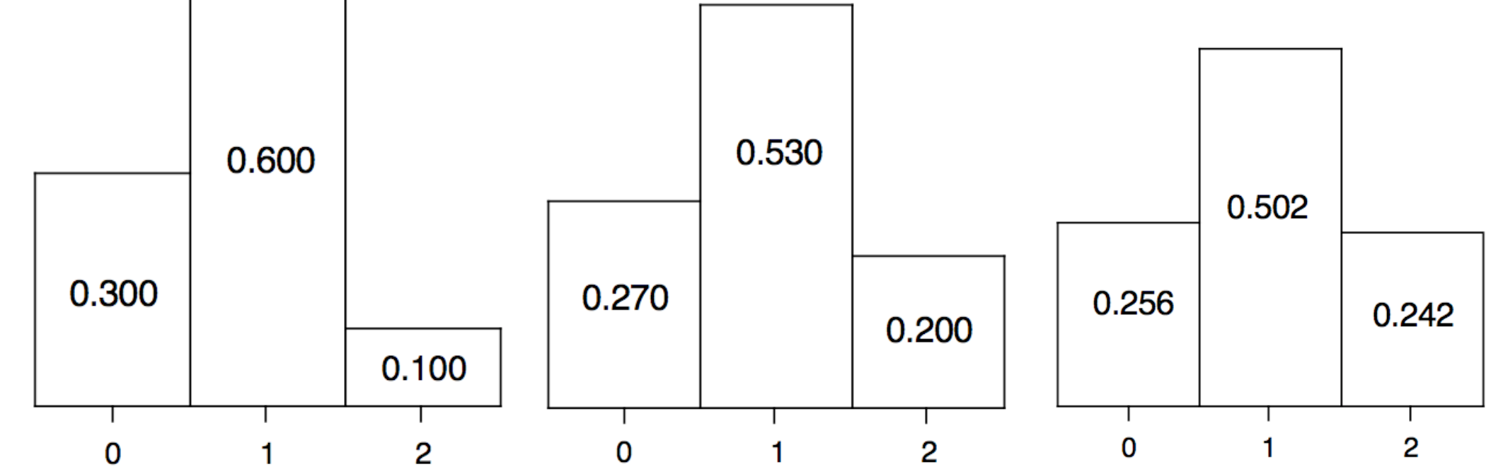
Notice how, with sample size \(n = 10\), the picture is noticeably different from the picture of probabilities on the previous page but that, by the time we reach \(n = 1,000\), the shape has become very similar to that picture of probabilities. So the histogram of the data gets closer and closer to the picture of the actual probabilities as the amount of sampling increases. This is no surprise: it is simply a natural consequence of considering probabilities as “long-term proportions of occurrences”.
That link between the picture of the probabilities and the histograms as the amount of sampling increases has its parallel with the sample statistics. Let’s consider the sample mean \(\bar{X}\). Our sample of size 10 consisted of 3 zeros, 6 ones and 1 two. Clearly, adding up these ten numbers gives us 8, and so \(\bar{X} = 8 \div 10 = 0.8\). With the sample of size 100 we had 27 zeros, 53 ones and 20 twos. Adding up these 100 numbers gives 93, and so \(\bar{X} = 93 \div 100 = 0.93\).
Before proceeding to the final case, let’s note something that will be important a little later. This is that, in the two cases so far considered, the calculations can be written respectively as
\[ \bar{X} = 0 \times \tfrac{3}{10} + 1 \times \tfrac{6}{10} + 2 \times \tfrac{1}{10} \quad\text{and}\quad \bar{X} = 0 \times \tfrac{27}{100} + 1 \times \tfrac{53}{100} + 2 \times \tfrac{20}{100}. \]
You can easily verify that, in the final case, the 1,000 numbers add up to 986 but, for the moment, building on what I have just pointed out, let’s simply write \(\bar{X}\) as
\[ \bar{X} = 0 \times \tfrac{256}{1000} + 1 \times \tfrac{502}{1000} + 2 \times \tfrac{242}{1000}. \]
Probability distributions, particularly the binomial distribution
Portrayal of the probabilities of all possible individual outcomes in the situation being considered, either as a picture like that on page 38 or just the numbers on which that picture is based, leads us to the idea of a probability distribution. That coin-tossing case of
\[ \begin{aligned} \text{Probability of no Heads} &= \tfrac{1}{4} \\ \text{Probability of 1 Head and 1 Tail} &= \tfrac{1}{2} \\ \text{Probability of 2 Heads} &= \tfrac{1}{4} \end{aligned} \]
is a simple example of an important type of probability distribution known as the binomial distribution. Some other types of probability distributions are often included in an introductory course, glorying in such names as Poisson, geometric, hypergeometric, uniform, exponential and, as you already know, normal.
The above link between probability distributions and histograms immediately raises the idea of a probability distribution having its own mean and standard deviation. What we have seen is that, as the number of data represented in the histogram increases, that picture becomes more and more like the picture of the probability distribution. Correspondingly, the probability distribution’s mean and standard deviation can be described as the “long-term” values of the histogram’s mean and standard deviation as the sample size becomes ever-larger. These “long-term” values of the mean and standard deviation are almost universally denoted respectively by the Greek letters μ (pronounced “mu”) and σ (you know how this one is pronounced: “sigma”). The mathematician talks of defining μ and σ (and σ²) as the limiting values of the histogram’s mean and standard deviation (and variance) as the sample size tends to infinity, using the symbolism:
\[ \bar{X} \to \mu \;\text{ as }\; n \to \infty \quad\text{and}\quad s \to \sigma \;\text{(or equivalently }s^2 \to \sigma^2\text{)}\; \text{as } n \to \infty. \]
Such symbolism often looks pretty scary to newcomers but, as you can see, its purpose is simply to provide a mathematical “shorthand” to prevent mathematical derivations and proofs becoming inconveniently wordy and cumbersome.
Let’s take another look at the calculations of the sample mean \(\bar{X}\) at the end of the previous section. You saw that we finished up writing them like this:
\[ \begin{aligned} \bar{X} &= 0 \times \tfrac{3}{10} + 1 \times \tfrac{6}{10} + 2 \times \tfrac{1}{10} = 0.800, \\ \bar{X} &= 0 \times \tfrac{27}{100} + 1 \times \tfrac{53}{100} + 2 \times \tfrac{20}{100} = 0.930, \\ \bar{X} &= 0 \times \tfrac{256}{1000} + 1 \times \tfrac{502}{1000} + 2 \times \tfrac{242}{1000} = 0.986. \end{aligned} \]
Can you see what’s happening? We are multiplying each possible value by the proportion of times that it occurs. But it is those very proportions that get closer and closer to the probabilities of those values occurring. So imagine we toss the coins 10,000 times, 100,000 times, 1,000,000 times and so on. Surely our calculation will get closer and closer to:
\[ \bar{X} = 0 \times \tfrac{1}{4} + 1 \times \tfrac{1}{2} + 2 \times \tfrac{1}{4} = 1, \]
i.e. it’s the sum of the values multiplied by the probabilities that those values occur. Ah, so to compute μ we don’t need to do all that sampling after all! We can simply calculate it directly from the probabilities.
Let’s develop the same theme to find the standard deviation σ or the variance σ² of this simple binomial distribution. So now we want to find the long-term value of \(s\) or of \(s^2\) as \(n \to \infty\). I suggest we copy the mathematicians here and focus on the variance: it will avoid having square root signs all over the place. We can compute the variance first and then simply take its square root to immediately get the standard deviation.
If we think of this in terms of tossing the coins thousands or millions of times, it all looks rather messy! E.g., suppose we look at the situation where we have the above results from tossing the two coins 1,000 times. Recall what \(s^2\) is: look back at Steps (b) and (c) of the four-step procedure on pages 18–19. At that stage our value of \(\bar{X}\) is 0.986, and so “the sum of the ‘squared gaps’” \(\div (n-1)\) would be:
\[ s^2 = \tfrac{1}{999}\Big\{(0 - 0.986)^2 \times 256 \;+\; (1 - 0.986)^2 \times 502 \;+\; (2 - 0.986)^2 \times 242\Big\} \]
or, if you like,
\[ s^2 = (0 - 0.986)^2 \times \tfrac{256}{999} \;+\; (1 - 0.986)^2 \times \tfrac{502}{999} \;+\; (2 - 0.986)^2 \times \tfrac{242}{999}. \]
No: I don’t intend to compute that unpleasant sum! We don’t need to. Let’s see what happens as \(n \to \infty\). First, as we saw above, \(\bar{X}\) gets closer and closer to the distribution’s mean, i.e. to μ = 1. And, secondly, the fractions (the proportions of occurrences) get closer and closer to the probabilities. So, in the limit (as the mathematicians would say), that unpleasant expression simply becomes:
\[ \sigma^2 = (0 - 1)^2 \times \tfrac{1}{4} \;+\; (1 - 1)^2 \times \tfrac{1}{2} \;+\; (2 - 1)^2 \times \tfrac{1}{4}. \]
That’s better—much easier arithmetic! It simply boils down to \(\sigma^2 = \tfrac{1}{2}\). So then taking the square root gives us \(\sigma = 1 \div \sqrt{2}\), which is equal to 0.707.
Finally for this section, let’s take a look at another example of a binomial distribution. Incidentally, as you may have realised, “bi-nomial” implies “two names”. A binomial distribution always concerns situations or experiments or trials, etc where the possible outcomes can simply be regarded as of just two types, let’s say S and F, and we are interested in the probabilities that S occurs \(x\) times (and F occurs the remaining \(n-x\) times) in \(n\) trials for all the possible values of \(x\). I’ve used S and F there because teachers often talk in terms of “Successes” and “Failures” in this context.
Let’s suppose we throw three dice (or, what comes to the same thing) one die three times. What is the probability of there being no sixes, or 1 six, or 2 sixes, or 3 sixes? No need to bother with sampling and histograms now: let’s head straight for the probabilities. We are, of course, assuming that the dice are “fair” so that, in particular, the probability of a six occurring when a die is thrown is \(\tfrac{1}{6}\).
Since each of the three dice produces a six with probability \(\tfrac{1}{6}\), the probability of all three dice showing a six is surely \(\tfrac{1}{6} \times \tfrac{1}{6} \times \tfrac{1}{6} = \tfrac{1}{216}\). Almost as easily, the probability that no die finishes up as a six is \(\tfrac{5}{6} \times \tfrac{5}{6} \times \tfrac{5}{6} = \tfrac{125}{216}\).
But what about the probability of there being exactly one six out of three? Here it’s easier to think of one die being thrown three times. There are three different ways of getting exactly one six: either the first throw produces the six and the other two throws do not produce a six, or the single six occurs on the second throw, or it occurs on the third throw. Using the S and F notation, we could therefore have either SFF or FSF or FFS. So, with the probability of S being \(\tfrac{1}{6}\) and of F being \(\tfrac{5}{6}\) and using the same kind of multiplication technique as above, the probability of SFF is \(\tfrac{1}{6} \times \tfrac{5}{6} \times \tfrac{5}{6} = \tfrac{25}{216}\). The same result will be true of both FSF and of FFS since you’ll still be multiplying the same fractions together; they’ll just be in a different order. Then the probability of there being exactly one six is therefore \(3 \times \tfrac{25}{216} = \tfrac{75}{216}\).
Finally, what is the probability of there being exactly two sixes? We could produce a similar argument as in the previous paragraph, but there is a neater way. Since all the four probabilities (of 0, 1, 2 and 3 sixes) must add up to 1, the probability of two sixes is equal to (1 minus the three probabilities we have just computed), i.e. \(1 - \tfrac{1}{216} - \tfrac{125}{216} - \tfrac{75}{216} = \tfrac{15}{216}\). Job done!
So we have finished up with:
| Probability of 0 sixes = \(\tfrac{125}{216}\) | Probability of 1 six = \(\tfrac{75}{216}\) |
| Probability of 2 sixes = \(\tfrac{15}{216}\) | Probability of 3 sixes = \(\tfrac{1}{216}\) |
For practice, you might like to verify that the mean μ of this binomial distribution is equal to \(\tfrac{1}{2}\) and its variance σ² is equal to \(\tfrac{5}{12}\) (and so, taking the square root, σ = 0.6455).
A more organised way of dealing with all binomial distributions is presented in the Technical Section on pages 85–89.
I appreciate that, at this stage, the standard deviation σ of a probability distribution may not mean a great deal to you! But its importance will become more apparent as we now move on to the next section where we introduce the famous “normal” distribution.
In Statistics books and courses you will often see the term “random variable”, and I shall also use this term from time to time later in this material. A “random variable” just means a variable (like the number of Heads or the number of sixes in the recent examples) whose behaviour is governed by a probability distribution. The adjective “random” is used to distinguish it from variables in algebra and elsewhere which do not have any such connection with probability.
Continuous probability distributions, particularly the normal distribution
Probability distributions divide themselves into two types depending on what kind of data they represent. So far, we have only been considering what we might call “count data” since the values are obtained by counting something, e.g. the number of Heads when coins are tossed or the number of sixes when dice are thrown (or we could also be considering the number of red beads in the paddle). Count data are a common type of so-called “discrete” data, where “discrete” indicates that all possible values of the data are at a “discrete” distance from each other. Thus, indeed, so far we have only been working with discrete probability distributions, of which the binomial distribution is a particularly important example. The other type of data is “continuous” data: these usually arise from a measurement operation as opposed to a counting operation. Obvious examples are lengths, weights, times, etc. In such cases the relevant probability distributions are, as you would expect, called “continuous” probability distributions.
So, when we have continuous data, can we copy what we did with discrete data such as when we were examining the number of Heads when two coins are tossed? That is, can we collect various amounts of data, form histograms of those data as we did on page 39, and see those histograms approaching a picture of a probability distribution such as the one we saw on page 38? The answer is partly Yes and partly No. The devil, as people say, is in the detail. There are both some important similarities and some important differences in the continuous case compared with the discrete case.
For example, in the discrete case our approach was to obtain approximations for the probabilities of each of the various possible values as the proportion of times that each value occurs in quite a large amount of sampling. But in the continuous case (would you believe?!) it actually doesn’t even make sense to talk about the probability of any particular value occurring. Let’s see why.
Suppose that you are taking readings of your body temperature once a day. You might just be taking very rough readings as a simple check that nothing untoward is happening to you. Let me interpret “very rough readings” as simply noting your temperature in degrees Celsius to the nearest integer (whole number). All being well, you will probably get 37°C most of the time, with 36°C some of the time, 38°C now and again, and anything else pretty rarely. But what does “37°C” really mean in this situation? To repeat, you’re recording the temperature “to the nearest integer (whole number)”. Therefore “37°C” actually implies that your temperature lies somewhere in the interval between 36.5°C and 37.5°C. So then it’s quite reasonable to get “37°C most of the time”.
However, it is more usual to read body temperatures to one place of decimals. So in that case, on the occasions when you record exactly 37°C (which, to one place of decimals, we should now write as 37.0°C), this actually implies that your temperature is somewhere between 36.95°C and 37.05°C. And if you had had a more expensive thermometer that can read temperatures accurately to two places of decimals then, of course, “exactly 37°C” should now be written as 37.00°C and would imply that the temperature is somewhere in the very narrow interval from 36.995°C to 37.005°C. Those three interpretations of “exactly 37°C” would obviously yield very different probabilities. Thus, as I’ve indicated, to consider the probability that the temperature is 37°C doesn’t really make sense—so it wouldn’t make much sense to try to estimate it! In fact, as you can see, the greater the precision, the smaller is the interval surrounding whatever number we record, and so the smaller the probability of recording that particular number. And it’s not just a little smaller; you can probably see that the probability of recording exactly “37°C” reduces by something of the order of 90% for each extra decimal place! The obvious but possibly worrying conclusion is that the probability of recording “exactly 37°C” (or any other precise value) rather rapidly heads toward 0 as we improve the precision of our measurements! That doesn’t mean it’s impossible, but it does mean that’s it’s something which would only happen just “once in a blue moon”, as the saying has it.
On the other hand, although this demonstrates what we can’t do in the continuous case, it also shows us what we can do. That is to consider probabilities of the measurement lying in any specified interval. And indeed, that is what is essentially always done when we have a continuous probability distribution.
This is therefore all quite opposite to the discrete case in which the probability distribution actually consists of evaluating the probabilities of each and every possible value (or showing a picture of those probabilities). So what form does the “probability distribution” take in the continuous case? What happens if we collect data and form histograms as we did before? One thing I will warn you about in advance: you would need to collect a lot more data than in the discrete case. That takes it rather outside the range of what you could envisage doing manually. If you had had the time and the patience, you could have tossed those two coins 1,000 times to get results like you saw on pages 38–39. With similar time and patience you could similarly have thrown three dice 1,000 times and counted the number of sixes.
Going by the results for tossing the two coins, it looked as if a sample size of 1,000 was quite sufficient to get a fairly accurate picture of the probability distribution. You’d have probably found the same had you thrown three dice 1,000 times. But, as you’ll soon see, the amount of data needed in the continuous case to get a close approximation to the probability distribution is of a different order of magnitude. However, we can get there eventually.
Since manual sampling is now effectively out of the question, we’ll need to resort to computer simulations (and it won’t be the last time in these Optional Extras). For many decades there have been well-known and well-tested methods available for generating data from any probability distribution (discrete or continuous). This current section is focused on what I often describe as “the statistician’s favourite” distribution (and understandably so): the normal distribution. So, for illustration, let’s use the above case of measuring body temperature; we’ll suppose that the temperature is normally distributed, and see what happens.
Let’s start as suggested above by measuring the temperature to the nearest degree Celsius. As I said, you would usually get 36°C, 37°C or 38°C (unless you are suffering from a fever or some other medical condition). You could get an occasional 35°C or 39°C, but that would only be very occasionally—unless you have a problem.
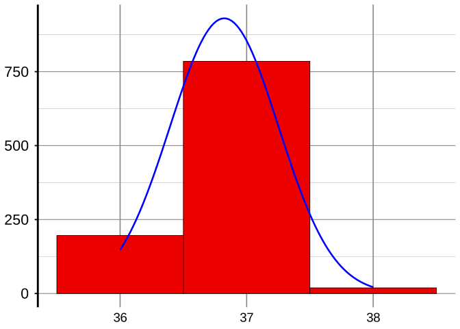
So, following on from the previous illustrations, let’s first consider a sample of size 1,000. (We’ll have to forget the situation previously suggested of daily readings since 1,000 is already close to three years of data, and we’re going to need a lot more than that!). The computer simulation that I wrote produced the following histogram (I’ve used much wider boxes than previously because of what will soon develop):
Now, of course, this picture is somewhat reminiscent of the example of tossing two coins, except we must remember that the 36, 37 and 38 are no longer counts but measurements rounded to the nearest integer. Nevertheless, it would be quite reasonable to deduce from previous work that, to this rather crude level of precision of “the nearest integer”, this picture gives a quite reasonable approximation to the probabilities of observing those integer values. But, just to be sure, I then got the program to generate a sample of size 10,000 readings and draw the resulting histogram. Here it is:
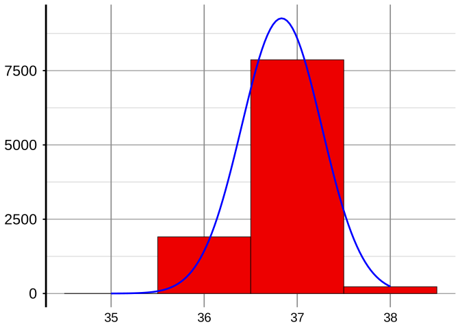
If you look very closely, you will see that this isn’t quite the same as before, although it is pretty similar. If you’re interested, the exact proportions of 36, 37 and 38 with sample size 1,000 were respectively 0.176, 0.801 and 0.023, and with sample size 10,000 were 0.1928, 0.7855 and 0.0217.
But, obviously, this does not give us much of a clue about what would happen if we recorded the temperatures to a more sensible level of precision. So let’s move on to recording them to one place of decimals. Here’s the histogram for those first 1,000 observations when measured to one decimal place:
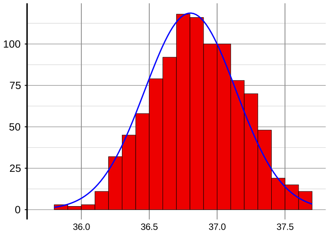
OK, that gives us more of an idea, but this picture is rather ragged. So let’s try 10,000 observations; this is what I got:
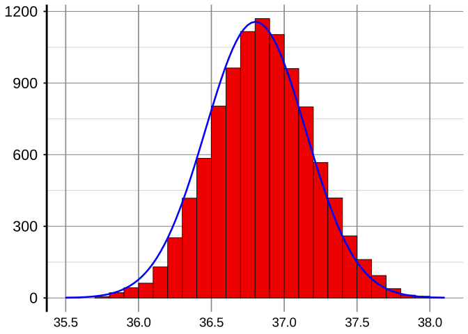
Good: that’s a better picture—now we have some reasonable idea of what’s going on. Thus encouraged, let’s try recording those same 10,000 temperatures to two decimal places:
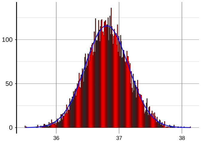
Although this somewhat matches what we were seeing before, we’re again back to a rather ragged picture. So let’s give the computer a little more work to do and try a sample size 100,000:
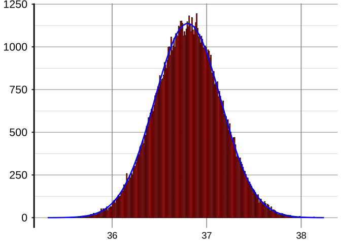
Less ragged, but computer time is cheap these days, so let’s go up to 1,000,000 observations:
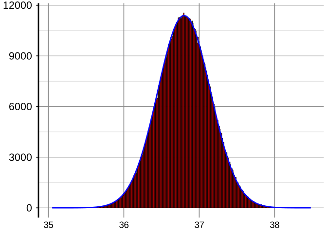
Still just a little wobbly, especially at the top, so we’ll go for one more picture. With 10,000,000 as our sample size we get:
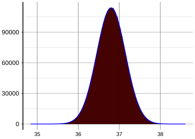
I think that’s good enough—if you’ve ever seen a picture of a normal distribution then I think you’ll recognise it!
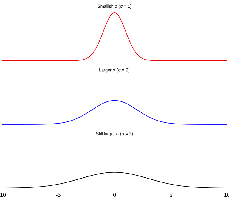
But which in the whole family of normal distributions is it? It so happens that there is one, and only one, normal distribution for each feasible choice of the mean μ and standard deviation σ. (This characteristic is actually not shared by all families of probability distributions.) As you would expect, μ specifies where the distribution is centred. And, as we see in the pictures on the next page, σ defines the shape of the distribution: if σ is small then the distribution is tall and thin, whereas if σ is large then the distribution is wider and flatter. Thus, if you have different normal distributions all with the same σ, they all have the same shape but are shifted sideways from each other.
The normal distribution with mean μ and standard deviation σ is often denoted by N(μ, σ²)—again showing the conventional statistician’s preference for referring to the variance σ² rather than the standard deviation σ. In particular, the normal distribution with mean 0 and standard deviation = variance = 1, i.e. N(0, 1), is known as the standard normal distribution.
Besides seeing the shape of the distribution developing from the histograms as the sample size increases and with the boxes becoming correspondingly narrower, you can also get reasonable approximations to μ and σ as the sample size increases. The computer program which produced the histograms also computed the values of \(\bar{X}\) and s each time. The values obtained for all the sample sizes illustrated in this and the previous section were as follows:
| Sample size | \(\bar{X}\) | s |
|---|---|---|
| 10 | 36.33460 | 0.38805 |
| 100 | 36.77109 | 0.36109 |
| 1,000 | 36.84587 | 0.34558 |
| 10,000 | 36.80593 | 0.34372 |
| 100,000 | 36.80136 | 0.35047 |
| 1,000,000 | 36.79796 | 0.35034 |
| 10,000,000 | 36.80027 | 0.35015 |
As you might guess from examining those figures, I was in fact generating data from N(36.8, 0.35²).
Because of its appealing symmetrical shape, the normal distribution is often referred to as having a bell-shaped curve. It has further appeal to the Mathematical Statistician for two main reasons:
- In practice, data from many sources are mainly clustered around their average (mean) and occur less frequently further away from their mean—which is nicely illustrated by this bell shape; and
- there turn out to be a whole host of pleasant mathematical theorems and results relevant to normal distributions, but to no others. We shall see one of the most famous creations in the next section: the Central Limit Theorem.
However, before moving on to that section, let’s get into just a little detail about finding probabilities when we have a normal distribution. So far we have established the fact that (as is the case with all continuous distributions) there is no point in trying to consider probabilities of getting individual values (because all such probabilities are zero!), so that instead we must concentrate on finding the probability that a normally distributed random variable lies within any specified interval. (Incidentally, in that respect, we must slightly extend the idea of an “interval” here to include “one-sided” intervals, i.e. the probability that the observed value is at least some number or the value is at most some number.) But how can we do all this?
We know how we could do it approximately by the method we have already demonstrated in this and the previous section: get lots of data from that normal distribution and find the proportion of those data that lie within any desired interval. But how can we do it without going through all that? The answer actually lies in one of Dr Deming’s quotations that we saw on page 30. He spoke of a “graph of the normal curve and proportions of area thereunder”. We have already noted that any pictures of probability distributions or of the approximating pictures of histograms with proportions in the boxes (rather than frequencies of occurrence) contain a total area of 1. So the “proportions of area thereunder” are, in fact, probabilities. In this sense, the normal distribution has an extremely appealing and convenient feature (a feature which is not wholly unique amongst probability distributions but is nevertheless pretty rare): those “proportions of area thereunder” apply irrespective of the particular values of μ and σ.
On the next page there are the same three “graphs of the normal curve” as on page 47 but now with some “proportions of area thereunder” inserted. So, as an example, you can immediately read off that, for any values of μ and σ, the probability of the normal random variable lying in the interval between μ − 2σ and μ + 2σ (often expressed as “lying within two standard deviations of the mean”) is:
\[2 \times (34.1\% + 13.6\%) = 2 \times 47.7\% = 95.4\%.\]
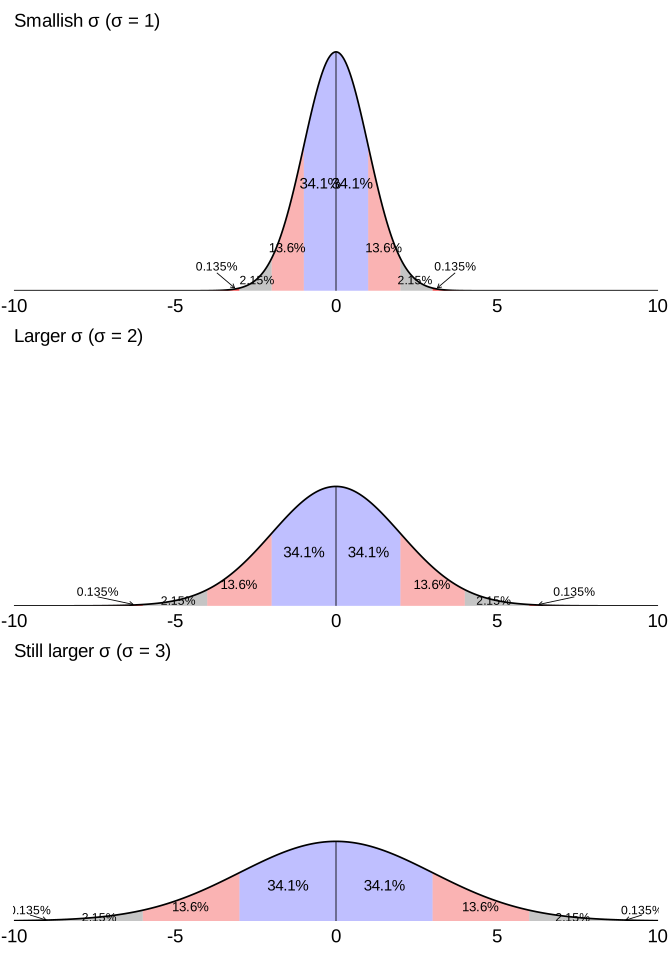
As is clearly seen in those pictures, and as is in any case obvious from the preceding development, the curve which illustrates a continuous probability distribution is relatively high in regions of high probability and relatively low in regions of low probability. The curve is therefore usually referred to as the probability density function, or pdf for short. (A relatively ancient expression for the pdf was frequency function—and this is what Shewhart was referring to in his quotation on page 30.)
On pages 90–91 in the Technical Section I shall describe how the probability of any normal random variable lying within any specific interval can be quickly found using widely-available tables of the normal distribution.
However, there are a couple of particular probabilities that are frequently used in applications of the normal distribution to popular techniques of so-called “statistical inference”. Those two probabilities are illustrated below as “proportions of area thereunder”. The two diagrams show that, with a normal distribution,
- a random variable has a 95% probability (coloured yellow) of lying within 1.96 standard deviations of its mean μ, 2.5% probability (left-hand tail coloured red) of being less than μ − 1.96σ, and 2.5% probability (right-hand tail coloured red) of being greater than μ + 1.96σ; and
- a random variable has a 99% probability (coloured yellow) of lying within 2.58 standard deviations of its mean μ, 0.5% probability (left-hand tail coloured red) of being less than μ − 2.58σ, and 0.5% probability (right-hand tail coloured red) of being greater than μ + 2.58σ.
On pages 54 and 55 I briefly describe the two most commonly-used methods of statistical inference, and the way in which these particular figures apply to them.
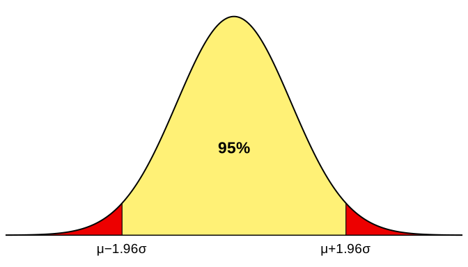
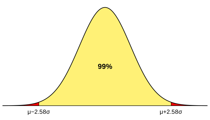
Incidentally, if I were to show you a similar diagram with 99.8% in the middle region and thus 0.1% in each of the two red tails then this would correspond to replacing the 1.96 or 2.58 with 3.09—which explains the remark made about “3.09σ” in the middle of page 2 in these Optional Extras.
The Central Limit Theorem
The Central Limit Theorem is a truly remarkable result which, within the context of conventional Statistics, does indeed place the normal distribution in a position of truly unique importance. Descriptively, it can be summarised as follows:
Irrespective of which probability distribution is being sampled, for sufficiently large samples the sample mean \(\bar{X}\) is almost exactly normally distributed. (In theory, there are some probability distributions that are exceptions to this statement but, in practice, they are rare.)
There is one respect in which this statement can be confusing. Let’s suppose the data are being drawn from a distribution having mean μ and standard deviation σ. As the sample size increases, the distribution of \(\bar{X}\) keeps changing. In particular, since we know that \(\bar{X}\) gets closer and closer to μ as the sample size increases, the distribution of \(\bar{X}\) must keep getting narrower and narrower and therefore taller and taller (since, as always, the total area under the histogram has to be equal to 1). So eventually it will get pretty difficult to see what kind of shape the distribution has other than that it is very tall and very thin! To overcome this problem, the Central Limit Theorem is often expressed as follows:
If \(\bar{X}\) is the mean of a random sample of size n taken from a population having mean μ and variance σ² (i.e. standard deviation σ) then
\[Z = \frac{\bar{X} - \mu}{\sigma / \sqrt{n}}\]
is a random variable whose distribution approaches that of the standard normal distribution N(0, 1) as \(n \to \infty\). (Z can be referred to as a “standardised” version or form of \(\bar{X}\).)
The fact that the random variable Z in this statement has a mean of 0 is fairly obvious: the mean value of \(\bar{X}\) is, of course, equal to μ and so the mean value of \((\bar{X} - \mu)\) must surely be 0, as must any multiple of it.
The expression in the denominator of Z is the standard deviation of \(\bar{X}\): this will be proved in the Technical Section on page 80. That expression is obviously consistent with a fact which we know to be true, i.e. that, as the sample size increases, the variability of \(\bar{X}\) keeps getting smaller (so that it approximates the value of μ better and better).
As you might expect from the fact that σ is a measure of variability, dividing a random variable by its standard deviation always changes its standard deviation to 1. So the facts that the mean and variance of Z are respectively 0 and 1 are bound to be true. The new and remarkable information from the Central Limit Theorem is that the distribution of Z almost always becomes closer and closer to the standard normal distribution as the sample size increases (irrespective of what kind of distribution the sample is being drawn from—either discrete or continuous), rather than to any other distribution which has mean zero and standard deviation 1. I implied above that there exist some rare and rather peculiar distributions for which this is not true, but I think that you’re unlikely to ever meet one in the “real world”!
Of course, usually our sample sizes n are rather small compared with “\(n \to \infty\)”! But what makes the Central Limit Theorem even more attractive is that, almost always, the movement toward normality of \(\bar{X}\)’s distribution already becomes apparent with very reasonable sample sizes: the distribution is usually effectively indistinguishable from normal for n no larger than 30 or 20 or 30 at most, and is often close to normal for much smaller n. As evidence for this, it’s time for some more computer simulations! As a rather remarkable fact, even Shewhart showed the results of some simulations to verify this attractive feature. You notice that I do not say “computer simulations” there: Shewhart published the results in his 1931 book—and that was rather a long while before computers were around. If you are interested in how Shewhart carried out his simulations without a computer, I refer you to pages 182–183 of his book.
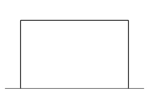
For the results of the computer simulations shown here, I generated samples of various sizes from three continuous probability distributions. The first was one of the two that Shewhart used: a uniform distribution whose pdf is illustrated alongside. The reason for the name is obvious: the probability is spread uniformly over an interval. As a good example, the values you get by pressing the “RAND” key on your calculator have a uniform distribution over the interval from 0 to 1.
Firstly, I generated samples of size just n = 2 from a uniform distribution: here is the interesting histogram of values of the “standardised” version of \(\bar{X}\) (i.e. the “Z” in the formal statement of the Central Limit Theorem). In this and all the simulations that follow, the samples were generated 10,000,000 times. This is in contrast to Shewhart’s 4,000 times—but even those few must have taken him quite a while!
![Histogram of the standardised sample mean Z = (X-bar − μ) / (σ / √n) from 100,000 samples of size n = 2 drawn from a uniform distribution on [−√3, √3]. The bars form a clear triangular pile centred on 0, with the standard normal density N(0, 1) overlaid in blue for comparison: the histogram is already remarkably close to the bell shape, though with slightly straighter shoulders reflecting the n = 2 stage of the Central Limit Theorem.](04-part-d-crash-course_files/figure-html/fig-uniform-n2-1.svg)
I then moved on to samples of size n = 4. Here is the histogram that was obtained. I confess that this one surprised even me—it’s incredibly like N(0, 1) already:
![Histogram of the standardised sample mean Z from 100,000 samples of size n = 4 drawn from a uniform distribution on [−√3, √3]. The histogram is now visually almost indistinguishable from the overlaid standard normal N(0, 1) density — symmetric, bell-shaped, centred on 0, with the curve sitting along the tops of the bars across the full range.](04-part-d-crash-course_files/figure-html/fig-uniform-n4-1.svg)
It hardly seems worth going any further, but here is the histogram with n = 10:
![Histogram of the standardised sample mean Z from 100,000 samples of size n = 10 drawn from a uniform distribution on [−√3, √3]. The histogram is indistinguishable by eye from the overlaid standard normal density: a clean, symmetric, centred bell with the blue N(0, 1) curve sitting exactly on top.](04-part-d-crash-course_files/figure-html/fig-uniform-n10-1.svg)
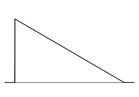
The feature of the uniform distribution which really helps the Central Limit Theorem’s effect to become clear so quickly is the fact that, like the normal distribution itself, it is symmetric. So presumably that is why Shewhart then moved on to a triangular distribution whose pdf is illustrated here and is, of course, nothing like symmetric.
Let’s see what happens with samples of size 2 now:
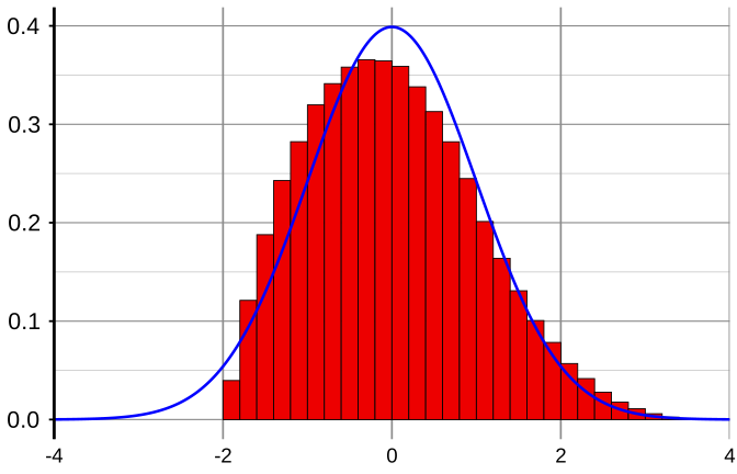
This is again quite a remarkable change from the distribution with which we started.
So let’s try n = 4:
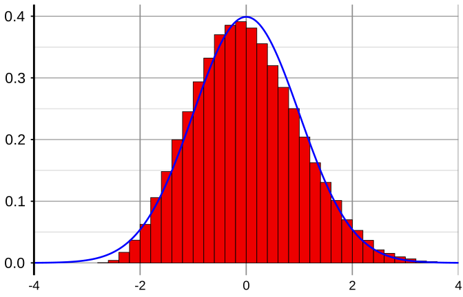
If you look closely, you will see that this is still slightly lop-sided, thus still showing the effect of the non-symmetry of the triangular distribution with which we started. But the Central Limit Theorem effect is remarkably evident already.
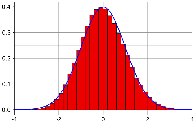
And so we move on to n = 10. Still not perfect, but it’s almost there.
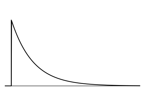
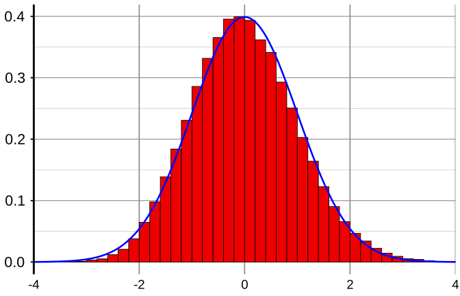
Some similar simulation work is reported in Chapter 4 of Wheeler and Chambers’ Understanding Statistical Process Control. Three further distributions are illustrated there. I’ll use just one of them here: this is the exponential distribution, whose pdf is shown alongside. It’s a distribution which is used as a model in many situations including failure analysis and queuing theory, but its main interest here is as one of the most unsymmetric distributions imaginable.
So let’s see what shape of distribution the standardised version of \(\bar{X}\) has with n = 2. Here it is:
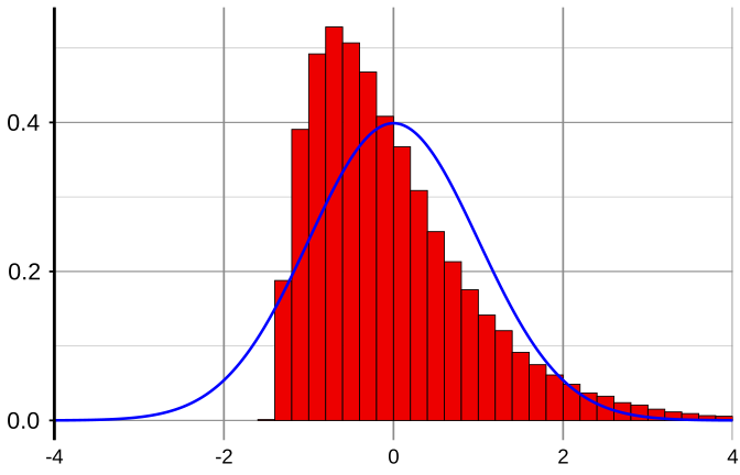
In this histogram it is fairly easy to see the combined influence of both the original shape of the exponential distribution and of an early stage of the Central Limit Theorem. But there’s a long way to go.
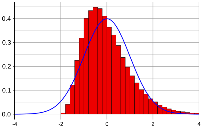
With n = 4 we have:
And with n = 10 we have:
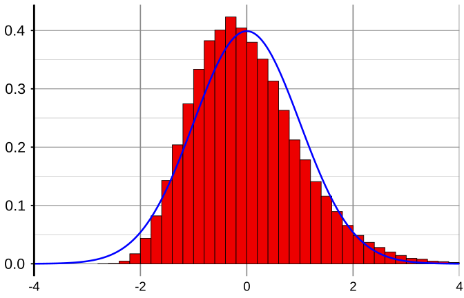
Well, it is getting there but, unsurprisingly, not very quickly. So, in this case, let’s give the computer some real work to do and go right up to n = 100: I think that just about does it. Yes, the Central Limit Theorem even works with something as unfriendly as the exponential distribution!
After all this, it’s hardly surprising that, in developing their theory as well as their tools and techniques, conventional statisticians have been very happy to base them on assumptions of normality, justifying this via the Central Limit Theorem in the case of large samples, or directly requiring the normality assumption in the case of small samples—for another really nice feature is that if the population being sampled is already normally distributed then \(\bar{X}\) itself is also exactly normally distributed, however small be the sample size.
Finally then in this crash-course, we come to two of the conventional statistician’s favourite applications of the above ideas, often regarded as the most important aspects of so-called “statistical inference”: confidence intervals and hypothesis tests.
Confidence intervals
If one wants to estimate the mean μ of the population from which data are being drawn, it is pretty obvious that we should use the sample mean \(\bar{X}\) as the estimator. Yes, but that’s not very useful unless we have some idea of how close \(\bar{X}\) is likely to be to μ.
Assuming that \(\bar{X}\) is near enough to being normally distributed, so that
\[Z = \frac{\bar{X} - \mu}{\sigma / \sqrt{n}}\]
is near enough to being standard normal, then, as we have seen on page 50, there is about a 95% probability of Z lying between −1.96 and +1.96. A little algebra enables this range to be expressed as
\[\bar{X} - 1.96\,\sigma / \sqrt{n} \;\le\; \mu \;\le\; \bar{X} + 1.96\,\sigma / \sqrt{n}.\]
If the value of σ is known then the first and last parts of this relationship can be evaluated, thus providing an interval within which we “are 95% confident that μ lies”. This interval is referred to as a “95% confidence interval” for μ. However, of course, if the value of μ isn’t known then it’s rather likely that σ is also not known! So it is quite common practice to compute the sample standard deviation s and throw that into the relationship instead, presumably hoping it’s “near enough” to σ. Alternatively, if n is judged to be too small to do that, the conventional statistician conveniently assumes that the data-values themselves are normally distributed, in which case
\[t = \frac{\bar{X} - \mu}{s / \sqrt{n}}\]
has what is known as a “Student t” distribution, tables of which can then be used to find a number to insert into the relationship in place of the 1.96. (“Student” was the pen-name of an English statistician whose real name was W S Gosset.)
I expect you will immediately appreciate (referring again to page 50) that a “99% confidence interval” can be obtained by replacing 1.96 by 2.58 throughout this discussion.
Hypothesis tests (also known as significance tests or tests of significance)
Finally, suppose we want to use the value of \(\bar{X}\) to formally “test the hypothesis” that μ has some proposed value: for sake of argument, say μ = 37. “μ = 37” is then usually referred to as the null hypothesis and is denoted H₀. How can we formally test for the truth or otherwise of H₀?
The standard approach is as follows. It starts by tentatively assuming that H₀ is true. It would then follow, of course, that
\[Z = \frac{\bar{X} - 37}{\sigma / \sqrt{n}}\]
has the standard normal distribution, at least approximately, under the same conditions as previously. Also as before, it is unlikely that the value of σ is known and so the sample standard deviation s is usually substituted instead, especially if the sample size n is large. It is easy to see how the resulting test statistic Z behaves. If the assumption that H₀ is true holds then \(\bar{X}\) will be reasonably close to 37 so that Z will be relatively small (positive or negative). But if H₀ is not true, particularly if it is seriously untrue—i.e. μ is very different from 37—then \(\bar{X}\) will reflect that very different value of μ, leading to a relatively large (positive or negative) value of Z.
But how large is “relatively large”? The same figures as before provide the answer. For example, if H₀ is true then we know there is (exactly or approximately) 95% probability that Z lies between −1.96 and +1.96. This interval is therefore often referred to as the “acceptance region”, thus leading to formally accepting H₀ if Z falls within it. All other values, i.e. all values outside the interval −1.96 to +1.96, thus form a corresponding “rejection region” such that if Z is found to have any such value then the formal decision is to “reject H₀”. This “rejection region” is usually referred to as the “5% critical region”, and the operation is referred to as carrying out the test at the “5% significance level”. Thus the “significance level” is defined as the probability that the test wrongly rejects H₀, i.e. rejects H₀ when H₀ is in fact true. Note that the smaller the significance level at which H₀ can be rejected, the stronger is the evidence for so doing.
It should also be noted that there is a considerable non-symmetry in such a testing procedure. If we consider continuous distributions in particular then, while strong evidence may be found for rejecting H₀, one can never find evidence of any kind for believing that H₀ is actually precisely true: all one can truthfully do is to not reject H₀. As soon as I realised this long ago, I never subsequently used phrases like “accept H₀” or “acceptance region” since I regard them to be misleading because of their sounding more positive than is appropriate. I guess it’s rather like a person in a law-court being judged as either “guilty” or “not guilty”: the latter verdict does not imply that innocence has been proved. The difference with this analogy is that it is nevertheless possible for innocence to be proved in a law-court, whereas in a hypothesis test involving a continuous distribution, it can never be proved that H₀ is true.
There are two further aspects of confidence intervals that can also be carried over into hypothesis testing. First, if n is small but normality is assumed then a replacement figure for 1.96 can be found from tables of the Student t distribution. And secondly, the above hypothesis test can be carried out at the 1% significance level by replacing 1.96 by 2.58 throughout.