RUN CHARTS
~ 8 min reading · ~ 35 min at Neave’s pace
Before commencing our study of the Experiment on Red Beads, there is just one “technical” matter to introduce—even for those on Stats-level 0 (or 00)! It is the type of chart known by various names such as a time series graph or a running record or simply a run chart. We’ll call it a run chart.
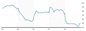
A run chart provides a picture of how a value or a measurement etc changes over time. It’s the kind of graph often seen in, for example, the Business or Money section of a newspaper or magazine or on the internet. Familiar examples are of a daily stock market index (like America’s Dow Jones or Britain’s FTSE 100) or of the exchange rate showing the value of, say, the British pound in terms of the American dollar or some other currency. Monthly data, e.g. of a country’s unemployment figure or trade balance, can similarly be illustrated on a run chart. Why do we need such pictures? Because they make it a lot easier to see what’s going on, often literally “at-a-glance”, compared with our just staring at lots of numbers arranged in lists or tables.
Drawing a run chart is straightforward. Of course, with a very large number of data-points such as were used for the run chart alongside, it would also be very tedious! Here we’ll generally be dealing with considerably smaller amounts of data, and so it will be feasible to draw our charts by hand.
Describe this chart
A line chart with months along the horizontal axis (August to December) and a vertical scale marked from 400 to 1000. The line starts high in August, falls steeply through September, recovers sharply at the start of October and then holds fairly steady, jumps again at the start of November, and drops abruptly at the start of December, staying low to the end. The visual point is that trends and step-changes leap out of a run chart — a reader scanning the same numbers in a column would have to work much harder to see them.
For illustration, imagine we have just launched a new product on the market, and consider how its monthly sales figures might develop and how the management might interpret those figures.
Despite what can be gained by using pictures rather than lists or tables of numbers, such monthly management data are often interpreted without using run charts. One common method uses pairwise comparisons, the most obvious being the comparison of the current month’s figure with the previous month’s figure. This comparison is usually expressed on the management report by + or – the actual numerical difference and/or the percentage difference—or both—between the two figures. Percentage differences are often the more popular since, obviously, they express the monthly changes in everything that is being reported on the same scale—so, for instance, it is then particularly easy to pick out the largest relative changes without having to do any further arithmetic. Other popular types of comparison relate the current month’s figure to the same month in the previous year, or alternatively the YTD (Year-To-Date) figure, i.e. the total for the year so far, compared with the YTD figure as recorded in the same month last year—the comparisons again possibly being expressed as percentages. Obviously, in the case of a new product, there are no figures for last year against which to compare. You may be pleased to know that, during this course, we shall not be using any of the devices just described (other than in this artificial example).
To keep things easy, I’ll present the supposed monthly sales figures as simple whole numbers. For example, we might be rounding to the nearest 1,000 sales so that, in the data now to be seen, “13” represents between 12,500 and 13,499 sales of the product during the month. Let’s say that the sales figure reported in this way at the end of the first month after the launch is indeed 13. At the monthly management meeting, everybody seems quite happy with this figure, but they are expecting higher sales in Month 2 since the introductory promotional effort will still be continuing throughout that month.
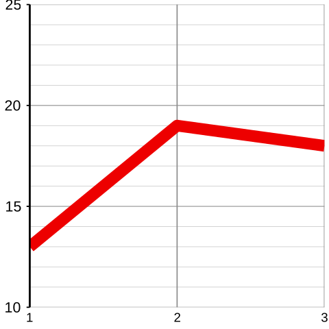
In fact, the Month 2 figure goes up to 19 which (following the small-print description above) is shown on the management report as 19 (+6, +46%). The numbers in brackets indicate that 19 is 6 greater than the previous month’s figure of 13 and is approximately 46% greater than that figure. Again, general satisfaction is expressed at the monthly meeting although there are differing opinions about what will happen in Month 3 since the introductory promotion is now at an end.
In the same way, Month 3’s figure is expressed as 18 (–1, –5%). (18 is 1 less than the previous month’s 19 and is approximately 5% less than 19.) This slight decrease is not wholly unexpected since the introductory promotional effort has now ended. Apart from that, there is little comment on the sales figure for this product at the monthly meeting. However, let’s now use the three months’ figures to start drawing a run chart:
Describe this chart
A run chart of monthly sales figures, with months 1 to 3 on the x-axis and sales values on the y-axis. The line goes up sharply from 13 in Month 1 to 19 in Month 2, then dips slightly to 18 in Month 3. Subsequent charts in this chapter add one new month at a time — only the latest month changes from one chart to the next, so the eye is drawn to whatever just happened.
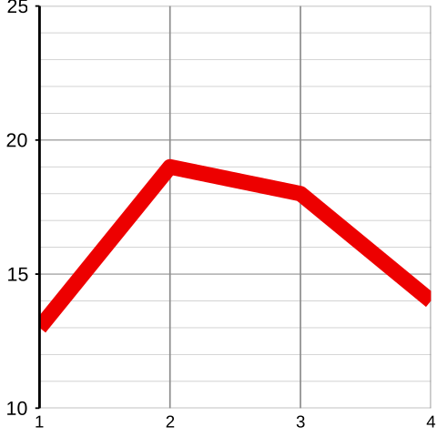
Month 4 is a different story. The figure has suddenly dropped to 14 (–4, –22%). The management all agree that the lack of promotional effort during the past two months is now damaging sales of this product to a really serious extent. If they also look at the run chart, they will see that sales are nearly down to those in the very first month when far fewer people had even heard of the product. Sadly, there is no alternative but to restore the advertising and promotional effort: this product is still not well enough known.
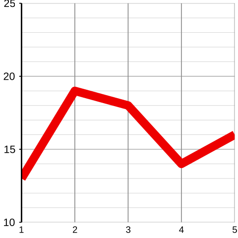
Sighs of relief are audible in Month 5’s management meeting. The decline in the sales figure has been reversed by the revitalised promotional effort: the figure has now risen to 16 (+2, +14%). As yet newer products are coming onto the market and thus advertising budgets are under pressure, management decides that this promotion should cease now that the decline has been halted.
But the sighs of relief are soon silenced. Month 6’s figure comes out at a dreadful 12 (–4, –25%)—the lowest figure in the whole six months. Drastic remedies are called for, otherwise this product is destined to be an expensive failure. And so the advertising and promotional efforts are reinstated along with additional price-cuts and other incentives.
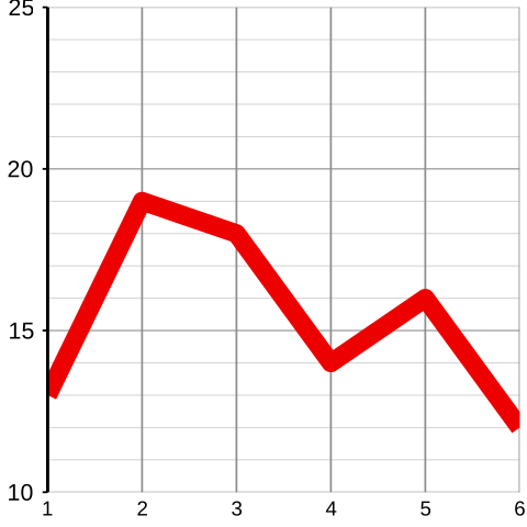
Success! As the result of the exceptional promotional efforts ordered at Month 6’s management meeting, Month 7’s sales have now soared to an unprecedented 21 (+9, +75%)—getting on for double last month’s figure! The champagne is flowing!
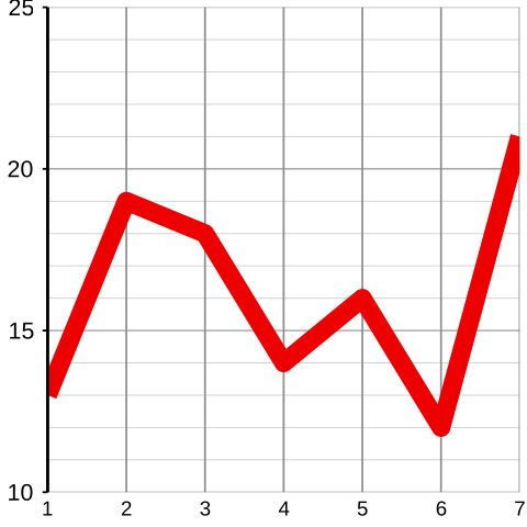
Month 8 shows a mild reduction in the sales figure to 18 (–3, –14%). As previously when a sales promotion came to an end, the managers at their meeting are not too surprised by this relatively slight reduction, recalling the mammoth rise in the previous month (as clearly pictured on the run chart).
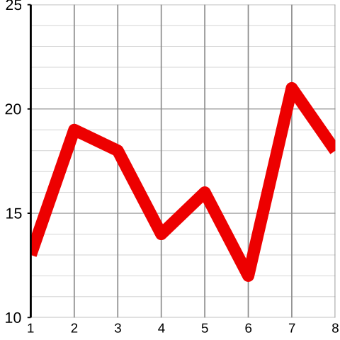
Sadly, Month 9’s management meeting has no option but to conclude that history is repeating itself. The sales figure is down again, admittedly just to 17 (–1, –6%). But those managers with longer memories (and those who might be looking at the run chart) also recall the 14% drop in the previous month. This cannot be allowed to continue. Yet another price reduction, or advertising campaign, and/or other promotional effort must be actioned.
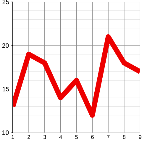
And it’s worked again! Thanks to the renewed, although admittedly expensive, publicity effort, Month 10 has produced the record sales figure for this product: 22 (+5, +29%). It really is so important to keep a watchful eye on the monthly figure and to act accordingly. Even those who are not just using the month-to-month pairwise comparisons but also checking the run chart can hardly escape a very positive conclusion: after the introductory promotion, the sales of this product had fallen alarmingly but, thanks to management’s diligence over recent months, we can now see an impressive upward movement overall.
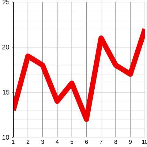
Now, I repeat that this was just a simple introductory example, purely for illustration to show how easy it is to draw a run chart, i.e. a picture of what otherwise would merely have been just a string of numbers.
PAUSE FOR THOUGHT 2–a
Even though these were not real sales figures, and this was not a real management team, do you think that this was a reasonable account of how management might have reacted had these been real sales data?
All I can say is that, in my experience, the answer is Yes! I might comment that the management are going to be awfully busy if they keep acting one way whenever a figure goes up, and another way whenever it goes down—for, except on the odd occasions when the figure stays the same, it will always either go up or go down! We’ll return to this illustration tomorrow.