import { persist } from "../../../assets/scripts/workbook.js"

viewof activity_9c = persist(
  "content/days/day-09/03-activity-9c-and-organisation-charts.qmd#activity_9c",
  Inputs.textarea({label: "Suggest some ways in which the improvement of quality would reduce cost in your organisation", placeholder: "Type your suggestions here.", rows: 10})
)ORGANISATION CHARTS AND FLOW DIAGRAMS
~ 11 min reading · ~ 60 min at Neave’s pace
ACTIVITY 9–c
With regard to your organisation, suggest some ways in which the improvement of quality would reduce cost.
(If you need a hint, you will find one on Appendix page 38.)
Organisation charts — vertical or horizontal?
With recent thoughts in mind, the development of the flow diagram which “ignited Japan” need not be difficult. Deming didn’t say it was difficult. He just said it was “the spark that turned Japan around”!
His description of the flow diagram when talking with Dr Russell Ackoff in Volume 21 of The Deming Library is also instructive:
“It all goes back to understanding a system. And that is the way I taught the Japanese top management in 1950. The aim of the system. Draw a flow diagram: what happens? what happens next? And, in that flow diagram, anybody may see what his job is. A flow diagram is an organisation chart. Anybody that works there … can see what his job is.”
An organisation chart! How the organisation should be organised! As opposed to what? Well, I think you may agree that there is some rather neat implicit teaching in Dr Deming’s innocent (?) use of that term “organisation chart”—for we know what that expression means to most people. See Figure 24 (DemDim page 133 [directly under Deming’s flow diagram for immediate comparison!]), along with the superb cartoon version in Figure 25 on the following page. Having turned to those pages, please read the short passage which begins just under Figure 25 and continues to midway through the following page. Deming’s “organisation chart” is perpendicular to the conventional one! The conventional one is vertical; Deming’s is horizontal.
So what? One way of answering that question is to relate something further that I learned from Peter Scholtes; and (not by coincidence, I suggest) this is “up-front” in his excellent book: The Leader’s Handbook. The conventional organisation chart (DemDim Figure 24) is the very first diagram in Peter’s book (Figure 1–1 on his page 3). But he’s given it an interesting name: “The ‘train-wreck’ chart”. Indeed, the initial section of his book is titled “Train-Wreck Management”.
According to Peter (and, to the best of my knowledge, nobody ever contradicted him), the story is as follows. In October 1841, two Western Railroad passenger trains collided head-on somewhere between Worcester, Massachusetts and Albany, New York, killing a conductor and a passenger and injuring 17 more. The Massachusetts legislature launched an investigation into the crash and appointed a committee to suggest how such an accident might be prevented in the future. One of their recommendations was to construct what we now know as a “conventional organisation chart”. Why? Let me quote Peter:
“A fundamental premise of the ‘train-wreck’ approach to management is that the primary cause of problems is ‘dereliction of duty’. The purpose of the organisation chart is to sufficiently specify those duties so that management can quickly assign blame, should another accident occur.”
Does that sound familiar to you? The conventional organisation chart helps you to speedily find out whom to blame! If something goes wrong, it must be somebody’s fault. The fundamental error in this is already familiar to us, e.g. from the Red Beads Experiment and from our discussions on common and special causes. Quoting just one more sentence from The Leader’s Handbook:
“While the standard organisation chart may seem ageless, it was, in fact, adapted from the Prussian Army and introduced to American business practice as a way to prevent train wrecks!”
Peter’s second section is headed: “Meanwhile, in Japan …”, and before long, in contrast, we see Dr Deming’s (horizontal) flow diagram.
If you would like to study more on this, I strongly recommend Chapter 1 of The Leader’s Handbook.
Where’s the fault?
A message coming loud and clear is therefore the need to start constructing (horizontal) flow diagrams—and to use them. This is, as mentioned on today’s opening page, what you’ll soon be doing in today’s Major Activity. An even more “macro” flow diagram (i.e. with larger components) is illustrated in Volume 21 of The Deming Library (also mentioned earlier today): a flow diagram for an education system; and that illustration is indeed very similar in structure to Deming’s “Organisation Viewed as a System” diagram.
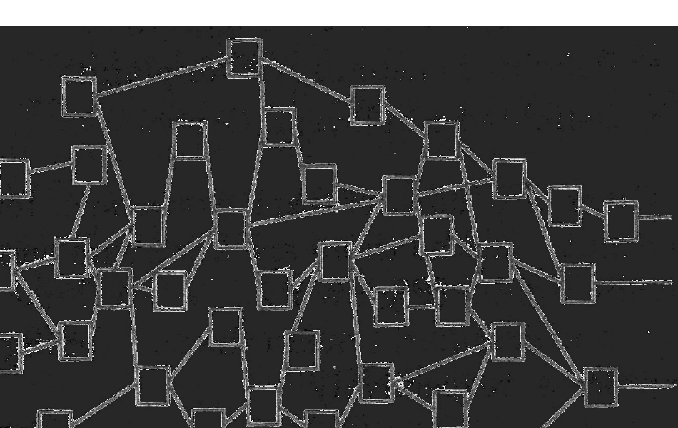
Having established a “macro” flow diagram for the organisation (or whatever system is being studied), it may then be useful to develop other diagrams and charts which have a little more detail both in regard to the parts of the organisation included and their main interconnections. Take a look at the example from Joiner Associates on DemDim page 124. However, do not go overboard with this, especially for the time being. It is important that Deming flow diagrams be comprehensible in their entirety, unlike ultra-detailed flow charts that can cover whole walls. The diagram that follows (from Bill Scherkenbach’s Deming’s Road to Continual Improvement page 10) is conceptual, rather than being intended as a model!
Describe this diagram
A deliberately overwhelming sketch on a black background: dozens of small empty boxes (representing groups, departments, individuals) scattered across the page, with a tangle of pale lines criss-crossing between them. There is no visible top, no clean hierarchy, no orderly chain of command — interconnections run in every direction. The point is not that this is a usable chart but that this is what any real organisation actually looks like once you stop pretending the conventional pyramid org-chart tells the whole story. It contrasts sharply with Deming’s deliberately simple flow diagram on the previous page; the lesson is that comprehensible, macro flow diagrams are useful, but ultra-detailed wall-sized maps like this one are not.
While addressing the British Deming Association’s 1991 Annual Conference, Bill showed this picture with a comment to the effect that “this is what any organisation is”. There are lots and lots of boxes (representing groups, departments, individuals, etc)—and also lots and lots of lines joining the boxes to indicate the numerous interconnections between them.
So what is to be gained by constructing Deming’s flow diagram? The important answer is that it helps us to change the way we think; and, as we have so often remarked before, what we think greatly affects what we do. It can therefore help management to start doing things differently. Such as what?
Consider the Massachusetts train wreck again. Was it really just somebody’s fault? With the advantage of our (Deming’s) thinking, we would surely doubt it. Was it not far more likely to have been a problem, a serious failing, of the system within which the people (at all levels) in the Railroad were working? In fact, if an individual’s error could have caused such havoc, surely an implication is that this was a poor system in dire need of improvement anyway. (I am reminded of the Zeebrugge Herald of Free Enterprise ferry disaster in 1987, apparently the result of the assistant boatswain being asleep when he should have been closing the bow-door.)
Again, as demonstrated by the Red Beads Experiment, people are at the mercy of the system. It is the system that needs improvement, in order that people are allowed, helped and encouraged to do good work. So now, when something goes wrong, the attention is not on finding a scapegoat but on examining what it was in preceding stages of the system (as indicated in the flow diagram) which caused it to go wrong. Then there is at least some chance of improving the system so that that “something” doesn’t go wrong again—a chance that didn’t even exist previously.
More generally, if things do not seem to be working well in some part of an organisation, what is it that “feeds in” to that part of the organisation that might be causing the trouble? If salespeople can’t sell, maybe it’s because the product isn’t very sellable. If the product isn’t very sellable, perhaps there were weaknesses at the design stage. Perhaps the reliability of the product is less than what the market would like—maybe at least partly caused by Purchasing awarding business on lowest price. Why should Purchasing be doing that? Perhaps in order to keep to a budget, or to achieve some target reduction in material costs. And where does that budget or target come from? From higher up in the conventional organisation chart! Blaming salespeople for poor sales, or “incentivising” them by higher commissions or fear of dismissal is rather a long way from the source of the real problem—which is that the organisation is not being viewed as a system. As we know, Dr Deming had a word for it: suboptimisation. (C.f. Gallery Furniture, in particular Mack’s “Then and Now” section on Day 6 page 13.)
Some notes from friends
Dave Young showed me a couple of excellent comparisons between the two types of organisation chart that friends had suggested to him. First: “The traditional organisation chart is a pyramid; it points upward, to the boss, to the shareholder. Deming’s chart points horizontally, to the consumer, to the customer.” And second: “The traditional organisation chart tells us a lot about who reports to whom, but absolutely nothing about what the organisation actually does.”
Also, Alan Hodges pointed out to me that Deming’s helix diagram (see page 6, the helix figure) has been adopted in the international standards ISO 14001 (Environment) and ISO 18001 (Management of Health and Safety).
When I first heard Deming’s term “flow diagram”, I did realise that he wasn’t saying what I was familiar with, i.e. “flow chart”, but I didn’t realise the importance of the difference straightaway. “John” (of Day 7 fame!) wrote to me at some length about this; here is part of what he said:
“The beauty of Deming’s system diagram is that it combines the purpose of the organisation with the key activities which the organisation undertakes. People can see the end point plus where their work fits within the processes and whom they affect and by whom they are affected. The key point for me is simplicity, which is frequently missed by the box-tickers of this world. Unfortunately there is a myriad of different types of ‘flow charts’ (key process maps, SIPOC, process mapping, swim lanes, VSM etc) which tend to draw thinking to minutiae, thus missing the whole point of Deming’s diagram. The purpose of the organisation or process becomes lost in the detail—and people lose their way in the system rather than concentrating on achieving its purpose.
I visited a designer who had ‘every part of the system’ available in an electronic flow-charted form. Nobody working on our project was even aware of its existence. Worse still, they decided that it did not apply to the design work they did during our tendering period! Also, a large construction company were proud to tell me about a flow chart that they had put together for everything in their management system. It covered five sheets of A0 paper. But was it useful? Did anyone ever look at it?”
PAUSE FOR THOUGHT 9–d
How would you describe the relationship between Shewhart’s diagram of the “New Way” (refer back to the diagram on page 3, where Shewhart’s diagram appears and also to your thoughts on page 4, where the Pauses for Thought appear) with Deming’s “Production (or Organisation) Viewed as a System” flow diagram on page 2, Deming’s flow diagram? And what might that tell you about the purpose of Deming’s flow diagram?
Surely the “New Way” diagram is an embryonic version of Deming’s flow diagram—and in fact, with Shewhart’s particular choice of words, of Deming’s original “Production Viewed as a System” flow diagram. So what does that tell us about the purpose of the flow diagram? We have already seen that the “New Way” diagram immediately relates to improvement. So is that not the essential purpose of Deming’s flow diagram itself? Remember his description of what the flow diagram does and what the consequence is: “A flow diagram is an organisation chart. Anybody that works there … can see what his job is.” By contrast, what does the conventional organisation chart do, and what does it show? It shows the “chain of command”. Rather than helping people to see what their job is, it tells them who their boss is (they probably knew already!). But, of course, sadly the truth is that, in organisations where the conventional organisation chart is the more appropriate picture, this does show people what their job is there: it is to please the boss. If Deming’s “organisation chart” is the more appropriate, their job is instead to please their consumer(s), be they internal or external.