Appendix L — PART A — USING CONTROL CHARTS ON FUNNEL EXPERIMENT DATA
PART A: USING CONTROL CHARTS ON FUNNEL EXPERIMENT DATA
~ 28 min reading
—an extension of Major Activity 3–h
1. Introduction
If you have read my discussion of the Funnel Experiment Major Activity 3–h in Appendix pages 15–18, you will remember that I studied two simulated sets of Funnel Experiment data that had been obtained using a computer program which I’d written in order to demonstrate the Funnel Experiment in my seminars. You, of course, might also like to reproduce that experiment by using a spreadsheet or writing a computer program if you are talented in that way—and, if you are able, I recommend that you do so. I personally found it extremely instructive to play around with my program in order to become familiar with the experiment and with the learning that it helps to develop.
In case that might be possible, let me tell you what I did in my seminars. As you will remember, Dr Nelson’s original version of the experiment is rather tricky to carry out for real except in a small group that has plenty of time to spend on it. And my “one-dimensional” version of the experiment that you used during Major Activity 3–h is also really only convenient for at most a small group rather than being in a form suitable for presentation in front of a larger audience. So that is the main reason I initially wrote a computer program to demonstrate the Funnel Experiment in my seminars. It was presented on-screen in front of the delegates, and represented a bird’s-eye view of the table in Lloyd Nelson’s original version of the experiment. A little icon indicated the current position of the funnel above the table and, at the click of a button, effectively a marble was dropped through the funnel and its final resting position was shown. At the following click of the button, the funnel was moved to its next position according to whichever Rule was being demonstrated. And so on. So this program enabled each of the four Rules to be initially carried out slowly step by step, then slightly faster, and then as fast as we liked. This therefore allowed the delegates to see and understand precisely what the Rules are before proceeding to examine their effects. All the previous resting positions of the marble were retained on-screen in order to study the long-term patterns and interpretations.
The prime purpose of Day 3 as a whole is best summarised by the short title of Don Wheeler’s excellent little book: Understanding Variation. So, looking forward to the time when you are actively working on interpreting real data and improving processes, etc, a really important aspect of Day 3 is your becoming familiar with the use of control charts in order to help you to do just that—understand variation—and know what is sensible to do as a consequence of that understanding. From that viewpoint, a one-dimensional version of the Funnel Experiment with my approach of using a couple of dice or something similar to simulate the variation is actually more fruitful than Dr Nelson’s original two-dimensional version in the sense that the data we obtain can indeed be immediately analysed on control charts. So, assuming you are now familiar with the Rules from your work in Major Activity 3–h, I would definitely recommend that you develop a one-dimensional version if you are willing and able to develop a computer program or devise some spreadsheet method to represent the experiment. However, that’s for the future! For now, let’s content ourselves by working with the data you generated during the Major Activity and with the data from my two computer simulations. Having spent some considerable time in the morning of Day 3 on becoming familiar with control charts, it would of course have been logical to construct control charts of all the Funnel Experiment data in the afternoon. But time would not permit. That is why I have decided to begin these Optional Extras by making up for that forced omission. Depending on how much time you would like to spend on this, there are various possibilities available.
If either you never got round to reading that material which begins on Appendix page 15, or it’s been quite a while since you did so, I suggest you first read through that as it will help to put you in the picture and remind you of matters which will be useful as you revisit the Funnel Experiment here.
As you’ll recall, in Major Activity 3–h you summarised your data from Rules 1 and 2 of the Funnel on histograms and your data from Rules 3 and 4 on run charts. Histograms would have been almost meaningless with Rules 3 and 4 since those processes were hopelessly out of control. However, as it turned out, histograms were extremely useful in comparing Rules 1 and 2. Rule 1 is the straightforward in-control process, and a histogram can often provide some additional useful information about the output from a stable process. Further, if you hadn’t constructed and compared the histograms for those two sets of data, it would have been quite tricky to figure out what Rule 2 was producing. Run charts and, even more so, control charts can often tell you the most important things to know about a process’s behaviour, but sometimes the histogram can shed extra light on the subject.
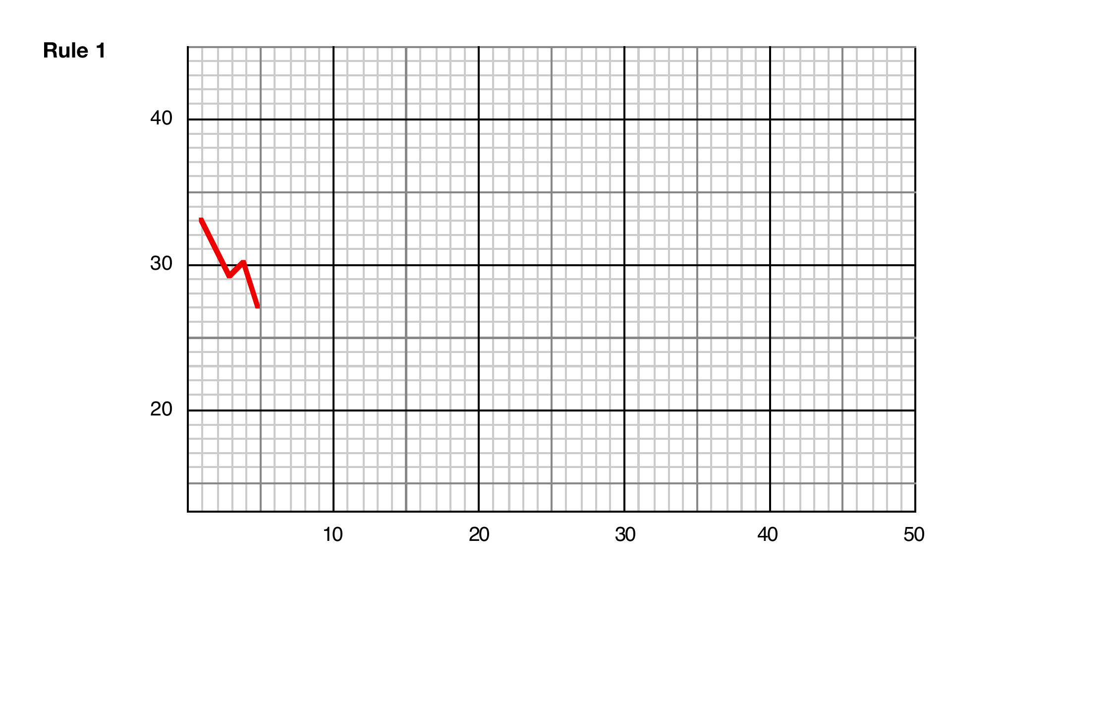
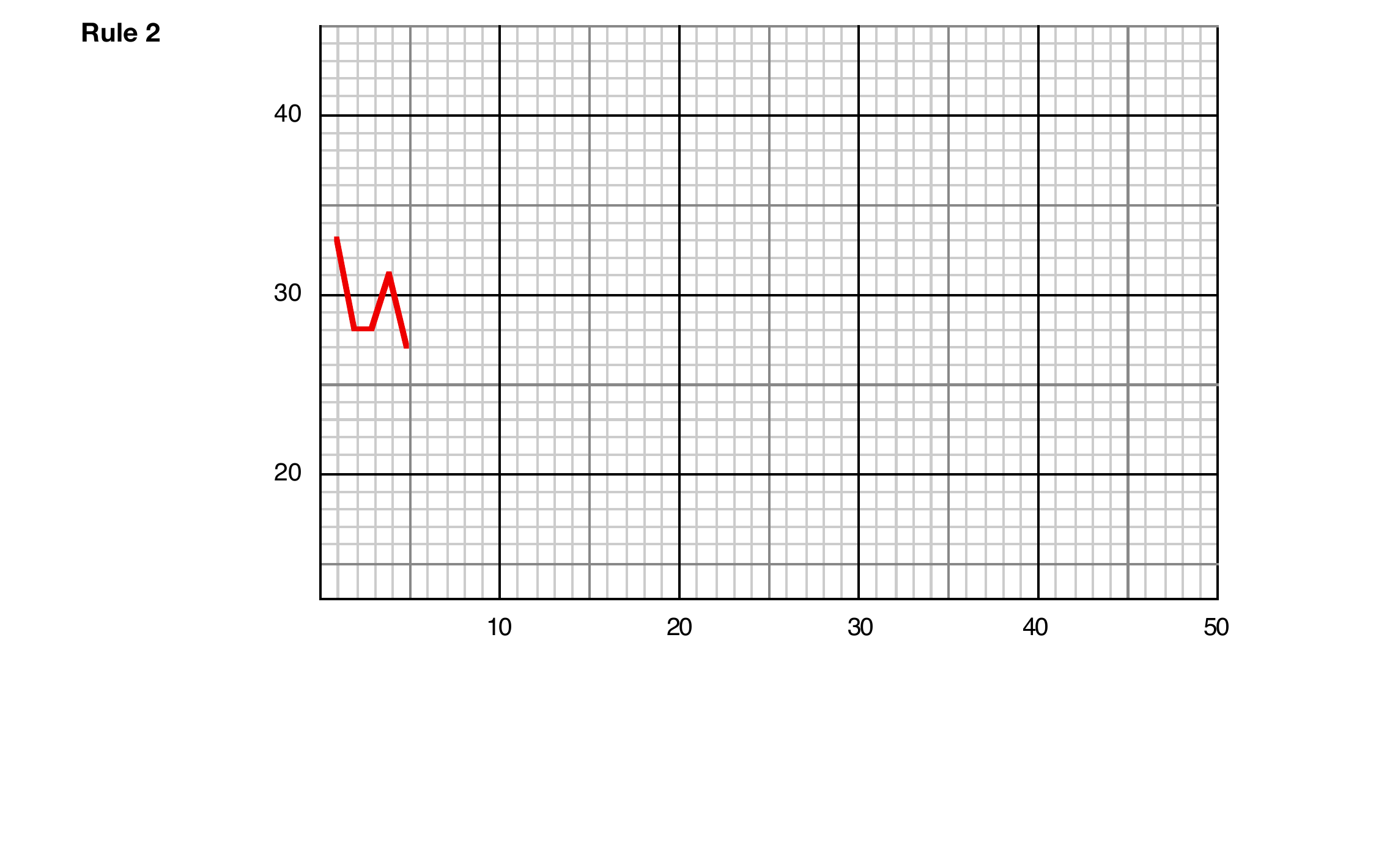
So, what are those “various possibilities” of what you might do next? The most challenging approach would be to throw you in at the deep end and simply suggest you construct control charts of your data for all four Rules, and see how you get on. When you get to Rules 3 and 4, starting on page 8, you will already have your run charts available in the main text, but with Rules 1 and 2 you will need to begin by drawing the run charts here. Similarly as with Rules 3 and 4 in the main text, I have provided here your graph-paper for Rules 1 and 2 with the first five points of the run charts already drawn in. So firstly complete those run charts using your data from Day 3 page 47 which came from Rule 1 (the Second Strategy in the Ford case) and page 44, i.e. Rule 2 (Ford’s First Strategy). Then move on to producing your control charts: refer back to Technical Aid 6 on Day 3 page 16 if you need to. Make some notes on what you learn and also on any problems that you encounter. When constructing your own control charts, you will, as always, need to decide on your baseline, i.e. how many data to use for computing the control limits (see Technical Aid 8 on Day 3 page 17). As a quick reminder, in that Technical Aid I suggested a baseline of between 10 and 15 observations—or less if you’re in a hurry to get started! There is much more detailed discussion on the length of the baseline at the start of the Technical Section in these Optional Extras on pages 71–74.
Having worked on control charts for all four Rules using your own data, then move on to my control charts and discussion, starting on page 9, for the two simulations that I worked with on Appendix pages 15–18. Here I’ve found it useful to extend the control charts to 50 points rather than the 40 shown there—the extra length permits a few effects to be demonstrated more clearly. You might be able to expand on the notes you will have made earlier, and maybe the discussion here will shed light on any problems you found.
A possibly more appealing approach might be to reverse the suggestions I’ve just made. That is, first read the material on my two simulations beginning on page 9. Then, in particular and if it appeals to you, you could then use the same approach with your own data from Activity 3–h as I have done there by producing both “short” and “long” control charts: that can be quite instructive.
If you are short of time then you could, of course, take the really easy way out: just read my material here for the time being, and then return to try out control charts with your Funnel Experiment data on some later occasion!
2. Rules 1 and 2 of the Funnel
So now go ahead with Rules 1 and 2 using the data you generated on Day 3. Your data for Rule 1 are on Day 3 page 47, and your data for Rule 2 are on Day 3 page 44.
Seeing that you have not drawn the run charts of these data previously, I suggest it would be a good idea for you to develop the charts for Rules 1 and 2 “live”. That is to say, reflect the more usual and better practice of first (a) drawing the run chart over your chosen baseline but no further; then (b) computing the positions of the Central Line and the control limits from those data; (c) inserting these three lines on the graph-paper throughout the baseline and then somewhat further into the future if all seems to be well at that stage (i.e. if it currently appears feasible that the process is in control); and finally (again if all seems well) (d) continuing the chart one point at a time. Imagine that you were seeing these data for the first time, so that you don’t know beforehand what you learned when generating them and constructing their histograms back on Day 3. There is room for your computations and whatever notes you care to make under the graph-paper on the next two pages. In both cases, describe what you feel the control chart is telling you as and when you are developing it: a kind of brief running commentary.
The two pages that follow reproduce the blank graph-paper from the original Optional Extras (pages 6 and 7). Print these pages, or draw on paper alongside the Funnel data from Day 3’s first two Rules of the Funnel, to build the charts as you read.
3. Rules 3 and 4 of the Funnel
The “motivation” for the various Rules is discussed in DemDim Chapter 5, so there is no need for me to say much about that here. In brief, recall that, as we’ve indicated previously, Rule 3 is at first sight a rather innocuous-looking variant of Rule 2, while Rule 4 concentrates on trying to minimise average short-term variation. The latter is, of course, an interesting mixture of good and bad. It is good to reduce variation, but is it wise to do so only in the short term? Let’s carry out similar procedures as previously but now for Rules 3 and 4, and see what happens.
Seeing that you have already drawn the run charts for your Rules 3 and 4 data (Day 3 pages 51 and 55 respectively, in each case preceded by the relevant data), I’m not going to suggest that you now start again! But you can at least pretend that you are going through the same procedure you have just been following with Rules 1 and 2, i.e. developing the control charts “live”: you will, of course, find some substantial differences compared with what happened in them!
So, in both cases, compute the positions of the Central Line and control limits from the data over your chosen baseline and draw them in on your run chart. Now, it’s not impossible that in either or both cases you could actually get one or more signals (points outside the control limits) even during the baseline. This is more likely with Rule 4 than with Rule 3. But, even if that doesn’t happen, imagine you haven’t seen the rest of the run chart (try covering it up for the time being!) and see if you would already have any different thoughts compared with what you had at the same stage in your “running commentaries” on Rules 1 and 2. Seeing that, of course, you already know what actually happened with these processes, that pretence might be quite difficult! But, with Rule 3, are you already seeing the first signs of the zig-zag effect that becomes the overwhelming feature of that rule sooner or later? Or, with Rule 4, are you already seeing some indication of the “wandering” nature of that process? It might be a good idea for you to briefly look back at Day 3 page 19 and remind yourself of the control charts on the left-hand side of that page. If you recall, those processes were mainly fairly happily in control, although there was some doubt regarding a possible seasonal effect in the chart at the bottom of that page. But, generally, the question to ask is whether or not your charts look noticeably different from those charts on the left of Day 3 page 19 over the baseline. And then gradually uncover the rest of the chart: in both cases, describe what you feel the chart is telling you, and how soon it is doing so.
Obviously, I don’t know how your data turned out, so I can’t describe what you will or won’t see. So it’s over to you now to discover what happens. When you return, move onto the next section to study the control charts and my discussions on them for the two sets of computer-generated Funnel Experiment data that I introduced on Appendix page 15.
4. Control charts for the computer-generated data
I hope you will have found it helpful to gain that additional experience of constructing and interpreting control charts. However, to be fair, Funnel Experiment data are not the best kinds of data to impress you of the control chart’s usefulness! The reason stems back to something I said on Day 3 page 18: “The control chart becomes really valuable when it is unclear as to whether or not the run chart is indicating there are some special causes—which is the more usual situation”. However, as we have seen, the run charts that result from the Funnel Experiment are mainly pretty easy to interpret! The Rule 1 run chart will of course have generally appeared very stable; and, unless you were very unlucky with your throws of the dice, inserting the control limits should then have produced control charts reminiscent of the various control charts that you have seen of stable processes such as those from the Red Beads Experiment and the other main in-control processes on the left of Day 3 page 19. And, almost certainly, you didn’t really need control limits when dealing with Rules 3 and 4 to convince you that those processes were unstable!
But let’s fill in a little more detail. Upgrading a run chart to a control chart by inserting control limits results in two important gains. First, it enables you to have much greater confidence in your judgment as to whether the process is or is not in statistical control, whereas with many run charts such judgment is little more than guesswork. And second, it often allows you to make your judgment earlier than if you were only using a run chart. Both of these features are extremely important advantages in practice.
So let’s now examine control charts produced by the two runs of the Funnel Experiment that were demonstrated in the Appendix. It will be useful to look at both the complete control charts and also how the charts appear when the control limits are first drawn in—I’ll refer to the latter as the “short” control charts. That, of course, occurs as soon as the baseline data have been recorded: I have used a baseline length of 15 in the following charts. What might we learn and what might we predict at that early stage? I’ll deal with the charts from the two simulations for one Rule at a time.
Rule 1
As expected, the short versions of the control charts for Rule 1 hold no surprises for us.
As we would have hoped, the Central Lines and the control limits are quite similar in the two simulations—although, of course, they’re not in exactly the same places. How could they have been? They’re almost bound to be different when using different sets of data from a process, however stable the process may be. This is analogous to the situation in conventional Statistics when drawing samples from the same distribution or “population”: the sample means and sample standard deviations (see page 18 and onward in Part B of these Optional Extras) will always differ, except for a very rare fluke.
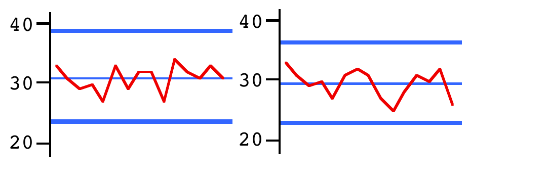
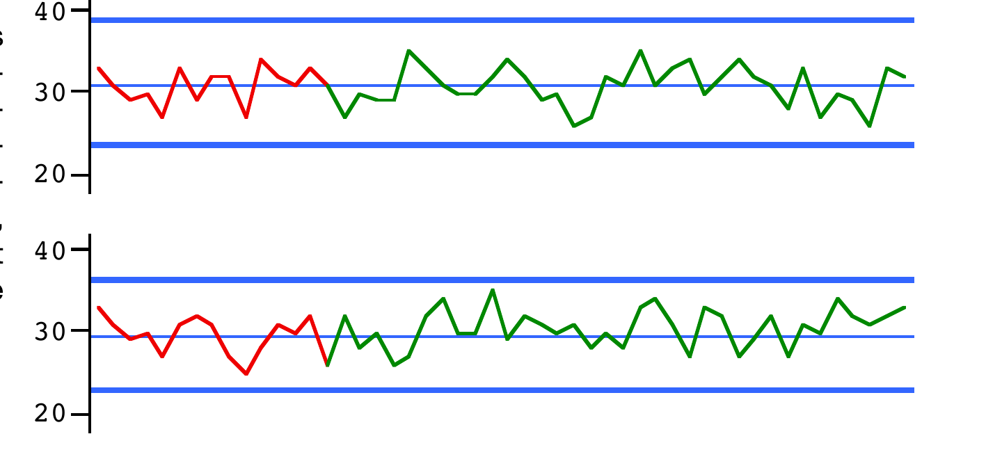
In the long versions of the control charts I’ve coloured in green the sections following the baseline, i.e. after the positions of the control limits have been calculated, drawn in and then extended into the future. And again, as expected, we get two charts strongly reminiscent of the control charts representing the stable processes on Day 3 page 19.
Rule 2
Rule 2 is the case where, as we know both from the Ford example and from your own work in the Major Activity, the situation is undesirable compared with Rule 1, in particular suffering from approximately 40% greater variation. However, going by Bill Scherkenbach’s account of the Ford example, it appears that the people involved there had no history of using Rule 1—it would seem that the process was actually set up as Rule 2, i.e. using the automatic compensation equipment. Perhaps a convincing salesperson for the equipment was around when the process was being designed! Also, as far as we know, they were not analysing their data even on a run chart, let alone a control chart: the implication from those histograms is that they were simply judging quality in terms of conformance or non-conformance to specifications (a poor method of judgment investigated on Day 7). And, with the compensation equipment in operation, almost all of the shaft diameters were within specifications—as seen in the first histogram on Day 3 page 5.
Mind you, the histogram indicates that quite a few were uncomfortably close to the edges of the specifications. In fact (as observed on Day 3 page 9), if you count carefully, that histogram appears to show only 49 diameters rather than the 50 that were claimed, so maybe one had just slipped over the edge and—shall we say?—vanished!
But suppose they had been using a run chart. Would they have noticed anything was amiss? Without a Rule 1 run chart with which to compare, the answer is probably No. (Presumably, had a comparison with Rule 1 been available, particularly with histograms, they would have noticed Rule 2’s larger variation along with the fact that none of Rule 1’s diameters were close to the edges of the specifications.) So what else might have been seen? I did point out in the Appendix that Rule 2’s run charts are relatively “jagged”, but it would probably have taken an experienced eye to notice something of that nature.
So how about control charts of the Rule 2 data in our two simulations? Do they appear at all different in nature from control charts of genuinely in-control processes? Let’s see.
Again let’s look first at the short control charts of the two simulations. The second one does not appear to have anything much to tell us, but I suggest the first one does. There are two features which, compared with the control charts of the six stable processes on Day 3 page 19, look rather odd. First, there is the pronounced zig-zag in the central part of the baseline. It’s rare to see anything like that in the pictures on Day 3 page 19. But also note the relatively large amount of “white space” between the graph itself (i.e. the run chart) and the control limits, especially between the graph and the lower control limit. That’s the same effect as was seen in the illustration on Day 3 page 24—the effect often referred to as “hugging the Central Line”, i.e. where none of the points are anywhere near the control limits. We have previously described an in-control process as one where (almost) all the points are “comfortably contained” between the control limits; but “hugging the Central Line” is where they are far too comfortably contained between the limits! Hugging the Central Line is not good—you should be very suspicious of it!
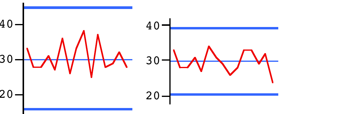
And, as becomes very clear, in the first simulation of the experiment this effect continues all the way through the complete control chart. Even in the second simulation (see the chart at the top of the next page) where the effect is less pronounced, note that, throughout all 50 values, not one gets at all close to either limit—so I suggest that that might be considered as at least slightly suspicious! But I’d say the clear impression in the first case is that the control limits are simply “wrong”: they should be closer together (so yet again compare with those six in-control charts on Day 3 page 19).
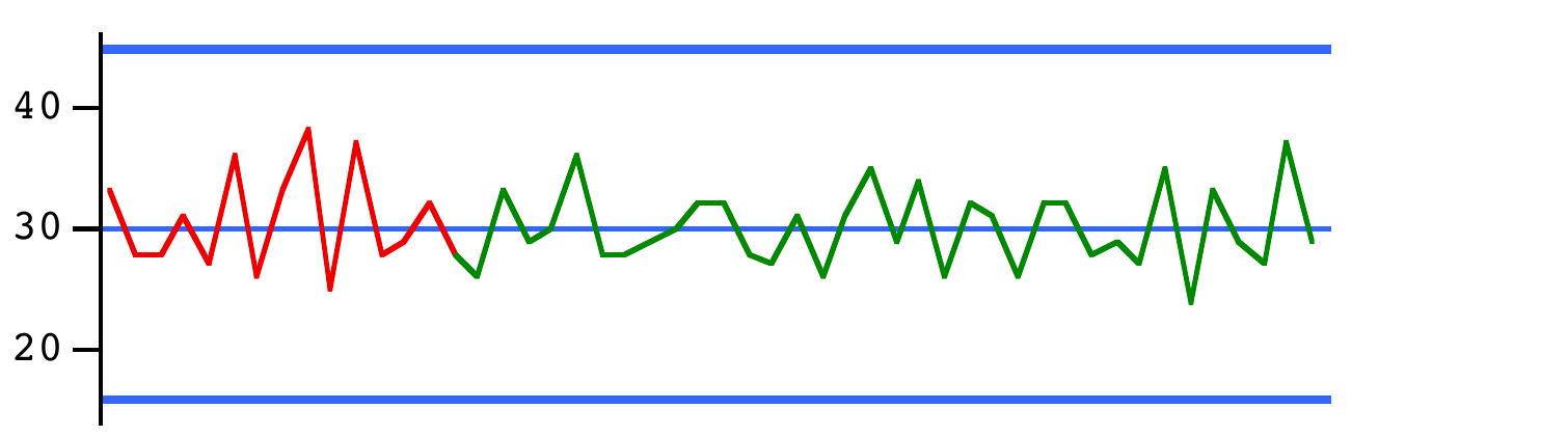

And, having made that observation, maybe it would seem that those limits in this second simulation should at least be a little closer together.
But, with our knowledge of what Rule 2 is, isn’t that precisely what we would expect? Rule 2’s compensation mechanism virtually ensures that particularly high values are followed by particularly low values, and vice-versa—i.e. the zig-zag effect already observed. But recall how the control limits are computed—the distance between them is simply proportional to the average moving range MR̄. Clearly, Rule 2’s zig-zag effect increases the moving ranges (the differences between adjacent values) compared with what would be expected if that compensation scheme were not operating. The control limits are indeed “wrong” in the sense that they now have no chance of reflecting the actual variation, precisely because of that zig-zag effect.
Now, as we have seen, the hugging-the-Central-Line effect will be more apparent with some sets of Rule 2 data than others: it’s a matter of luck! But, at least, we now know that the control chart stands a reasonable chance of indicating a problem with Rule 2, even when there isn’t a Rule 1 version with which to compare it. That is much less true with both the run chart and the histogram. (Please move on to the next section for Rule 3 and then Rule 4.)
Rule 3
Since you have already seen the run charts of both Rules 3 and 4, you may well suspect there is not much further description necessary in either case. You’d be right! There are just a couple of points worth mentioning but, by and large, the run charts told the stories more than adequately.
One aspect immediately noticeable about Rule 3’s short control charts is their similarity to those of Rule 2 on page 10. A moment’s reflection will show why. Recall that the only difference between the two Rules is that in Rule 2 the funnel is moved relative to its current position while in Rule 3 it is moved relative to the target of 30. So while the funnel, and hence the marble, both stay fairly close to the target, the Outcomes (i.e. positions of the marble) will be quite similar in the two cases. And that is what we see in these short control charts.
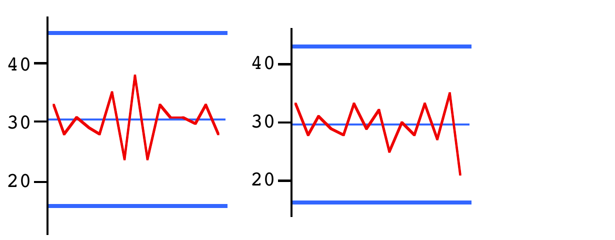
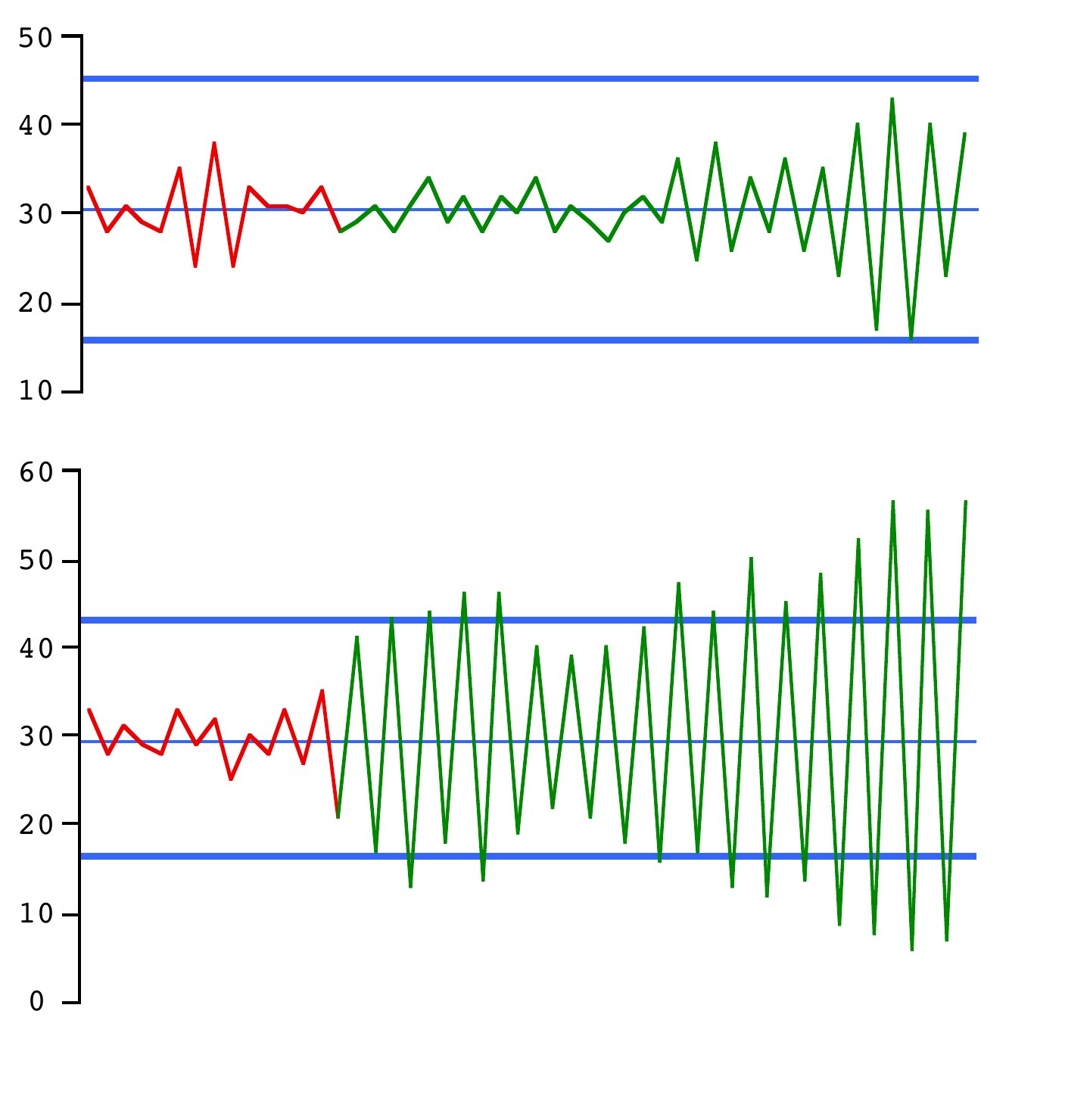
Sooner or later, however, the marble will finish up rather further away from the target than previously which will, in Rule 3’s case, position the funnel at that same larger distance on the other side of the target. And then the very severe zig-zags are likely to really get moving! It is possible that, with some lucky throws of the dice, they may die out for a while—as does indeed happen during the first simulation alongside following those early zig-zags within the baseline). But be sure: they will always return and in time will become absurdly large as is demonstrated here in the second simulation:
Rule 4
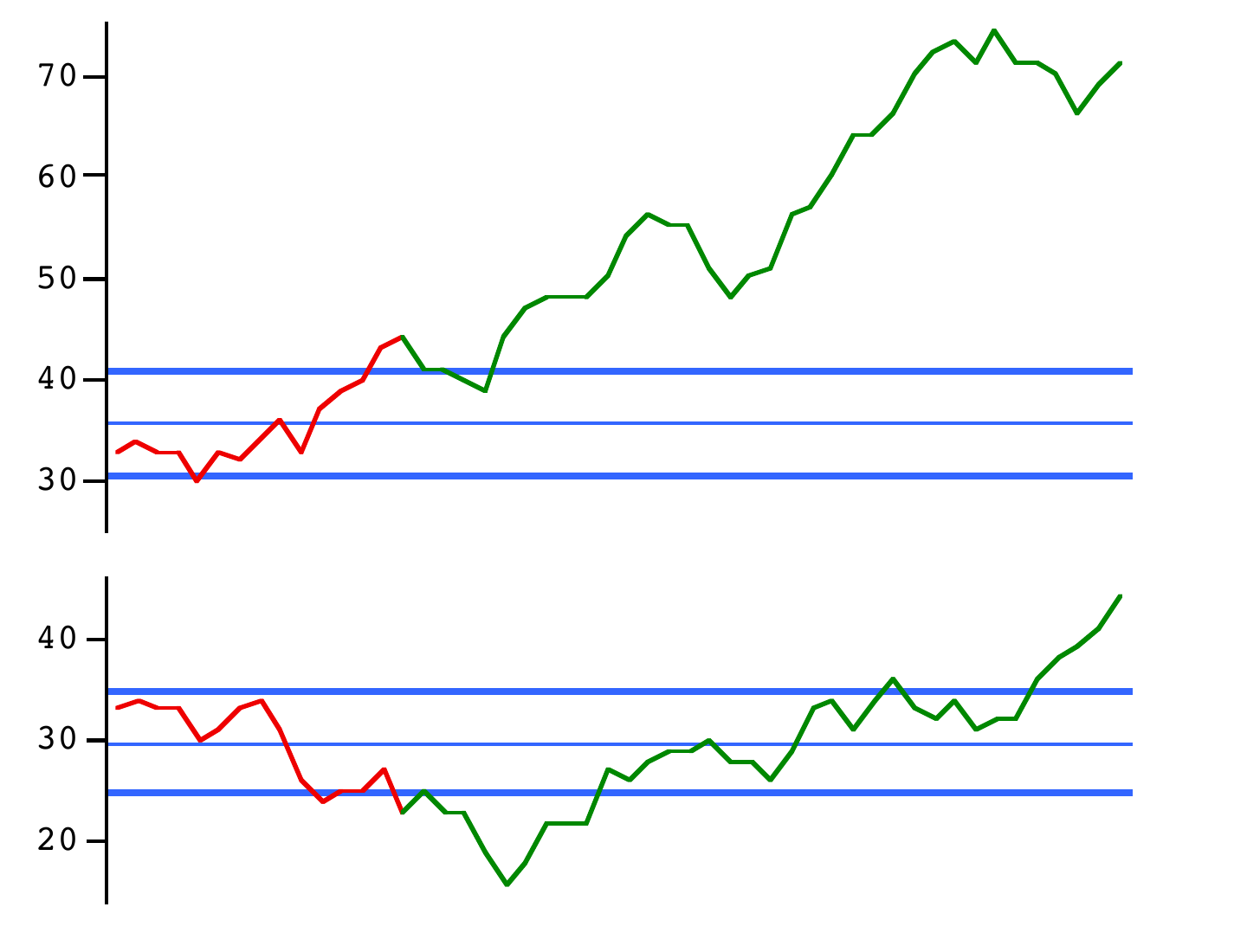
Whereas Rule 3’s short control charts did not give much warning of the horrors to come, Rule 4’s short charts immediately show conclusive evidence of severe problems. They would have done so even if we had been using a shorter baseline than recommended in my general guidance. The reason lies in the very motivation for Rule 4: to reduce short-term variation. And remember that it is precisely the short-term variation which the moving ranges (and hence MR̄ itself) measure, with the immediate effect here of substantially narrowing the gap between the control limits. That reduced short-term variation is, of course, a delusion: in reality, this process is not capable of such low variation. So, if you were trying Rule 4 after you had tried Rule 2 (or indeed Rule 1), you might be quite excited when you compute Rule 4’s limits! But not as soon as you insert them on the run chart and see how the graph behaves in relation to them. The “wandering” effect that was already discussed on Appendix page 19 causes points well outside the control limits to start arriving thick and fast—probably, as in both simulations here, even within the baseline itself or if not then very soon afterwards.
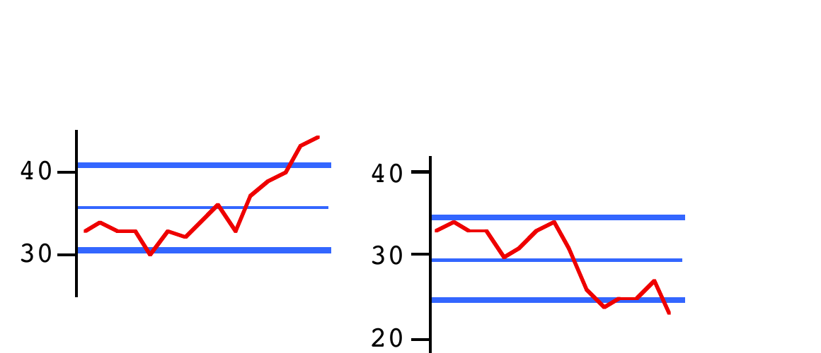
So if you obtained either of those short control charts in practice then there’d have been no point in extending their control limits into the future. The purpose of control limits is to help you to notice when the process goes out of control. But here you already know it’s out of control, and so hopefully instead you would be immediately trying to find out why! However, just for completeness (and perhaps amusement!), here alongside are the long control charts!
5. Discussion
Let’s now summarise and develop what we have learned in these last few pages. Note that we haven’t really been studying the four processes in terms of control charts—we’ve been doing the reverse! The truth is that we had already learned most of what there is to know about these processes from your own work in the Major Activity and from the two sets of simulated data in the Appendix. We have instead been investigating what the control charts look like when each of the four Rules is in operation. And that’s useful: the way one often studies suggested procedures or methods is to let them run under known conditions and see what happens. We now know that if an unjustified compensation effect is in operation then the control chart will have unusually wide control limits, possibly resulting in the hugging-the-Central-Line phenomenon and/or (in the case of Rule 3) wild zig-zags which eventually go outside even those over-wide control limits. Conversely, we also know now that if adjacent values in the data are unnaturally close together—as they are bound to be with Rule 4—then the control limits will be correspondingly close together: so much so that we are likely to get points outside those limits even within the baseline, let alone subsequently. Also, of course, the “wandering” effect will be all-too-obvious.
The fact that the control chart shows these features so clearly is particularly notable since these are kinds of data which it was not really designed to work with! As you know, the basic idea of the control chart is that the formula for deriving the control limits is designed to indicate the scale of the process’s common-cause variation—even, in many circumstances, when the process is already out of control (which is itself, of course, quite an achievement). But how else could the control limits enable the chart to detect special causes? When the process is in control, we’ve seen both here and with the collection of six processes on Day 3 how well the control limits illustrate the extent of the common-cause variation. But how can they still manage to do that when the data from which they are computed are disturbed by special causes?
That question was largely addressed in the “How do we compute those control limits—and why?” section beginning on Day 3 page 13. There we argued how moving ranges can often succeed pretty well in meeting that challenge, certainly compared with the conventional statistician’s standard deviation (about which, if you wish, you can read more in Part B of these Optional Extras). However, in the middle paragraph of Day 3 page 15, I warned you that the Funnel Experiment reveals some serious exceptions where even the moving-range method is wholly unable to perform as just described. For to say that moving ranges can reflect the scale of the process’s common-cause variation even if computed from data recorded when the process is out of control does depend on an implicit assumption. This assumption is that it’s mostly true that the two adjacent values contributing to a moving range are themselves still free to be “typical” values from the process. This is not unusual with many special causes that occur in practice. But it’s clearly not the case with Rules 2, 3 and 4. In Rules 2 and 3, if one value is high then it is likely that the next will be low. Conversely, in Rule 4 any two adjacent values are bound to be relatively close to each other. Both effects clearly destroy the ability of moving ranges (and hence MR̄ which is used in the computation of the limits) to guide us as to the size of common-cause variation. Data in which any one value considerably influences what the next value is are said to be “autocorrelated”; in the case of Rules 2 and 3 they are said to be negatively autocorrelated, and in the case of Rule 4 they are positively autocorrelated.
So now you know that, if you see either the zig-zag effect or the “wandering” effect in a control chart, you might immediately have a suggestion as to what might be happening in the process being studied. But beware: don’t jump to conclusions without further thought. Although unjustified compensation causes the zig-zag effect, it’s not the only possible cause of that effect. As a stupidly-simple example, let’s suppose you are recording the outside temperature every 12 hours: at midday and at midnight. Yes, I think that would produce a pretty impressive zig-zag!
Less trivially, suppose the data alternately measure efficiency or productivity etc of both a day-shift and a night-shift. There could be many reasons for a zig-zag here: effectively, you are likely to have two processes in operation rather than just the one. The night-shift might be disadvantaged because of poor lighting or an inefficient heating system. Alternatively, the day-shift may be disadvantaged since the computer system runs rather slowly during the daytime because everybody is using it—whereas if relatively few staff are working the night-shift then the computer may be operating like greased lightening! The crucial practical point is that, as soon as the zig-zag is seen on the control chart, discussions can immediately start on the reason(s) for it—and, because the control chart is such a straightforward statistical tool (not encumbered by what some might consider to be the usual mathematical mumbo-jumbo of conventional statistical techniques), everyone can be involved in the discussion—not just the “experts”. The importance of this with, say, process improvement teams is beyond price. Similarly, the control chart can serve very effectively as a communication language within and between departments in an organisation, between different levels of management, and even between organisations.
There are also lots of circumstances which will lead to positively autocorrelated data. Financial data are a good case in point. Stock market indices, inflation figures, exchange rates, etc are bound by their very nature to be highly positively autocorrelated since normally it’s the case that any figure is relatively close to the previous one compared with the variation as a whole. Does that mean control charts can have no useful role to play in studying such processes? No. But agreed, there’s no point in simply plotting data whose main characteristics we already know and which will almost surely drown out anything else that might be of interest. One very simple but often effective ploy is instead to chart the changes day-to-day (or whatever time-interval is relevant)—these changes are, of course, the same as the moving ranges except for being recorded as positive or negative according as whether they go up or down. Since this simple manoeuvre almost completely extinguishes the autocorrelation effect, such a chart is now quite likely to be able to discover other special causes that may be affecting the process.
An aspect I would like to emphasise regarding this discussion is that we haven’t been involved here with an exercise in Mathematics but rather an exercise in common sense. And that is a valuable contrast between (a) using control charts and (b) using many of the conventional statistical approaches.
Of two books by Dr Wheeler that I particularly recommend, some such matters are touched upon in Understanding Variation but are dealt with more comprehensively in Making Sense of Data.