HOW DO WE COMPUTE THESE CONTROL LIMITS—AND WHY?
~ 18 min reading · ~ 30 min at Neave’s pace
Let me remind you of something I told you when first referring to the Red Beads Experiment (Day 1 page 7):
“[Dr Deming] would usually draw up a [control] chart once the results were obtained in his famous Red Beads Experiment … But how? He would just write down a simple formula, insert some numbers obtained from the experiment, and do the arithmetic. But there was nothing about where the simple formula came from nor the fact that, with the large majority of processes, that same formula wouldn’t even be appropriate!”
Further, during Technical Aid 1 on Day 2 page 20, my introduction to that method for computing control limits was as follows (slightly abbreviated):
“One of the earliest applications of Shewhart’s invention of the control chart was for batch inspection of mass production processes. In such inspection, samples (batches) of items from the process’s output are regularly drawn and inspected, and the number of defective items recorded.”
Interpreting the red beads as “defective items”, we immediately see that the method for computing the limits described there is indeed appropriate for Red Beads data. But we must be clear that the theory underlying that method depends on
[A] Shewhart’s guidance on where to place the control limits
and
[B] some particular characteristics of the behaviour of data from batch inspection processes
—both [A] and [B]. Now, [A] is very generally applicable to different kinds of processes that we are concerned with in practice but, of course, [B] is not. In particular, neither real sales data nor data generated by throwing dice match the “batch inspection” model in any way. Without [B], the “batch inspection” method of computing control limits makes no sense, has no relevance. Instead we need a method which uses [A] but does not have [B]—or maybe anything like [B]—available. So that is surely true for the control limits shown on page 11, in the section above: the data there have nothing to do with “batch inspection”. Simply stated, we need a method for computing control limits which only uses Shewhart’s guidance plus some data from the process that we want to study—nothing else: no other information, no other assumptions. But, in principle, this presents a serious logical dilemma. Why?
As we know, the control limits need to indicate the range over which the data will vary when the process is in statistical control: so that, if and when data go outside those limits, we have evidence that the process may well be out of statistical control. That is, of course, quite feasible if the process is in statistical control when we collect the data from which the limits are computed. But that begs the question. Suppose the process is out of statistical control when we collect those data. Surely that same method is then likely to produce control limits which instead indicate the range of the data when the process was out of statistical control. To put it mildly, that’s not much use! So surely we need to check that the process is in statistical control when we collect our data. But in order to do that we need a control chart. Ah, but we don’t have one yet—that’s what we are trying to produce. Wouldn’t you call that a “serious logical dilemma”?
So ideally we need a method for producing control limits which indicate the extent of common-cause variation, whether or not the process is in statistical control during the time that the data are being collected from which we shall compute the limits. That’s a tall order, and there is no perfect solution. In particular, if using the type of methods for measuring variation which are familiar in traditional Statistics (particularly the “standard deviation”), the effect of special causes is usually to considerably widen the gap between the control limits. That will, of course, destroy the ability of the control chart to detect special causes, effectively making the chart useless.
But there is a better way. There is an ingenious yet simple approach to substantially reducing the “contamination” effect of special causes on the control limits. It harks back to a previous section: “The Importance of Time” on pages 7–9, above. The standard deviation and similar traditional measures of variation pay absolutely no attention to the order in which the data are generated (which, recall, is incidentally the same disadvantage as that suffered by histograms). In fact, if you used them to produce control limits for the data presented in the “Importance of Time” section, the control limits would actually be so far apart that all the data there would be contained well inside them—despite the fact that those data hardly look as if they came from a stable process such as in the Red Beads Experiment! (For if they did then the Foreman would really have had something to get excited about!)
So the approach that we use instead measures variation in a completely different way—a way which is wholly dependent on the order in which the data are generated. So let’s be clear about the fundamental difference between the two approaches:
- The traditional measures of variation typically focus simply on how far away the values in the data are from the average of the data-values
whereas
- The method we are now introducing is based on the point-to-point changes in the data, i.e. how far away each data-value is from the data-value that preceded it in time-order.
These point-to-point changes, i.e. differences between consecutive values in the data, are known as “moving ranges”. Obviously, if many of these moving ranges are large then high variation is indicated; whereas if the moving ranges are mostly small then low variation is indicated. So this is certainly a sensible alternative method of measuring variation. But that is a relatively minor point.
The major point is that, in most cases, using moving ranges substantially reduces the “contamination” effect of special causes on the control limits compared with using the standard deviation or anything similar to it. Suppose, for example, that a special cause simply raises (or lowers) the process average and that, unfortunately, the numbers used for calculating the control limits include data from both before and after that change. The Central Line and control limits are then likely to move quite a lot from where they would have been otherwise. The vital advantage of using moving ranges to compute the control limits is that then it’s often the case that the special cause alters the distance between the limits by only a small amount—so that the chart retains its sensitivity to detect special causes. That is not true if using traditional measures.
How does the moving-range method achieve this? Let’s consider the case where a fault occurs which raises the process average from what it was before. That fault thus also similarly raises all of the subsequent data—but not their variation. That special cause will in fact only affect a single moving range: the one starting with the data-point immediately before the special cause occurs. All the other moving ranges are unaffected by the change in process average since they all compare two data-values which were both recorded when the process had the original average or were both recorded when the process had the raised average. Thus, other than that one exception, all the moving ranges still continue to reflect the size of the process’s common-cause variation. So the computed control limits will be slightly contaminated by the special-cause effect (because of the one exceptional moving range) but usually not to the extent of seriously harming the control limits’ ability to do their job of indicating the presence of special causes.
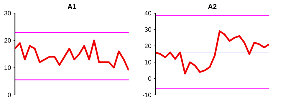
This kind of feature is so important that we’d better study some charts. Firstly, take a look at the two control charts, labelled A1 and A2, at the top of page 19, in the Six Processes section below. (Recall that on Appendix page 1 I indicated you would find it convenient to print a separate copy of that page.) I think you will quickly realise that Chart A1 shows a process which is in control. But Chart A2 looks very different. Amongst other features, four of its 24 points are very close to, or outside, the control limits. Thus there is little doubt that the data shown there come from a process which is out of statistical control.
The control limits (coloured blue) in those charts on page 19, in the Six Processes section below were computed by the moving-range method (in both cases using all of the 24 data-points included on the chart in the calculations). However, what would happen if we were instead to try computing the control limits with the conventional statistician’s standard deviation (again using all the 24 data-points on each chart)? The control limits (coloured magenta) on the charts that follow are computed using standard deviations.
Describe this chart
Two charts side by side: Chart A1 (a stable process) and Chart A2 (an out-of-control process), each shown with control limits drawn in magenta — computed using the conventional standard deviation. On Chart A1 the magenta limits sit roughly where the moving-range (blue) limits did on page 19, in the Six Processes section below: no harm done. On Chart A2, however, the magenta limits are roughly twice as far apart as the blue limits would have been. They have been pushed outward by the very special causes they were meant to detect — and as a result, the chart now wraps around all the data and signals nothing. The standard deviation, like the histogram, ignores the order of the values; the moving-range method does not.
Now, those magenta limits on this Chart A1 (computed using standard deviations) are virtually the same as the blue ones (computed using moving ranges) on page 19, in the Six Processes section below. But look what happens to Chart A2 where the standard-deviation-type (magenta) control limits have been computed from the data there which we have already just recognised as coming from an out-of-control process. They are approximately twice as far apart as the ones on page 19! These limits are totally useless as a criterion for judging whether the process is or is not in statistical control. Why does this happen? It’s because, just like the histogram, the standard deviation totally ignores the order in which the numbers occur in the data—refer again to the remark about “the most important information of all” near the top of page 9, in the Importance of Time section above.
Now, as I said, using moving ranges is not a perfect solution for obtaining control limits that purely reflect common-cause variation even if computed when the process is out of statistical control. A perfect solution doesn’t exist. But using moving ranges works pretty well in mitigating the contamination effects of many kinds of special causes. There are a few exceptions but, now that you know the general idea about how the control limits are produced, i.e. using moving ranges, those exceptions soon become relatively easy to recognise. That is why I have included this present discussion here in the main text rather than just in the Technical Aids—this is important knowledge for all users of control charts, including those on Stats-level 0. Two important exceptions that one needs to be able to recognise are illustrated with data generated in the Funnel Experiment, and so we shall see those this afternoon. But the general success of the moving-range method will be amply illustrated this morning in the section which begins on page 19.
Those on Stats-level 0 can now move to that section almost immediately since the remainder of this current section consists of some Technical Aids and an Activity in which to use those Technical Aids. However, since most of this afternoon will be spent on the substantial Major Activity of carrying out a version of the Funnel Experiment, there will then be no further formal Activities or Pauses for Thought during the rest of this morning. The important “activities” related to what follows this morning will instead be those which take place in the future when you start to interpret your own control charts using your own data from processes that are of interest and relevance to you!
Let me re-emphasise that what follows, all the way up to page 34, at the end of the Six Processes Revisited section, is effectively “extra-curricular” as far as this course is concerned. Neither this afternoon’s work nor anything during the rest of this course will depend on the content of those pages. Further, the substantial Optional Extras material that has been previously mentioned is specifically for those who want to gain both deeper and broader knowledge about control charts than is included in the main course, particularly including more technical details. So that will not be suitable for everybody—which is, of course, why it is indeed “Optional Extra”! By contrast, pages 19–34, starting in the Six Processes section below here are focused on helping you to interpret control charts: they are not concerned with more technical matters nor with the actual construction of control charts. So, although they are optional as far as the rest of this course is concerned, I believe you will find them extremely helpful if and when you become actively involved in control-charting.
I hope therefore that you will find pages 19–34, starting in the Six Processes section below interesting to browse through now (so that you get some idea of what’s there) but, more importantly, that they will then become ones to which you will return from time to time, particularly when you use control charts in your own work and elsewhere. There is much reading and thinking involved during these coming pages. Please do not expect to take it all in straightaway today—there’s a lot of it! Keep a careful watch on my timing-guidance. This is the one and only occasion when I encourage you to just “skim-read” a substantial section of the main course material.
On the other hand, if you find it too difficult to deal with everything in the time that I’ve allotted to these pages then there’s no harm done. When the time comes for you to start working with your own control charts then you can return to study at your own pace the guidance given in these coming pages. However, please note that, if you do decide to skip some (or all!) of these pages now, be sure not to miss out pages 35–37, starting in the Introduction to the Funnel Experiment section since they cover essential preparation for this afternoon’s Major Activity and thus are not optional!
So, if you are on Stats-level 0 (or 00), please omit the following Technical Aids and move on to page 19.
Technical Aid 5
With Red Beads and similar data, the σ in Shewhart’s guidance for control limits (referred to on Appendix page 4) was computed by a formula merely involving the average: \(\bar{X}\). That was possible because, with such data, there is a natural link between the average and the way the data vary. (If the average is particularly small or large then the variation is relatively small, whereas if the average is more central then the variation is relatively large.) This is not the case with most other types of data, and so then a more direct representation of the variation is needed. As has now been introduced, the recommended method uses moving ranges: the distances (positive or zero, not negative) between consecutive values in the data.
Technical Aid 6
The artificial sales data on pages 10–12, starting in the More on the Sales Data section above were, in time order: 13 19 18 14 16 12 21 18 17 22.
- As with the Red Beads data, \(\bar{X}\) represents the average of all the data that are being used to compute the control limits. We’ll use all ten of them. So here we have
\[\bar{X} = (13 + 19 + 18 + 14 + 16 + 12 + 21 + 18 + 17 + 22) \div 10 = 170 \div 10 = 17.0.\]
This is where the Central Line of the control chart on page 11, in the More on the Sales Data section above was placed.
- \(\overline{MR}\) represents the average moving range in the data. In what follows, the moving ranges are shown in italics. Note that the moving ranges are the sizes of the point-to-point changes: there are no minus signs involved. Also note that, with 10 data-points, there are of course just 9 moving ranges:
13 19 18 14 16 12 21 18 17 22
6 1 4 2 4 9 3 1 5
So \(\overline{MR} = (6 + 1 + 4 + 2 + 4 + 9 + 3 + 1 + 5) \div 9 = 35 \div 9 = 3.889\).
- The control limits are placed at a distance of \(2.66 \times \overline{MR}\) either side of the Central Line. Here we have \(2.66 \times \overline{MR} = 2.66 \times 3.889 = 10.34\), and so the control limits were placed at \(17.0 - 10.34 = 6.7\) and at \(17.0 + 10.34 = 27.3\).
Technical Aid 7
Why the 2.66? Sorry: as with the formula in the Red Beads case, this is more material for the Optional Extras. But trust me: it is derived using the guidance about control limits provided by Dr Shewhart.
However, although moving ranges are quick and easy to compute, they can become quite tedious if being computed (especially by hand) for a lot of data. For example, it would be bad enough if we had to compute control limits using all the 24 data in the illustration below. Much worse still would be control limits for the data which you will generate in this afternoon’s Major Activity: four lots of 40 numbers!
Technical Aid 8
If we want to turn run charts containing a lot of data into control charts, do we have to use all those data to compute the control limits?
Fortunately, no. Sometimes we do use all of the available data to compute control limits retrospectively, i.e. when studying past behaviour of a process (as in the following section and also in the Springboard article previously referenced). But otherwise it is more usual and useful to develop a control chart “live”, i.e. plotting the points one at a time as and when the data are received. The normal practice is to compute control limits from, say, the first 10 to 15 data-values—or less if the data are received weekly or monthly, or if you’re in a hurry to get started! The length of data used for calculating the control limits is sometimes called the “baseline”. Of greater significance than just the convenience of using fewer data is that, obviously, a relatively short baseline can result in special causes being detected earlier than otherwise. There is much more discussion about this important matter of short or longer baselines in Part F of the Optional Extras section. There is also some discussion on pages 82–84 in ST, the revised edition of my Statistics Tables.
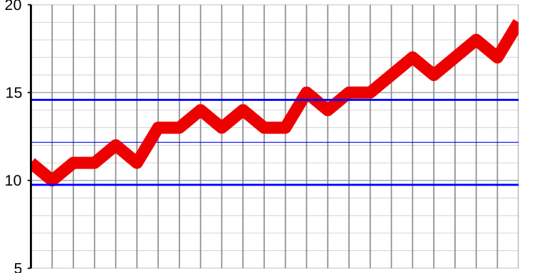
I’ll illustrate Technical Aid 8 using the first set of 24 data from page 7, in the Importance of Time section above:
11 10 11 11 12 11 13 13 14 13 14 13 13 15 14 15 15 16 17 16 17 18 17 19
Let’s compute the control limits using just the first half of these data, i.e. the first 12 values. Following Technical Aid 6 we firstly compute \(\bar{X}\), the average of all the data which are being used to produce the control limits:
11 10 11 11 12 11 13 13 14 13 14 13.
This is
\[(11 + 10 + 11 + 11 + 12 + 11 + 13 + 13 + 14 + 13 + 14 + 13) \div 12 = 146 \div 12 = 12.167.\]
Then it’s the turn of \(\overline{MR}\), the average moving range in those 12 data. As before, the moving ranges are printed in italics:
11 10 11 11 12 11 13 13 14 13 14 13
1 1 0 1 1 2 0 1 1 1 1
So \(\overline{MR} = (1 + 1 + 0 + 1 + 1 + 2 + 0 + 1 + 1 + 1 + 1) \div 11 = 10 \div 11 = 0.909\), and \(2.66 \times \overline{MR} = 2.66 \times 0.909 = 2.418\). This puts the control limits at \(12.167 - 2.418 = 9.749\) and \(12.167 + 2.418 = 14.585\). Showing the control limits in blue as previously, the control chart is then:
Describe this chart
A control chart of all 24 values from the first process, but with the control limits computed using only the first 12 (LCL ≈ 9.75, UCL ≈ 14.59, Central Line at 12.17). The first 12 points fluctuate quietly inside the limits. The remaining 12 climb steadily upward — by point 24 (value 19) they are well above the UCL. The lesson: with a “live” chart, you do not need every data point to set the limits; computing them from a short baseline lets later special causes show up as soon as they appear.
This was clearly a case where, in practice, there was little to be gained by producing the control chart: the run chart had already told the story of the rising trend. That’s fine: if the run chart tells you all you need to know then don’t bother to upgrade it to a control chart. The control chart becomes really valuable when it is unclear as to whether or not the run chart is indicating there are some special causes—which is the more usual situation.
ACTIVITY 3–g
Just for practice, compute the control limits by the method just demonstrated (again using just the first 12 values) on the data whose run chart you drew in Activity 3–e on page 8, in the Importance of Time section above. Here are those data:
18 19 17 17 16 17 16 15 14 15 15 13 14 13 14 13 13 13 11 11 12 11 10 11
(Hint: I deliberately chose these numbers to provide easy arithmetic for you—in particular, you should find that both \(\bar{X}\) and \(\overline{MR}\) computed from the first 12 values turn out to be whole numbers.)
(If you need to check your arithmetic then see Appendix page 15.)
Then insert the control limits on your run chart on page 8, in the Importance of Time section above.
If you had needed the control limits to help you interpret the data, what would they have told you?