A FAVOURITE EXAMPLE
~ 5 min reading · ~ 35 min at Neave’s pace
Through our study of the “Six Processes” we have already ventured well beyond the mere basics of interpreting control charts. So let’s continue the good work a little while longer.
The example described below is one which Dr Deming frequently showed in his four-day seminars and is covered on Out of the Crisis pages 227–228(264–266). Instead of simply reproducing what is shown in the book, I have redrawn a couple of charts based on the information in his account.
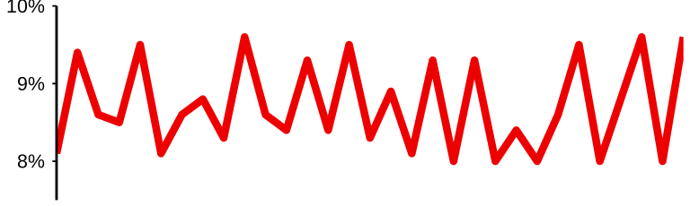
The following run chart is based on some inspection data. Quoting from Dr Deming’s account, it “shows the daily record for two months of the proportion defective found on final audit of a product ready to ship out.” It is quite usual, as here, to chart the proportion or percentage of defectives rather than the actual number of defectives—the run chart is exactly the same in each of the three cases except for what is written on the vertical axis. Of course, if upgrading the run chart to a control chart then the control limits will need to be expressed in the same terms as are used on the vertical scale.
Describe this chart
A run chart of the daily proportion defective on final audit, over two months. The line wanders up and down in a tight band well below 10%. The chart looks unremarkable — but Neave has deliberately omitted the control limits, and the next chart will show why: the band is too tight to be the natural variation of a stable process.
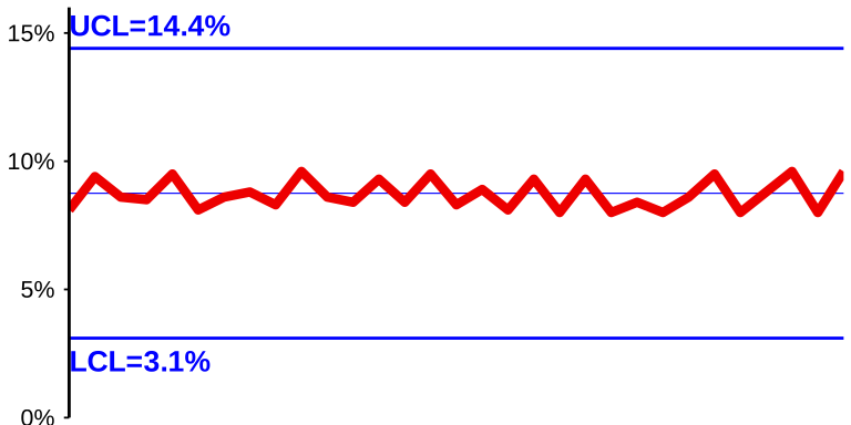
Would you say that this process is in statistical control? You might be wise enough to answer that you cannot be sure without inserting the control limits to upgrade the run chart to a control chart. But there was a good reason why I haven’t included the control limits here: you might be surprised to know that, starting with the run chart as shown above, the control limits wouldn’t fit onto this page! Take a look at the way that Dr Deming drew the control chart of these data with a quite different vertical scale:
Describe this chart
The same daily proportions, redrawn on a much wider vertical scale so that the correctly-computed control limits actually fit on the page. The control limits are very far apart — and every point sits clustered in a narrow horizontal band along the Central Line, nowhere near either limit. This is the “Hugging the Central Line” pattern. It does not say “the process is exceptionally well-behaved”; it says the data are too good to be true. In this case the inspector was sandbagging — fiddling the figures to keep the daily proportion defective safely below the 10% threshold that rumour said would close the plant.
Yes, be sure that Dr Deming did compute those control limits correctly! So, in order to produce a reasonable picture, he did indeed need to use a drastically different vertical scale from that which would normally have been used when drawing the run chart. Not surprisingly, the effect shown in his control chart is often known as “hugging the Central Line”. As soon as Dr Deming saw this “curious condition”, as he called it, he knew that there was something for him to find out. What he discovered was well described by his heading to the story: “Faulty inspection caused by fear”. His explanation was as follows:
“The inspector was insecure, in fear. Rumour had it throughout the plant that the manager would close the plant down and sweep it out if the proportion defective on the final audit ever reached 10 per cent on any day. The inspector was protecting the jobs of 300 people.”
She was “fiddling the figures”! Could you blame her? Wouldn’t you have done the same? Her kind of action is sometimes called “sandbagging”. On “good days” she would set aside some of the good items and replace them with some defective ones that she had set aside on a previous day, and on “bad days” she would do the opposite. A similar activity is engaged in by salespeople who need to reach some target in order to obtain a higher rate of commission: I’m sure you can suggest some relevant details! Maybe in some companies the inspector would have been fired when the truth was discovered. But not in this case, I believe. “We reported to the top management our explanation—fear. The problem disappeared when this plant manager migrated to another job, and a new manager came in.”
A control chart may not be able to completely solve a problem. But it is certainly a great help for discovering when there is a problem to be solved and can often give some pretty useful clues to aid its solution. In this case the solution was not to fire the inspector but instead to kill the rumour.